Quantcast
Channel: Search Results for “heatmap”– R-bloggers
Viewing all 152 articles
Browse latest View live

Pretty Correlation Map of PIMCO Funds

$
0
0

(This article was first published on Timely Portfolio, and kindly contributed to R-bloggers)

As PIMCO expands beyond fixed income, I thought it might be helpful to look at correlation of PIMCO mutual funds to the S&P 500.  Unfortunately due to the large number of funds, I cannot use the chart.Correlation from PerformanceAnalytics.  I think I have made a pretty correlation heatmap of PIMCO institutional share funds with inception prior to 5 years ago.  Of course this eliminates many of the new strategies, but it is easy in the code to adjust the list.  I added the Vanguard S&P 500 fund (VFINX) as a reference point.  Then, I orderded the correlation heat map by correlation to VFINX.

As expected there are two fairly distinct groups of funds: those (mostly fixed income) with negative/low correlation to the S&P 500 and those with strong positive correlation.

From TimelyPortfolio

Here is the more standard heat map with dendrogram ordering, which has its purpose but gets a little busy.

From TimelyPortfolio

If we are only interested in the correlation to the S&P 500 (VFINX), then this might be more helpful.

From TimelyPortfolio

R code from GIST:

To leave a comment for the author, please follow the link and comment on his blog: Timely Portfolio.

R-bloggers.com offers daily e-mail updates about R news and tutorials on topics such as: visualization (ggplot2, Boxplots, maps, animation), programming (RStudio, Sweave, LaTeX, SQL, Eclipse, git, hadoop, Web Scraping) statistics (regression, PCA, time series,ecdf, trading) and more...

More on birthday probabilities

$
0
0

(This article was first published on Revolutions, and kindly contributed to R-bloggers)

Last week, Joe Rickert used R and four years of US Census data to create an image plot of the relative probabilities of being born on a given day of the year:

HeatMapofProbs

Chris Mulligan also tackled this problem with R, but this time using 20 years of Census data from 1969 to 1988. Chris extracted the birthday frequencies using Google BigQuery, and charted the results with the time series below using this R script.

Birthday probabilities

My apologies to Joe, but I much prefer this representation to the heat map. Not only is the February 29 frequency multiplied by 4 (where we see that it's not a particularly surprising birthday to have given the overall seasonal trend), but the unusual days really stand out (and are annotated). You're relatively unlikely to find someone born on January 1, July 4 or Christmas Eve or Christmas Day (most likely because fewer Caesarian births happen, or more induced natural births are avoided, on those days). December 30 is a more likely birthday that you'd otherwise expect (maybe this has something to do with getting kids into an earlier school year?). Andrew Gelman shares a model of the seasonal trend that defines these outliers.

chmullig.com: Births by Day of Year

To leave a comment for the author, please follow the link and comment on his blog: Revolutions.

R-bloggers.com offers daily e-mail updates about R news and tutorials on topics such as: visualization (ggplot2, Boxplots, maps, animation), programming (RStudio, Sweave, LaTeX, SQL, Eclipse, git, hadoop, Web Scraping) statistics (regression, PCA, time series,ecdf, trading) and more...

Color Palettes in RGB Space

$
0
0

(This article was first published on Trestle Technology, LLC » R, and kindly contributed to R-bloggers)

Introduction

I've recently been interested in how to communicate information using color. I don't know much about the field of Color Theory, but it's an interesting topic to me. The selection of color palettes, in particular, has been a topic I've been faced with lately.

I downloaded 18 different sequential color palettes from Cynthia Brewer's ColorBrewer2 website to use as suggested color palettes. I was struck by the various movements through the spectrum of some of these palettes and wanted to poke around at quantifying some of that movement. This is the result of that analysis.

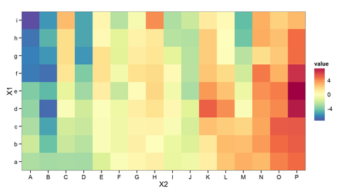
Using the 18 different sequential color palettes, I generated heatmaps to try to gauge the aesthetic appeal of each palette. Using Amazon's Mechanical Turk, I was able to ask workers to rate a palette on a scale from 1 to 5. I had each palette rated 20 times to generate a sufficient amount of data to start determining statistical significance. The 360 ratings were completed by 28 workers in a couple of hours.

This initial study didn't consider anything about how clear the heatmaps are, only how aesthetically pleasing they are. The 18 matrices in the 18 available palettes are displayed below.

source("../Correlation.R") source("loadPalettes.R") par(mfrow = c(6, 3), mar = c(2, 1, 1, 1)) for (i in 1:18) { palette <- allSequential[[i]] image(mat, col = rgb(palette/255), axes = FALSE, main = i) }

RGB-Space

One question I had was about the motion of a "visually attractive" color palette through the 3-dimensional space of all RGB values. My assumption was that most palettes can be represented as a straight line through this space.

rgbsnapshot
You must enable Javascript to view this page properly.

An interactive visualization of palette #2 in 3-Dimensional RGB space

R2 Values

One way to quantify this is to calculate the principal component of each palette, which represents the line in RGB space which best fits the palette. The R2 value can then be used to quantify how well the data aligns to this component. An R2 value of 1 indicates that the palette aligns perfectly to a straight line through RGB space.

pcasnapshot
You must enable Javascript to view this page properly.

Palette #2 with the Principal Component. Note the curve of the palette around the component.
#' Compute the proportion of variance accounted for by the given number of #' components #' #' @author Jeffrey D. Allen \email{jeff.allen@@trestletechnology.net} propVar <- function(pca, components = 1) { # proportion of variance explained by the first component pv <- pca$sdev^2/sum(pca$sdev^2)[1] return(sum(pv[1:components])) } #' Calculate the R-squared values of all 18 color palettes #' #' @author Jeffrey D. Allen \email{jeff.allen@@trestletechnology.net} calcR2Sequential <- function() { library(rgl) R2 <- list() for (i in which(sequential[, 2] == 9)) { palette <- sequential[i:(i + 8), 7:9] pca <- plotCols(palette$R, palette$G, palette$B, pca = 1) cat(i, ": ", propVar(pca, 1), "\n") R2[[length(R2) + 1]] <- propVar(pca, 1) } return(R2) }

Path Length

An alternative way to consider the palette in RGB space is to consider the "length" of the palette through RGB space by simply calculating the distance between each color represented as a point in RGB space. My thought is that this may better capture the "movement" of a palette around this space. The R2 value doesn't encompass any notion of how much space is covered by a palette, but only the arrangement of the colors relative to their principal component.
#' Calculate the path length for all sequential palettes. #' #' @author Jeffrey D. Allen \email{jeff.allen@@trestletechnology.net} calcPathLength <- function() { plen <- array(dim = sum(sequential[, 2] == 9, na.rm = TRUE)) p <- 1 for (i in which(sequential[, 2] == 9)) { palette <- sequential[i:(i + 8), 7:9] cat(i, ": ", getPathLength(palette), "\n") plen[p] <- getPathLength(palette) p <- p + 1 } return(plen) } #' Calculate the length of a path through RGB space of a given palette. #' #' Sums the distance from all adjacent colors. @author Jeffrey D. Allen #' \email{jeff.allen@@trestletechnology.net} getPathLength <- function(palette) { pd <- apply(palette, 2, diff) pl <- sqrt(apply(pd^2, 1, sum)) return(sum(pl)) }

Comparison

Let's compare the R2 values to the path length values
r2 <- calcR2Sequential()
## 34 : 0.981 ## 76 : 0.9097 ## 118 : 0.9541 ## 160 : 0.9847 ## 202 : 0.9552 ## 244 : 0.9663 ## 286 : 0.9674 ## 328 : 0.9273 ## 370 : 0.9344 ## 412 : 0.9593 ## 454 : 0.9049 ## 496 : 0.9007 ## 538 : 0.9954 ## 580 : 0.9752 ## 622 : 0.9846 ## 664 : 0.9292 ## 706 : 0.9311 ## 748 : 1
r2 <- unlist(r2) names(r2) <- 1:18 pl <- calcPathLength()
## 34 : 404.8 ## 76 : 455.2 ## 118 : 377.5 ## 160 : 407.5 ## 202 : 418.1 ## 244 : 400.5 ## 286 : 389.5 ## 328 : 405.6 ## 370 : 430 ## 412 : 420.7 ## 454 : 424.7 ## 496 : 430 ## 538 : 342.9 ## 580 : 374.1 ## 622 : 400.2 ## 664 : 400.3 ## 706 : 430.6 ## 748 : 441.7
plot(r2 ~ pl, main = "Path Length vs. R-Squared Value", xlab = "Path Length", ylab = "R-Squared Value") abline(lm(r2 ~ pl), col = 2)
pv <- anova(lm(r2 ~ pl))$"Pr(>F)"[1]
The p-value (0.0318) is significant in the negative correlation between the two variables, meaning that, as expected, the closer the palette stays to its principal component, the shorter the path through RGB space is (on average). So either scheme could be used to quantify a palette's non-linearity.

Color Ratings

The output of the Mechanical Turk trial is available in a stored file in this project. We'll read it in and filter out the peripheral information.
colorPreference <- read.csv("../turk/output/Batch_790445_batch_results.csv", header = TRUE, stringsAsFactors = FALSE) colorPreference <- colorPreference[, 28:29] colorPreference[, 1] <- substr(colorPreference[, 1], 44, 100) colorPreference[, 1] <- substr(colorPreference[, 1], 0, nchar(colorPreference[, 1]) - 4) colnames(colorPreference) <- c("palette", "rating") prefList <- split(colorPreference[, 2], colorPreference[, 1]) prefList <- prefList[order(as.integer(names(prefList)))]
We can then visualize the results, as well.
boxplot(prefList, main = "Ratings of Color Palettes", xlab = "Palette Number", ylab = "Rating")
avgs <- sapply(prefList, mean)
We can then check to see if there's a significant association between the palette and the rating of the palette, or if we've just got noise.
fit <- anova(lm(colorPreference[, 2] ~ as.factor(colorPreference[, 1]))) pv <- (fit$"Pr(>F)")[1]
With a p-value of 1.6911 × 10⁻⁴, you can see that there is a significant difference between the different palettes.

We can list out the most attractive palettes in order, as well:

sort(sapply(prefList, mean), decreasing = TRUE)
## 14 13 4 6 3 15 1 7 18 5 8 2 16 9 10 ## 4.30 4.10 3.85 3.75 3.65 3.65 3.55 3.45 3.45 3.40 3.40 3.35 3.15 3.10 3.10 ## 17 12 11 ## 2.95 2.85 2.65
So the palettes, in order of visual appeal are:
par(mfrow = c(6, 3), mar = c(2, 1, 1, 1)) for (i in order(avgs, decreasing = TRUE)) { palette <- allSequential[[i]] image(mat, col = rgb(palette/255), axes = FALSE, main = i) }

Warm Palettes

The first thing I noticed was that the cooler palettes were rated more highly than the warmer palettes. To try to quantify this, we can plot out the "redness" (the strenght of the red channel in each palette) against the average rating.
redness <- apply(sapply(allSequential, "[[", "R"), 2, mean) plot(avgs ~ redness, main = "Warmth of Palette vs. Aesthetic Appeal", xlab = "\"Redness\"", ylab = "Average Aesthetic Rating") abline(lm(avgs ~ redness), col = 2)
pv <- anova(lm(avgs ~ redness))$"Pr(>F)"[1]
Indeed, the p-value of this correlation is significant for this data (3.6602 × 10⁻⁴) indicating that -- among these palettes and in this context -- cooler palettes are more visually appealing.

R2 Values

We can calculate the R2 values for each palette as previously discussed and compare to see if it's associated with the aesthetic appeal of a palette.
r2
## 1 2 3 4 5 6 7 8 9 10 ## 0.9810 0.9097 0.9541 0.9847 0.9552 0.9663 0.9674 0.9273 0.9344 0.9593 ## 11 12 13 14 15 16 17 18 ## 0.9049 0.9007 0.9954 0.9752 0.9846 0.9292 0.9311 1.0000
plot(avgs ~ r2, main = "Linearity of Color Palette vs. Aesthetic Appeal", xlab = "R-squared Value", ylab = "Average Aesthetic Rating") abline(lm(avgs ~ r2), col = 4)
pv <- anova(lm(avgs ~ r2))$"Pr(>F)"[1]
Again, the p-value of this association is significant (3.2224 × 10⁻⁴). So it seems that adhering a color spectrum to a straight line through RGB-space is visually appealing.

Similarly, for the path length, the p-value is significant (though not as strongly as with the R2 values).

anova(lm(avgs ~ pl))$"Pr(>F)"[1]
## [1] 0.001476

Summary

This analysis answered a couple of questions for me. First, it showed that, in general, linear paths through RGB space create more aesthetically pleasing color palettes. Second, it demonstrated that, in this narrow study, palettes with cooler color schemes were preferred as more "aesthetically pleasing." Finally, it gave some concrete recommendations regarding which of the available color palettes to use if the goal is purely aesthetic.

Future Work

Of course, aesthetics are not to only goal behind color palette selection. Generally, the goal of heatmaps such as these is to convey information. If no legend is given, we're hoping to convey relative "strengths" of some phenomena to the viewer. If a legend is given, we're additionally hoping to support some quantification to these data, as well. So merely determining which color palettes are best to look at will likely not be the most important consideration in determining which palettes to use. We should do further analysis to determine which palettes convey such information most efficiently, and then likely make some compromise between efficient communication and aesthetics, depending on the application.

Acknowledgements

In case you missed it: June 2012 Roundup

$
0
0

(This article was first published on Revolutions, and kindly contributed to R-bloggers)

In case you missed them, here are some articles from June of particular interest to R users.

The FDA goes on the record that it's OK to use R for drug trials.

A review of talks at the useR! 2012 conference.

Using the negative binomial distribution to convert monthly fecundity into the chances of having a baby in a given time period.

Some benchmarks and a video demonstration of big-data Tweedie models with Revolution R Enterprise.

Why Orbitz's R-based models present more expensive hotels to Mac users.

How to convert a rugby score to an equivalent soccer score, with GAMs.

Performance improvements in R 2.15.1.

David Smith talks about R for data science in a DM Radio podcast.

CIO magazine says R is a Big Data open source technology to watch.

Birthday probabilities aren't uniform. US census data analysis reveals unlikely days to be born, as a calendar heatmap based on simulation () and a time series.

R makes the cover (with Hadoop and NoSQL) of ComputerWorld magazine.

The "killer app" for R with Hadoop: converting the "crude oil" of unstructured data into the "refined gasoline" of structured data.

A video with several demonstrations of data mining with R.

Info on the new Revolution R Enterprise 6.0 (based on R 2.14.2), released in June.

A Government Security News article on applications of R in government.

Pat Burn's "Inferno-ish R" describes the influences that shaped R, and includes an historic photo of Robert and Ross.

Other non-R-related stories in the past month included: the improbability of finding a soulmate, the Fibonacci sequence in a Tool song, using randomized trials for government policy, a Battlestar Galactica game parody, a Lego-themed movie quiz, the awe of Big Data and Andromeda on a collision course.

There are new R user groups in Ankara and Toronto. Meeting times for local R user groups can be found on the updated R Community Calendar.

As always, thanks for the comments and please send any suggestions to me at david@revolutionanalytics.com. Don't forget you can follow the blog using an RSS reader like Google Reader, or by following me on Twitter (I'm @revodavid). You can find roundups of previous months here.

To leave a comment for the author, please follow the link and comment on his blog: Revolutions.

R-bloggers.com offers daily e-mail updates about R news and tutorials on topics such as: visualization (ggplot2, Boxplots, maps, animation), programming (RStudio, Sweave, LaTeX, SQL, Eclipse, git, hadoop, Web Scraping) statistics (regression, PCA, time series,ecdf, trading) and more...

Community Detection in Networks with R

$
0
0

(This article was first published on Algoritmica: een data blog, and kindly contributed to R-bloggers)

I mainly post this visualization because I think it’s pretty. It reminds a little of the work by the famous Dutch painter Mondrian. The complete matrix can be found here.

Adjacency Matrix Directed Graph

The plot is a heatmap of an adjacency matrix generated by a weighted directed graph, where the weight is the influence of one product on another. The matrix was reordered using the infoMAP community detection algorithm which just got implemented in the most recent update of the igraph package for R. The variable importance score for each variable on every other variable was calculated by using the randomforest package and also the party package. The permutation test used in the regression tree grown by the party package is more robust than the one used in the randomforest package when dealing with highly correlated variables. The computation was done en parallel on a cluster at Amazon Web Services. 

R is a very popular open source data analysis tool. It can connect to any data source and even offers integration with Hadoop. It supports Parallel processing and a has the biggest set of libraries for machine learning. According to CIO.com, R is the #2 big data open-source software to watch. It’s also supported and compatible with IBM and SAS systems. R is even approved by the FDA in clinical trials and is the favorite weapon of choice by many of the most elite data scientists. 

The community detection algorithm clusters entities together that form natural islands of entities that influence eachother. In this particular incarnation of the analysis, the matrix was made to study product substitution effects and look for predictors. Sadly, I had to omit the labels because they contain non-disclosable information. Colors range from blue to purple, where purple stands for a big influence, and non-symmetry is a measure of importance. The diagonal is white but doesn’t count.

This analysis could be used to optimize the interaction of machine parts, study klout in social networks or look for substitution goods. A similar application, but using a graph representation of the network based on Wikipedia data, can be found here.

To leave a comment for the author, please follow the link and comment on his blog: Algoritmica: een data blog.

R-bloggers.com offers daily e-mail updates about R news and tutorials on topics such as: visualization (ggplot2, Boxplots, maps, animation), programming (RStudio, Sweave, LaTeX, SQL, Eclipse, git, hadoop, Web Scraping) statistics (regression, PCA, time series,ecdf, trading) and more...

Heatmap tables with ggplot2

$
0
0

(This article was first published on socialdatablog » R, and kindly contributed to R-bloggers)

I wrote before about heatmap tables as a better way of producing frequency or other tables, with a solution which works nicely in latex.

It is possible to do them much more easily in ggplot2, like this

library(Hmisc)
library(ggplot2)
library(reshape)
data(HairEyeColor)
P=t(HairEyeColor[,,2])
Pm=melt(P)
ggfluctuation(Pm,type="heatmap")+geom_text(aes(label=Pm$value),colour="white")+ opts(axis.text.x=theme_text(size = 15),axis.text.y=theme_text(size = 15))

Note that ggfluctuation will also take a table as input, but in this case P isn’t a table, it is a matrix, so we have to melt it using the reshape package.

Here is the output from the code above:

However, doing the marginal totals would be a bit of a faff like this.

Notice that this is statistically quite a different animal – unlike the previous version, the colours just divide the range of values. They are not indications of any kind of significant deviation from expected values. So they are less useful to the careful reader but on the other hand need no explanation.

Note also that ggfluctuation produces by default a different output

which is better in many ways. But it looks like a graphic, not a table, and the point of heatmap tables is you can slip them in where your reader expects a table and you don’t have to do so much explaining.


To leave a comment for the author, please follow the link and comment on his blog: socialdatablog » R.

R-bloggers.com offers daily e-mail updates about R news and tutorials on topics such as: visualization (ggplot2, Boxplots, maps, animation), programming (RStudio, Sweave, LaTeX, SQL, Eclipse, git, hadoop, Web Scraping) statistics (regression, PCA, time series,ecdf, trading) and more...

Heatmap tables with ggplot2, sort-of

$
0
0

(This article was first published on socialdatablog » R, and kindly contributed to R-bloggers)

I wrote before about heatmap tables as a better way of producing frequency or other tables, with a solution which works nicely in latex.

It is possible to do them much more easily in ggplot2, like this

library(Hmisc)
library(ggplot2)
library(reshape)
data(HairEyeColor)
P=t(HairEyeColor[,,2])
Pm=melt(P)
ggfluctuation(Pm,type="heatmap")+geom_text(aes(label=Pm$value),colour="white")+ opts(axis.text.x=theme_text(size = 15),axis.text.y=theme_text(size = 15))

Note that ggfluctuation will also take a table as input, but in this case P isn’t a table, it is a matrix, so we have to melt it using the reshape package.

Here is the output from the code above:

However, doing the marginal totals would be a bit of a faff like this.

Notice that this is statistically quite a different animal – unlike the previous version, the colours just divide the range of values. They are not indications of any kind of significant deviation from expected values. So they are less useful to the careful reader but on the other hand need no explanation.

Note also that ggfluctuation produces by default a different output

which is better in many ways. But it looks like a graphic, not a table, and the point of heatmap tables is you can slip them in where your reader expects a table and you don’t have to do so much explaining.


To leave a comment for the author, please follow the link and comment on his blog: socialdatablog » R.

R-bloggers.com offers daily e-mail updates about R news and tutorials on topics such as: visualization (ggplot2, Boxplots, maps, animation), programming (RStudio, Sweave, LaTeX, SQL, Eclipse, git, hadoop, Web Scraping) statistics (regression, PCA, time series,ecdf, trading) and more...

R Package Vignettes with Markdown

$
0
0

(This article was first published on Yihui Xie, and kindly contributed to R-bloggers)

What is the best resource to learn an R package? Many R users know the almighty question mark ? in R. For example, type ?lm and you will see the documentation of the function lm. If you know nothing about a package, you can take a look at the HTML help by

help.start()

where you can find the complete list of documentation by clicking the link Packages. The individual help pages are often boring and difficult to read, because you cannot see the whole picture of the elephant. That is where package vignettes can help a lot. A package vignette is like a short paper (in fact some are real journal papers), which gives you an overview of this package, and sometimes with examples. Package vignettes are not a required component of an R package, so you may not find them in all packages. For those packages which contain vignettes, you can find them by browseVignettes(), e.g. for the knitr package

browseVignettes(package = 'knitr')
# or go to
system.file('doc', package = 'knitr')

You can also see links to vignettes from help.start(): click Packages and go to the package documentation, or

help.start()
browseURL(paste0('http://127.0.0.1:', tools:::httpdPort,
          '/library/knitr/doc/index.html'))

Most vignettes are written in LaTeX/Sweave since that is the official approach (see Writing R Extensions). In the past Google Summer of Code, Taiyun Wei explored a few interesting directions of the knitr package, and one of them was to build HTML vignettes for R packages from Markdown, which is much easier to write than LaTeX.

For package authors who are interested, Taiyun's corrplot package (on Github) can serve as an example. The markdown vignette is inst/doc/index.Rmd, and it is built to HTML by knitr with the Makefile. When you run R CMD build corrplot, index.Rmd will be converted to index.html, which you can view it in help.start() after R CMD INSTALL corrplot_*.tar.gz (DO NOT use devtools::install_github() here because it does not run R CMD build).

The Makefile should be pretty clear: it is merely a call to knitr::knit2html(). The vignette index.Rmd is a simple R Markdown document; if you are not familiar with this format, see this video for a brief introduction:

Note you need

  1. Suggests: knitr in your package DESCRIPTION file to pass R CMD check, and
  2. a fake *.Rnw file under inst/doc/ to trigger the Makefile

Once you have this HTML vignette, you can also publish it elsewhere. For example, either RPubs.com or GitHub pages to gain more publicity (see an example of the phyloseq package). It is important to let users be aware of package vignettes, and a web link is apparently easier to tell other people than browseVignettes() (I felt very uncomfortable when I was writing the first half of this post because the vignettes are hidden so deep, hence so hard to describe).

So why not start building an HTML vignette for your package with R Markdown now? Think about animations, interactive content (e.g. googleVis), MathJax equations and other exciting web stuff.

To leave a comment for the author, please follow the link and comment on his blog: Yihui Xie.

R-bloggers.com offers daily e-mail updates about R news and tutorials on topics such as: visualization (ggplot2, Boxplots, maps, animation), programming (RStudio, Sweave, LaTeX, SQL, Eclipse, git, hadoop, Web Scraping) statistics (regression, PCA, time series,ecdf, trading) and more...

Tutorials for Learning Visualization in R

$
0
0

(This article was first published on Revolutions, and kindly contributed to R-bloggers)

Today's guest post comes from Nathan Yau. Nathan runs FlowingData, a site on statistics and visualization, and is the author of Visualize This.

Calendar-sample1
Years ago, when I started FlowingData, the purpose of the blog was to catalog and think out loud about visualization, in its many varieties. In the beginning I was talking to myself for the most part, but people started to ask me how the stuff I posted was made. The more I blogged, the more people asked, so instead of replying to individual emails, I wrote tutorials that everyone (including me) could learn from. I found that — especially with visualization — step-by-step tutorials that provide immediate results encourage people to learn R more readily and makes it a lot easier pick up.

10-filled-contour-colors
Those who are interested in R for visualization often don't have programming experience. If you come from Microsoft Excel, you're used to pointing and clicking to get the graphs you want, and the idea of of variables and functions probably seems foreign. Ideally, you want to learn these concepts first, but practically speaking, most people need results in the near future, so a learn-as-you-go approach seems to work better. This year I started FlowingData memberships so I could spend more time writing tutorials. I have a mix of free and members-only tutorials that walk you through the process of visualizing data in R, along with JavaScript and design-focused software. You can also download source code for all the tutorials.

Featured-image1

My main hope is that the tutorials provide a good starting point for people to visualize their own data in whatever way they like. So I have tutorials on specific visualization types, such as calendar heat maps or area charts, but I've also written generalized tutorials on creating custom charts and working with color. For the former, I try to wrap up all the code in a function so that it can be used right away. With the latter, I try to relate back to the more specific visualization tutorials so that you can see how the generalizations apply. In the end, whatever route you choose to learn visualization, it comes down to practice. Reading books on design concepts is good to start with, but you don't get any better at visualization until you make stuff and apply what's in the book. That's where all the fun's at.

FlowingData: Tutorials

To leave a comment for the author, please follow the link and comment on his blog: Revolutions.

R-bloggers.com offers daily e-mail updates about R news and tutorials on topics such as: visualization (ggplot2, Boxplots, maps, animation), programming (RStudio, Sweave, LaTeX, SQL, Eclipse, git, hadoop, Web Scraping) statistics (regression, PCA, time series,ecdf, trading) and more...

Designing Data Apps with R at Periscopic

$
0
0

(This article was first published on Revolutions, and kindly contributed to R-bloggers)

Today's guest post comes to us from Andrew Winterman, Data Designer at data visualization company Persiscopic. He shares with us the process of using the R language and other tools to create an interactive data application for a client — ed. 

The Hewlett Foundation contacted us a few months ago because they were interested in exploring ways to visualize the distribution and impact of their grantmaking efforts over the last ten years. They hoped to make a tool with three functions: It would provide insight into where the Foundation has made the largest impact; provide grant seekers context for their applications; and help the Foundation’s officers make decisions about new grantmaking efforts, based on their existing portfolio. They had one request: No maps.

The data arrived, as it so often does, in the rough: An Excel document compiled quickly, by hand, with the primary goal of providing an overview, rather than complete accuracy. At this point in the process, we paint with broad brushes. We learn the data’s characteristics, determine which facets are interesting, and prototype visualization ideas.

At the beginning of a project, I always explore a few simple visualization techniques to get a feel for the data. For example, simple bar charts as shown in Figure 1, scatter plots, and choropleths, are great ways to get a visual sense of what the data is saying. 


1a GrantAmounts
Figure 1

My main tools for this process are d3.js, R — ggplot2 in particular — and Tableau. For this project I used ggplot2 (version 0.9 came out halfway through) and the CRAN package 'beanplot'.


Once we have a feel for the data, we start brainstorming, and trying out ideas. For example, an early idea led us to explore using concentric circles to represent the tree of geographic categories (Hemisphere, Continent, Country, Region, County, City), and then filling an arc of a circle with a scatter plot to show individual grants. You can see this idea sketched, with mostly fake data in Figure 2. We ultimately decided the technique didn’t use space effectively enough for what we needed to convey. 

2 Tree Rings
Figure 2

Our next idea was to use modified beanplots [Figure 3] to succinctly describe the distribution of various quantities at the same time. These were made with the beanplot package available on CRAN. We denormalized them — meaning we hacked the beanplot function to make the total area of the beanplot proportional to volume. With traditional beanplots, the total area of each bean is always the same, since they represent probability distributions rather than counts. This is counter-intuitive if the viewer is unfamiliar with statistics. We actually went as far as developing a working tool using these modified bean plots. 

3 beanplot
Figure 3 : Beanplot

The width of the bean at a given dollar amount shows the probability the next dollar falls at the given amount. After extensive user testing, this proved too high a cognitive hurdle for the casual viewer. Users liked the visual presentation, but were confused as to their meaning, even with a detailed page showing how to interpret the beanplot.

We decided to consider alternatives to the beanplot that still accomplish the same goals. We also wanted a very simple technique that could be explained in a phrase. After a few iterations, we agreed that interactive heatmaps [Figure 4] would be a good solution. You will be able to see them in action at Persiscopic.com when the final product launches at later this year.

4 heatmap
Figure 4: Heatmap

R provides an ideal toolkit to explore methods to visualize data distributions. Between specialized packages and comprehensive toolkits like ggplot2, a wide range of techniques are available to the analyst. In particular, the transparent structure of most R functions make them easy to pull apart and put back together again, lending great flexibility to the patient programmer.

Andrew Winterman does Data Design for Periscopic. An inquisitive humanist, he is motivated by the promise of making ours a more rational society. He applies his skills to the problem of converting data into information, a process requiring scripting and research into the relevant fields of study. He holds a B.A. in Mathematics from Reed College, and patiently pursues a Masters of Science in Biostatistics at the Oregon Health and Sciences University. He greatly enjoys his daily bicycle commute, Portland’s artisanal culture, searing vegetables in cast iron, and thinking about epidemiology.

To leave a comment for the author, please follow the link and comment on his blog: Revolutions.

R-bloggers.com offers daily e-mail updates about R news and tutorials on topics such as: visualization (ggplot2, Boxplots, maps, animation), programming (RStudio, Sweave, LaTeX, SQL, Eclipse, git, hadoop, Web Scraping) statistics (regression, PCA, time series,ecdf, trading) and more...

Simplest possible heatmap with ggplot2

$
0
0

(This article was first published on is.R(), and kindly contributed to R-bloggers)

Featuring the lovely “spectral” palette from Colorbrewer. This really just serves as a reminder of how to do four things I frequently want to do:

  1. Make a heatmap of some kind of matrix, often a square correlation matrix
  2. Reorder a factor variable, as displayed along the axis of a plot
  3. Define my own color palette with colorRampPalette()
  4. Use RColorBrewer, specifically the diverging “spectral” scheme

To leave a comment for the author, please follow the link and comment on his blog: is.R().

R-bloggers.com offers daily e-mail updates about R news and tutorials on topics such as: visualization (ggplot2, Boxplots, maps, animation), programming (RStudio, Sweave, LaTeX, SQL, Eclipse, git, hadoop, Web Scraping) statistics (regression, PCA, time series,ecdf, trading) and more...

Optimal seriation for your matrices

$
0
0

(This article was first published on is.R(), and kindly contributed to R-bloggers)

In our previous post, we used a quick-and-dirty method for ordering the axes on our heatmap. It has been pointed out to me that There is a Package for That (which is my nominee for a new slogan for R — not that it needs a slogan). seriation offers many methods for optimally ordering dist() objects, matrices, and arrays, and the Gist below offers one example of its usage.

By the same source who offered the seriation tip, I have been publicly (if gently) admonished for the use of the spectral palette. We can talk more about selecting a color palette later, but for today at least, our example uses the “safest” diverging RColorBrewer palette, “PuOr.”

To leave a comment for the author, please follow the link and comment on his blog: is.R().

R-bloggers.com offers daily e-mail updates about R news and tutorials on topics such as: visualization (ggplot2, Boxplots, maps, animation), programming (RStudio, Sweave, LaTeX, SQL, Eclipse, git, hadoop, Web Scraping) statistics (regression, PCA, time series,ecdf, trading) and more...

A replacement for theme_blank()

$
0
0

(This article was first published on is.R(), and kindly contributed to R-bloggers)

ggplot2 has just hit 0.9.2, and with the change comes a new theme system. Previous versions of ggplot2 offered a theme_blank(), which was a stripped-down, essentially blank plotting canvas, but it is now deprecated.

github user jrnold has produced a series of nice themes to work with the new system, but my most pressing need was for a replacement for theme_blank(), which I outline below.

This plot illustrates a heatmap similar to that shown here previously, but with my new_theme_empty applied:

To leave a comment for the author, please follow the link and comment on his blog: is.R().

R-bloggers.com offers daily e-mail updates about R news and tutorials on topics such as: visualization (ggplot2, Boxplots, maps, animation), programming (RStudio, Sweave, LaTeX, SQL, Eclipse, git, hadoop, Web Scraping) statistics (regression, PCA, time series,ecdf, trading) and more...

EDA Before CDA

$
0
0

(This article was first published on John Myles White » Statistics, and kindly contributed to R-bloggers)

One Paragraph Summary

Always explore your data visually. Whatever specific hypothesis you have when you go out to collect data is likely to be worse than any of the hypotheses you’ll form after looking at just a few simple visualizations of that data. The most effective hypothesis testing framework in existence is the test of intraocular trauma.

Context

This morning, I woke up to find that Neil Kodner had discovered a very convenient CSV file that contains geospatial data about every valid US zip code. I’ve been interested in the relationship between places and zip codes recently, because I spent my summer living in the 98122 zip code after having spent my entire life living in places with zip codes below 20000. Because of the huge gulf between my Seattle zip code and my zip codes on the East Coast, I’ve on-and-off wondered if the zip codes were originally assigned in terms of the seniority of states. Specifically, the original thirteen colonies seem to have some of the lowest zip codes, while the newer states had some of the highest zip codes.

While I could presumably find this information through a few web searches or could gather the right data set to test my idea formally, I decided to blindly plot the zip code data instead. I think the results help to show why a few well-chosen visualizations can be so much more valuable than regression coefficients. Below I’ve posted the code I used to explore the zip code data in the exact order of the plots I produced. I’ll let the resulting pictures tell the rest of the story.

1
2
3
4
5
6
7
8
9
10
11
12
13
14
15
16
17
zipcodes <- read.csv("zipcodes.csv")
 
ggplot(zipcodes, aes(x = zip, y = latitude)) +
  geom_point()
ggsave("latitude_vs_zip.png", height = 7, width = 10)
ggplot(zipcodes, aes(x = zip, y = longitude)) +
  geom_point()
ggsave("longitude_vs_zip.png", height = 7, width = 10)
ggplot(zipcodes, aes(x = latitude, y = longitude, color = zip)) +
  geom_point()
ggsave("latitude_vs_longitude_color.png", height = 7, width = 10)
ggplot(zipcodes, aes(x = longitude, y = latitude, color = zip)) +
  geom_point()
ggsave("longitude_vs_latitude_color.png", height = 7, width = 10)
ggplot(subset(zipcodes, longitude < 0), aes(x = longitude, y = latitude, color = zip)) +
  geom_point()
ggsave("usa_color.png", height = 7, width = 10)

Picture

(Latitude, Zipcode) Scatterplot


Latitude vs zip

(Longitude, Zipcode) Scatterplot


Longitude vs zip

(Latitude, Longitude) Heatmap


Latitude vs longitude color

(Longitude, Latitude) Heatmap


Longitude vs latitude color

(Longitude, Latitude) Heatmap without Non-States


Usa color

To leave a comment for the author, please follow the link and comment on his blog: John Myles White » Statistics.

R-bloggers.com offers daily e-mail updates about R news and tutorials on topics such as: visualization (ggplot2, Boxplots, maps, animation), programming (RStudio, Sweave, LaTeX, SQL, Eclipse, git, hadoop, Web Scraping) statistics (regression, PCA, time series,ecdf, trading) and more...

Color Palettes in HCL Space

$
0
0

(This article was first published on Trestle Technology, LLC » R, and kindly contributed to R-bloggers)

This is a quick follow-up to my previous post about Color Palettes in RGB Space. Achim Zeileis had commented that, perhaps, it would be more informative to evaluate the color palettes in HCL (polar LUV) space, as that spectrum more accurately describes how humans perceive color. Perhaps more clear trends would emerge in HCL space, or color palettes would more closely hug their principal component.

For the uninitiated, a good introduction to HCL color spaces is available at this site, or from Mr. Zeileis' own paper here.

We'll start by loading in some code written previously (or slightly modified to support HCL). We can plot out an image of the different color palettes we're evaluating once again.

source("../Correlation.R")
source("loadPalettes.R")
par(mfrow = c(6, 3), mar = c(2, 1, 1, 1))
for (i in 1:18) {
    palette <- getSequentialLuv(i, allSequential)
    image(mat, col = hex(palette), axes = FALSE, main = i)
}

HCL-Space

The fundamental question for this analysis was how these color palettes move through HCL space, as opposed to RGB space, which was considered last time.

rgbsnapshot
You must enable Javascript to view this page properly.

An interactive visualization of palette #2 in 3-Dimensional HCL space

R2 Values

As we did in the previous analysis, we can use the principal component of each palette, to compute the R2 value to quantify how well the data aligns to this component.

pcasnapshot
You must enable Javascript to view this page properly.

Palette #2 with the Principal Component.

We'll recycle some of the old functions, and create a new one that calculates the R2 values in HCL space.

#' Compute the proportion of variance accounted for by the given number of components
#'
#' @author Jeffrey D. Allen \email{Jeffrey.Allen@@UTSouthwestern.edu}
propVar <- function(pca, components=1){
  #proportion of variance explained by the first component
  pv <- pca$sdev^2/sum(pca$sdev^2)[1] 
  return(sum(pv[1:components]))
}

#' Calculate the R-squared values of all 18 color palettes
#'
#' @author Jeffrey D. Allen \email{Jeffrey.Allen@@UTSouthwestern.edu}
calcR2Sequential <- function(){
  library(rgl)
  R2 <- list()
  for (i in which(sequential[,2] == 9)){
    palette <- RGBToLuv(sequential[i:(i+8), 7:9])
    pca <-plotLuvCols(palette[,"L"],palette[,"C"], palette[,"H"], pca=1)    
    R2[[length(R2)+1]] <- propVar(pca,1)
  }
  return(R2)
}

calcR2RGBSequential <- function() {
    library(rgl)
    R2 <- list()
    for (i in which(sequential[, 2] == 9)) {
        palette <- sequential[i:(i + 8), 7:9]
        pca <- plotCols(palette$R, palette$G, palette$B, pca = 1)
        cat(i, ": ", propVar(pca, 1), "\n")
        R2[[length(R2) + 1]] <- propVar(pca, 1)
    }
    return(R2)
}

Comparison of R2 Values

Let's compare the R2 values computed from RGB space to those computed in HCL space

# R2 Values in HCL Space
r2 <- calcR2Sequential()
r2 <- unlist(r2)
names(r2) <- 1:18

# R2 Values in RGB Space
rgbr2 <- calcR2RGBSequential()
## 34 :  0.981 
## 76 :  0.9097 
## 118 :  0.9541 
## 160 :  0.9847 
## 202 :  0.9552 
## 244 :  0.9663 
## 286 :  0.9674 
## 328 :  0.9273 
## 370 :  0.9344 
## 412 :  0.9593 
## 454 :  0.9049 
## 496 :  0.9007 
## 538 :  0.9954 
## 580 :  0.9752 
## 622 :  0.9846 
## 664 :  0.9292 
## 706 :  0.9311 
## 748 :  1
rgbr2 <- unlist(rgbr2)
names(rgbr2) <- 1:18

# plot the comparison
plot(rgbr2 ~ r2, ylab = "RGB R2 Values", xlab = "HCL R2 Values", main = "RGB vs. HCL R2 Values")
pv <- anova(lm(rgbr2 ~ r2))$"Pr(>F)"[1]

As seen clearly in the plot, these two variables are not correlated (p-value of 0.5232), so there's definitely a difference in how these palettes move through HCL vs. RGB space.

Color Ratings

One hypothesis of this analysis was that because HCL space corresponds more directly to our perception of color, perhaps a smoother or more linear path through HCL space would have greater consequence on the visual appeal of the color palette than it would in RGB space. To test this, we can repeat the same analysis as we had before to see if a small R2 value is significantly correlated with the visual appeal of a color palette.

colorPreference <- read.csv("../turk/output/Batch_790445_batch_results.csv", 
    header = TRUE, stringsAsFactors = FALSE)
colorPreference <- colorPreference[, 28:29]
colorPreference[, 1] <- substr(colorPreference[, 1], 44, 100)
colorPreference[, 1] <- substr(colorPreference[, 1], 0, nchar(colorPreference[, 
    1]) - 4)
colnames(colorPreference) <- c("palette", "rating")

prefList <- split(colorPreference[, 2], colorPreference[, 1])
prefList <- prefList[order(as.integer(names(prefList)))]

R2 Values

We can calculate the R2 values for each palette as previously discussed and compare to see if it's associated with the aesthetic appeal of a palette.

r2
##      1      2      3      4      5      6      7      8      9     10 
## 0.9614 0.9794 0.9799 0.9388 0.9708 0.8902 0.9651 0.9579 0.9725 0.9842 
##     11     12     13     14     15     16     17     18 
## 0.9325 0.9129 0.9603 0.9358 0.9568 0.9611 0.9785 1.0000
plot(avgs ~ r2, main = "Linearity of Color Palette vs. Aesthetic Appeal", xlab = "R-squared Value", 
    ylab = "Average Aesthetic Rating")
abline(lm(avgs ~ r2), col = 4)
pv <- anova(lm(avgs ~ r2))$"Pr(>F)"[1]

Oddly, this result contradicts the previous result; it seems that adhering to a linear path through HCL space is actually inversely related with the aesthetic appeal on these palettes. We should note, of course, that the p-value for this correlation is not significant, as it stands (p-value = 0.6598).

Regardless, the negative trend seems fairly obvious on inspection and, if you were to exclude the two "outlier" palettes on the left side which have stark breaks in HCL space on either end of the spectrum, you get a significant (0.01) negative correlation. Indeed, these same two palettes were the same outliers in the previous plot comparing RGB to HCL R2 values.

Obviously, as it stands, the conclusion of the analysis is that there is no correlation in these palettes between linearity in HCL space and aesthetic appeal, but it is curious that the hinted correlation is actually negative.

Dimensional Spread

Another point of interest is the "spread" or coverage of a palette across one particular axis. For instance, it may be interesting to compare a color palette which varies only in luminance to one which varies only in chroma to see if one type of progression is more aesthetically appealing.

We can summarize such a phenomenon by calculating the distance between each color in a palette along a given axis (luminosity, for instance), which we'll label "ΔLuminosity" the . Extracting the median of these points may provide some insight into the movement of a particular palette along an axis.

plotDimensionalScoring <- function(palettes, scoring, ...) {
    
    ranges <- data.frame(L = numeric(0), C = numeric(0), H = numeric(0))
    
    for (i in 1:length(palettes)) {
        colPal <- RGBToLuv(palettes[[i]])
        
        # get the differences between each color on each axis
        colPal <- diff(colPal)
        colPal <- abs(apply(colPal, 2, median))
        
        ranges[i, ] <- colPal
        
    }
    
    plot3d(0, 0, 0, xlab = "L", ylab = "C", zlab = "H", type = "n", xlim = c(-0.5, 
        max(ranges[, 1] + 1)), ylim = c(-0.5, max(ranges[, 2] + 1)), zlim = c(-0.5, 
        max(ranges[, 3] + 1)), ...)
    
    cols <- heat_hcl(n = 101)
    
    for (i in 1:nrow(ranges)) {
        plot3d(ranges[i, 1], ranges[i, 2], ranges[i, 3], type = "p", add = TRUE, 
            pch = 19, size = 10, col = cols[101 - (round(scoring[i], 2) * 100)], 
            ...)
    }
    ranges
}

normAvgs <- avgs - min(avgs)
normAvgs <- normAvgs/max(normAvgs)
ranges <- plotDimensionalScoring(allSequential, normAvgs)

Each palette now has one median Δ value for each axis. We can plot these in 3D space to see where the palettes fall. We'll go ahead and color-code these based on their average visual appeal to see if we can observe any trends or "hotspots" in which palettes are consistently rated as visually appealing based only on their median movement along an axis.

hclsnapshot
You must enable Javascript to view this page properly.

A plot of all color palettes' median change in HCL space.

We're descending into fairly non-scientific analysis here, but I noticed a pattern when viewing these points along the chroma and luminosity axes. It seems like there's something of a pattern resulting in consistently positioned high-ranked palettes.

I interpolated a heatmap based on these ratings on the C and L axes.

library(akima)

resolution = 64
cSeq <- seq(min(ranges[, 2]), max(ranges[, 2]), length.out = resolution)
lSeq <- seq(min(ranges[, 1]), max(ranges[, 1]), length.out = resolution)

a <- interp(x = ranges[, 1], y = ranges[, 2], z = normAvgs, xo = lSeq, yo = cSeq, 
    duplicate = "mean")

filled.contour(a, color.palette = heat_hcl, xlab = "Luminance", ylab = "Chroma", 
    main = "Visual Appeal Across Chroma & Luminance")
maxL <- lSeq[which.max(apply(a$z, 2, max, na.rm = TRUE))]
## Warning: no non-missing arguments to max; returning -Inf
maxC <- cSeq[which.max(apply(a$z, 1, max, na.rm = TRUE))]
## Warning: no non-missing arguments to max; returning -Inf

You can see the peak of visual appeal at luminance = 6.374 and chroma = 8.332. A few examples of palettes using this "optimized" chroma and luminance spacing...

par(mfrow = c(6, 3), mar = c(2, 1, 1, 1))
for (i in 1:18) {
    barplot(rep(1, 9), col = sequential_hcl(9, h = (20 * i), c. = c(100, 33.6), 
        l = c(40, 84.59), power = 1))
}

Individual Axis Analysis

There is one palette that seems to be a bit of an outlier in most regards. Of all the palettes, the greyscale palette has the lightest L value, and the lowest C and H values. If you calculate the Z-scores on each color axis, this palette has consistently higher scores; below is a plot of the average Z-score across the 3 axes.

barplot(apply(abs(scale(ranges)), 1, mean), col = c(rep("#BBBBBB", 17), "#CC7777"), 
    xlab = "Palette #", ylab = "Average Z-score Across {H, C, L} Axes")

Because of this, I decided to exclude it from all further calculations of significance. Where appropriate, I'll still plot it graphically but distinguish it from the other palettes.

Rather than relying on a 3D plot, we can examine each axis individually to see if there's a significant association between a palette's median variation on that access and its visual appeal. (The greyscale plot will be plotted with a triangle symbol in these plots, and was excluded to p-value and regression calculations).

filRanges <- ranges[1:17, ]
filNormAvgs <- normAvgs[1:17]

plot(normAvgs ~ ranges[, "H"], pch = c(rep(1, 17), 2), main = "Hue vs. Visual Appeal", 
    xlab = expression("Median " * Delta * Hue), ylab = "Average Aesthetic Rating")
abline(lm(filNormAvgs ~ filRanges[, "H"]), col = 2)
pvH <- anova(lm(filNormAvgs ~ filRanges[, "H"]))$"Pr(>F)"[1]
text(3, 0.1, paste("p-value =", round(pvH, 3)))
plot(normAvgs ~ ranges[, "C"], pch = c(rep(1, 17), 2), main = "Chroma vs. Visual Appeal", 
    xlab = expression("Median " * Delta * Chroma), ylab = "Average Aesthetic Rating")
abline(lm(filNormAvgs ~ filRanges[, "C"]), col = 2)
pvC <- anova(lm(filNormAvgs ~ filRanges[, "C"]))$"Pr(>F)"[1]
text(3, 0.1, paste("p-value =", round(pvC, 3)))
plot(normAvgs ~ ranges[, "L"], pch = c(rep(1, 17), 2), main = "Luminance vs. Visual Appeal", 
    xlab = expression("Median " * Delta * Luminance), ylab = "Average Aesthetic Rating")
abline(lm(filNormAvgs ~ filRanges[, "L"]), col = 2)
pvL <- anova(lm(filNormAvgs ~ filRanges[, "L"]))$"Pr(>F)"[1]
text(5, 0.1, paste("p-value =", round(pvL, 3)))

As shown on the plots, there is no observable correlation with regards to movement through hue with visual appeal; there is a significant negative correlation between median variation in chroma and the visual appeal; and there seems to be a negative (though non-significant) correlation between median variation in luminance and visual appeal.

Conclusion

Comparison to Colorspace Palettes

It was mentioned that colorspace generates their palettes in HCL space, so the trends should more obviously emerge for such palettes. As it turns out, the palettes in HCL not necessarily linear, even in HCL space. Many palettes are fairly linear on at least one axis, but often have at least one color at either end which is completely non-linear, causing the R2 values to often be lower than they were in colorbrewer palettes. For instance:

csp <- as(hex2RGB(sequential_hcl(n = 9)), "polarLUV")@coords
pca <- plotLuvCols(csp[, "L"], csp[, "C"], csp[, "H"], 1)

colorspacesnapshot
You must enable Javascript to view this page properly.

A plot of the "sequential_hcl" color palette from the colorspace package.

After inspecting the code, the hue value in this color palette never changes. So it seems that we're encountering a substantial rounding error when you get the the dark/light edges of the color palette.

Summary

I'm still a bit perplexed by the results I observer, but I suppose this analysis hints at a few things.

First of all, I realized that it very much matters which color space you're working in when designing color palettes. As the lack of a correlation between the R2 values from RGB space and HCL space show, the movement of different palettes through these spaces are drastically different and don't seem to be correlated.

Second, it looks like there is some potential to optimize the spacing of colors in a given palette by finding these "hotspots" in the Luminance vs. Chroma plot. On the other hand, movement along the hue axis for a given palette doesn't seem to have much of an effect on the visual appeal.

Finally, it seems that the rounding error on hex codes and 255-value RGB values becomes significant for especially dark or bright ends of a palette. This may put into question the effectiveness of such analysis in 3D space. Of course, the hue value represents a complete circle, so a hue of 359 is very close to a hue of 0, which wouldn't be captured in a naive 3D analysis. Even accounting for this problem, there are other nuances of this color space which can't be captured in 3D space, and may jeopardize the effectiveness of PCA in such a space.

Future Work

As mentioned previously, it will be interesting to analyze not just the visual appeal of a color palette, but the effectiveness of a palette at communicating information. Hopefully the next post will be able to capture some of that information.

As always, comments are welcome! I'm well outside the scope of my training and expertise, so I'd be happy to hear any critiques or concerns about methodology.

Acknowledgements

To leave a comment for the author, please follow the link and comment on his blog: Trestle Technology, LLC » R.

R-bloggers.com offers daily e-mail updates about R news and tutorials on topics such as: visualization (ggplot2, Boxplots, maps, animation), programming (RStudio, Sweave, LaTeX, SQL, Eclipse, git, hadoop, Web Scraping) statistics (regression, PCA, time series,ecdf, trading) and more...

Presidential Debates 2012

$
0
0

(This article was first published on TRinker's R Blog » R, and kindly contributed to R-bloggers)

I have been playing with the beta version of qdap utilizing the presidential debates as a data set. qdap is in a beta phase lacking documentation though I’m getting there. In previous blog posts (presidential debate 1 LINK and VP debate LINK) I demonstrated some of the capabilities of qdap. I wanted to further show some of qdap’s capabilities while seeking to provide information about the debates.

In previous posts readers made comments or emailed regarding functionality of qdap . This was extremely helpful in working out bugs that arise on various operating systems. If you have praise or methods you used to run the qdap scripts please leave a comment saying so. However, if you are having difficulty please file an issue at qdap’s home, GitHub (LINK).

In this post we’ll be looking at:

1. A faceted gantt plot for each of the speeches via gantt_plot
2. Various word statistics via word_stats
3. A venn diagram showing the overlap in word usage via trans.venn
4. A dissimilarity matrix indicating closeness in speech via dissimilarity
5. iGraph Visualization of dissimilarity

Installing qdap (note: qdap was updated 10/23/12)
Here’s the github link for qdap (LINK) and install instructions

# install.packages("devtools")
library(devtools)
install_github("qdap", "trinker")

Reading in the data sets and Cleaning

library(qdap) #load qdap
# download transcript of the debate to working directory
url_dl(pres.deb1.docx, pres.deb2.docx, pres.deb3.docx)   

# load multiple files with read transcript and assign to working directory
dat1 <- read.transcript("pres.deb1.docx", c("person", "dialogue"))
dat2 <- read.transcript("pres.deb2.docx", c("person", "dialogue"))
dat3 <- read.transcript("pres.deb3.docx", c("person", "dialogue"))

# qprep for quick cleaning
dat1$dialogue <- qprep(dat1$dialogue)
dat2$dialogue <- qprep(dat2$dialogue)
dat3$dialogue <- qprep(dat3$dialogue)

# Split each sentece into it's own line
dat1b <- sentSplit(dat1, "dialogue", stem.col=FALSE) 
dat1$person <- factor(dat1$person , levels = qcv(ROMNEY, OBAMA, LEHRER))
dat2b <- sentSplit(dat2, "dialogue", stem.col=FALSE)  
dat3b <- sentSplit(dat3, "dialogue", stem.col=FALSE) 

# Create a large data frame by the three debates times
L1 <- list(dat1b, dat2b, dat3b)
L1 <- lapply(seq_along(L1), function(i) data.frame(L1[[i]], time = paste("time", i)))
dat4 <- do.call(rbind, L1)

#view a truncated version of the data (see also htruncdf)
truncdf(dat4)

Faceted Gantt Plot

#reorder factor levels
dat4$person <- factor(dat4$person, 
    levels=qcv(terms="OBAMA ROMNEY CROWLEY LEHRER QUESTION SCHIEFFER"))

with(dat4, gantt_plot(dialogue, person, time, xlab = "duration(words)", 
    x.tick=TRUE, minor.line.freq = NULL, major.line.freq = NULL, 
    rm.horiz.lines = FALSE, scale = "free"))

rm3

Basic Word Statistics
This section utilizes the word_stats function in conjunction with ggplot2 to create a heat map for various descriptive word statistics. Below is a list of column names for the function’s default print method.

   column.title description                           
1  n.tot        number of turns of talk               
2  n.sent       number of sentences                   
3  n.words      number of words                       
4  n.char       number of characters                  
5  n.syl        number of syllables                   
6  n.poly       number of polysyllables               
7  sptot        syllables per turn of talk            
8  wps          words per sentence                    
9  cps          characters per sentemce               
10 sps          syllables per sentence                
11 psps         polly syllables per sentence          
12 cpw          characters per word                   
13 spw          syllables per word                    
14 n.state      number of statements                  
15 n.quest      number of questions                   
16 n.incom      number of incomplete satetments       
17 n.hapax      number of hapax legomenon             
18 n.dis        number of dis legomenon               
19 grow.rate    proportion of hapax legomenon to words
20 prop.dis     proportion of dis legomenon to words

z <- with(dat4, word_stats(dialogue, list(person, time), tot))
z$ts
z$gts
(z2 <- colsplit2df(z$gts))    #split a qdap merged column apart
z2$person <- factor(z2$person, levels=          #relevel factor
    qcv(terms="OBAMA ROMNEY CROWLEY LEHRER SCHIEFFER QUESTION"))
x <- with(z2, z2[order(person, time), ])

library(reshape2); library(plyr)
x2 <- melt(x)
x2 <- ddply(x2, .(variable), transform,
   rescale = rescale(value))
x2$var <- as.factor(paste2(x2[, 1:2]))
x3 <- x2[x2$person %in% qcv(ROMNEY, OBAMA), ]
x3$var <- factor(x3$var, levels = rev(levels(x3$var)))

ggplot(x3, aes(variable, var)) + geom_tile(aes(fill = rescale),
    colour = "white") + scale_fill_gradient(low = "white",
    high = "black") + theme_grey() + labs(x = "",
    y = "") + scale_x_discrete(expand = c(0, 0)) +
    scale_y_discrete(expand = c(0, 0)) + theme(legend.position = "none",
    axis.ticks = element_blank(), axis.text.x = element_text(angle = -90, 
        hjust = 0, colour = "grey50"))

heatmap

Venn Diagram
With proper stop word use and small, variable data sets a Venn diagram can be informative. In this case the overlap is fairly strong and less informative though labels are centered. Thus labels closer in proximity are closer in words used.

with(subset(dat4, person == qcv(ROMNEY, OBAMA)), 
    trans.venn(dialogue, list(person, time), 
    title.name = "Presidential Debates Word Overlap 2012")
)

venn

Dissimilarity Matrix

dat5 <- subset(dat4, person == qcv(ROMNEY, OBAMA))
dat5$person <- factor(dat5$person, levels = qcv(OBAMA, ROMNEY))
#a word frequency matrix inspired by the tm package's DocumentTermMatrix
with(dat5, wfm(dialogue, list(person, time)))
#with row and column sums
with(dat5, word.freq.df(dialogue, list(person, time), margins = TRUE))
#dissimilarity (similar to a correlation 
#The default emasure is 1 - binary or proportion overlap between grouping variable
(sim <- with(dat5, dissimilarity(dialogue, list(person, time))))
              OBAMA.time.1 OBAMA.time.2 OBAMA.time.3 ROMNEY.time.1 ROMNEY.time.2
OBAMA.time.2         0.293                                                      
OBAMA.time.3         0.257        0.303                                         
ROMNEY.time.1        0.317        0.261        0.245                            
ROMNEY.time.2        0.273        0.316        0.285         0.317              
ROMNEY.time.3        0.240        0.276        0.311         0.265         0.312

Network Graph
The use of igraph may not always be the best way to view the data but this exercise shows one way this package can be utilized. In this plot the wlabels are sized based on number of words used. The distance measures that label the edges are taken from the dissimilarity function (1 – binary). Colors are based on political party.

library(igraph)
Z <- with(dat5, adjacency_matrix(wfm(dialogue, list(person, time))))
g <- graph.adjacency(Z$adjacency, weighted=TRUE, mode ='undirected')
g <- simplify(g)
# set labels and degrees of vertices
V(g)$label <- V(g)$name
V(g)$degree <- degree(g)

set.seed(3952)
layout1 <- layout.auto(g)
opar <- par()$mar; par(mar=rep(.5, 4)) #Give the graph lots of room
plot(g, layout=layout1)

edge.weight <- 9  #a maximizing thickness constant
z1 <- edge.weight * sim/max(sim)*sim
E(g)$width <- c(z1)[c 1="!=" 2="0" language="(z1)"][/c] #remove 0s: these won't have an edge
numformat <- function(val, digits = 2) { sub("^(-?)0.", "\\1.", sprintf(paste0("%.", digits, "f"), val)) }
z2 <- numformat(round(sim, 3), 3)
E(g)$label <- c(z2)[c 1="!=" 2="0" language="(z2)"][/c]
plot(g, layout=layout1) #check it out! 

label.size <- 15 #a maximizing label size constant
WC <- aggregate(dialogue~person +time, data=dat5, function(x)  sum(word.count(x), na.rm = TRUE))
WC <- WC[order(WC$person, WC$time), 3]
resize <- (log(WC)/max(log(WC)))
V(g)$label.cex <- 5 *(resize - .8)
plot(g, layout=layout1) #check it out!

V(g)$color <- ifelse(substring(V(g)$label, 1, 2)=="OB", "pink", "lightblue")

plot(g, layout=layout1)
tkplot(g)

igr

This blog post is a rough initial analysis of the three presidential debates. It was meant as a means of demonstrating the capabilities of qdap rather than providing in depth analysis of the candidates. Please share your experiences with using qdap in a comment below and suggestions for improvement via the issues page of qdap’s github site(LINK).

For a pdf version of all the graphics created in the blog post -click here-


To leave a comment for the author, please follow the link and comment on his blog: TRinker's R Blog » R.

R-bloggers.com offers daily e-mail updates about R news and tutorials on topics such as: visualization (ggplot2, Boxplots, maps, animation), programming (RStudio, Sweave, LaTeX, SQL, Eclipse, git, hadoop, Web Scraping) statistics (regression, PCA, time series,ecdf, trading) and more...

DIY ZeroAccess GeoIP Plots

$
0
0

(This article was first published on rud.is » R, and kindly contributed to R-bloggers)

Since F-Secure was #spiffy enough to provide us with GeoIP data for mapping the scope of the ZeroAccess botnet, I thought that some aspiring infosec data scientists might want to see how to use something besides Google Maps & Google Earth to view the data.

If you look at the CSV file, it’s formatted as such (this is a small portion…the file is ~140K lines):

CL,"-34.9833","-71.2333"
PT,"38.679","-9.1569"
US,"42.4163","-70.9969"
BR,"-21.8667","-51.8333"

While that’s useful, we don’t need quotes and a header would be nice (esp for some of the tools I’ll be showing), so a quick cleanup in vi gives us:

Code,Latitude,Longitude
CL,-34.9833,-71.2333
PT,38.679,-9.1569
US,42.4163,-70.9969
BR,-21.8667,-51.8333

With just this information, we can see how much of the United States is covered in ZeroAccess with just a few lines of R:

# read in the csv file
bots = read.csv("ZeroAccessGeoIPs.csv")
 
# load the maps library
library(maps)
 
# draw the US outline in black and state boundaries in gray
map("state", interior = FALSE)
map("state", boundary = FALSE, col="gray", add = TRUE)
 
# plot the latitude & longitudes with a small dot
points(x=bots$Longitude,y=bots$Latitude,col='red',cex=0.25)

Can you pwn me now?

Click for larger map

If you want to see how bad your state is, it’s just as simple. Using my state (Maine) it’s just a matter of swapping out the map statements with more specific data:

bots = read.csv("ZeroAccessGeoIPs.csv")
library(maps)
 
# draw Maine state boundary in black and counties in gray
map("state","maine",interior=FALSE)
map("county","maine",boundary=FALSE,col="gray",add=TRUE)
 
points(x=bots$Longitude,y=bots$Latitude,col='red',cex=0.25)

We’re either really tech/security-savvy or don’t do much computin’ up here

Click for larger map

Because of the way the maps library handles geo-plotting, there are points outside the actual map boundaries.

You can even get a quick and dirty geo-heatmap without too much trouble:

bots = read.csv("ZeroAccessGeoIPs.csv")
 
# load the ggplot2 library
library(ggplot2)
 
# create an plot object for the heatmap
zeroheat <- qplot(xlab="Longitude",ylab="Latitude",main="ZeroAccess Botnet",geom="blank",x=bots$Longitude,y=bots$Latitude,data=bots)  + stat_bin2d(bins =300,aes(fill = log1p(..count..))) 
 
# display the heatmap
zeroheat


Click for larger map

Try playing around with the bins to see how that impacts the plots (the stat_bin2d(…) divides the “map” into “buckets” (or bins) and that informs plot how to color code the output).

If you were to pre-process the data a bit, or craft some ugly R code, a more tradtional choropleth can easily be created as well. The interesting part about using a non-boundaried plot is that this ZeroAccess network almost defines every continent for us (which is kinda scary).

That’s just a taste of what you can do with just a few, simple lines of R. If I have some time, I’ll toss up some examples in Python as well. Definitely drop a note in the comments if you put together some #spiffy visualizations with the data they provided.

To leave a comment for the author, please follow the link and comment on his blog: rud.is » R.

R-bloggers.com offers daily e-mail updates about R news and tutorials on topics such as: visualization (ggplot2, Boxplots, maps, animation), programming (RStudio, Sweave, LaTeX, SQL, Eclipse, git, hadoop, Web Scraping) statistics (regression, PCA, time series,ecdf, trading) and more...

Controlling heatmap colors with ggplot2

$
0
0

(This article was first published on mintgene » R, and kindly contributed to R-bloggers)

One of the most popular posts on this blog is the very first one, solving the issue of mapping certain ranges of values to particular colors in heatmaps. Given the abundance of ggplot2 usage in R plotting, I thought I’d give it a try and do similar job within the context of graphics grammar.

## required packages (plot, melt data frame, and rolling function)
library(ggplot2)
library(reshape)
library(zoo)

## repeat random selection
set.seed(1)

## create 50x10 matrix of random values from [-1, +1]
random_matrix <- matrix(runif(500, min = -1, max = 1), nrow = 50)

## set color representation for specific values of the data distribution
quantile_range <- quantile(random_matrix, probs = seq(0, 1, 0.2))

## use http://colorbrewer2.org/ to find optimal divergent color palette (or set own)
color_palette <- colorRampPalette(c("#3794bf", "#FFFFFF", "#df8640"))(length(quantile_range) - 1)

## prepare label text (use two adjacent values for range text)
label_text <- rollapply(round(quantile_range, 2), width = 2, by = 1, FUN = function(i) paste(i, collapse = " : "))

## discretize matrix; this is the most important step, where for each value we find category of predefined ranges (modify probs argument of quantile to detail the colors)
mod_mat <- matrix(findInterval(random_matrix, quantile_range, all.inside = TRUE), nrow = nrow(random_matrix))

## remove background and axis from plot
theme_change <- theme(
 plot.background = element_blank(),
 panel.grid.minor = element_blank(),
 panel.grid.major = element_blank(),
 panel.background = element_blank(),
 panel.border = element_blank(),
 axis.line = element_blank(),
 axis.ticks = element_blank(),
 axis.text.x = element_blank(),
 axis.text.y = element_blank(),
 axis.title.x = element_blank(),
 axis.title.y = element_blank()
)

## output the graphics
ggplot(melt(mod_mat), aes(x = X1, y = X2, fill = factor(value))) +
geom_tile(color = "black") +
scale_fill_manual(values = color_palette, name = "", labels = label_text) +
theme_change

Result of the quantile color representation:

We can predefine ranges, and create skewed colorsets:
Trick was to discretize the matrix of continuous values. Alternatively, you can use “breaks” argument in functions such as scale_fill_gradientn, but such method will assign continuous list of colors within set range.

Cheers.


To leave a comment for the author, please follow the link and comment on his blog: mintgene » R.

R-bloggers.com offers daily e-mail updates about R news and tutorials on topics such as: visualization (ggplot2, Boxplots, maps, animation), programming (RStudio, Sweave, LaTeX, SQL, Eclipse, git, hadoop, Web Scraping) statistics (regression, PCA, time series,ecdf, trading) and more...

edply: combining plyr and expand.grid

$
0
0

(This article was first published on dahtah » R, and kindly contributed to R-bloggers)

Here’s a code snippet I thought I’d share. Very often I find myself checking the output of a function f(a,b) for a lot of different values of a and b, which I then need to plot somehow.
An example: here’s a function that computes the value of a sinusoidal function on a grid of points, and returns a data.frame.

fun <- function(freq,phase) {
x <- seq(0,2*pi,l=100);
data.frame(x=x,value=sin(freq*x-phase))
}

It takes a frequency and a phase argument, and we want to know what the output looks like for frequencies between 1 and 6 and phase values of 0 and 1.
Usually this means calling e.g., expand.grid(freq=1:6,phase=c(0,1)), to get all possible combinations of the two variables, then calling one of the plyr functions to get the results in a useable form. The edply function does it all in one line:

d <- edply(list(freq=c(1,2,4,8),phase=c(0,1)),fun)

which returns a data.frame:
> head(d,3)

freq phase          x      value
1    1     0 0.00000000 0.00000000
2    1     0 0.06346652 0.06342392
3    1     0 0.12693304 0.12659245

which we can then plot:

ggplot(d,aes(x,value,col=as.factor(phase)))+facet_wrap( ~ freq)+geom_path()

edply_1
The edply function can also be used to compute and plot a heatmap:

fun <- function(x,y) dnorm(x)*dnorm(y)*sin(x)
d <- edply(list(x=seq(-3,3,l=40),y=seq(-3,3,l=40)),fun)
ggplot(d,aes(x,y))+geom_raster(aes(fill=V1))

edply_2
I’ve attached the code below, there really isn’t much to it. Note that there’s also an “elply” function that (not unexpectedly) returns a list.

#eply: combining plyr and expand.grid.
#Simon Barthelmé, University of Geneva
#
#Example usage
#-------------
#fun <- function(x,y) dnorm(x)*dnorm(y)*sin(x)
#d <- edply(list(x=seq(-3,3,l=40),y=seq(-3,3,l=40)),fun)
#ggplot(d,aes(x,y))+geom_raster(aes(fill=V1)) #Heatmap of f(x,y)


elply <- function(vars,fun,...,.progress="none",.parallel=FALSE)
{
df <- do.call("expand.grid",vars)
if (all(names(vars) %in% names(formals(fun))))
{
#We assume that fun takes the variables in vars as named arguments
funt <- function(v,...)
{
do.call(fun,c(v,list(...)))
}
res <- alply(df,1,funt,...,.progress=.progress,.parallel=.parallel)
}
else
{
#We assume that fun takes a named list as first argument
res <- alply(df,1,fun,...,.progress=.progress,.parallel=.parallel)
}
res
}

edply <- function(...)
{
res <- elply(...)
plyr:::list_to_dataframe(res,attr(res, "split_labels"))
}

To leave a comment for the author, please follow the link and comment on his blog: dahtah » R.

R-bloggers.com offers daily e-mail updates about R news and tutorials on topics such as: visualization (ggplot2, Boxplots, maps, animation), programming (RStudio, Sweave, LaTeX, SQL, Eclipse, git, hadoop, Web Scraping) statistics (regression, PCA, time series,ecdf, trading) and more...
Viewing all 152 articles
Browse latest View live