Quantcast
Channel: Search Results for “heatmap”– R-bloggers
Viewing all 152 articles
Browse latest View live

Follow-up: So … daylight savings time does not minimize variance in sunrises

$
0
0

(This article was first published on Decision Science News » R, and kindly contributed to R-bloggers)

NOT SURE WHY DAYLIGHT SAVINGS TIME IS WHEN IT IS

Last week we posted a nice theory about daylight savings time, in particular, that its dates were chosen to reduce variance in the time of sunrise. It looked plausible from the graph.

We were talking to our Microsoft Research colleague Jake Hofman who suggested “why don’t you just find the optimal dates to change the clock by one hour?” So we did. We got the times of sunrise for New York City from here, threw them into R, and optimized.

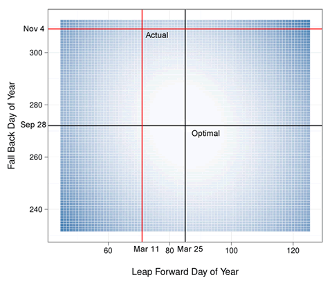
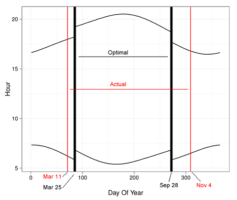
The result was surprising. The dates of daylight savings time do not come close to minimizing variance in sunrise. If they did, in 2012, DSL would have started on March 25th and ended on September 28th. In actuality, it started on March 11th and ended on November 4th. For NYC, daylight savings time starts too early and ends too late to minimize variance in sunrise. In the heatmap above, the higher the variance, the bluer the squares. The variance minimizing dates are shown in black, and the actual ones in red. The same color coding is used in the plot below, which also shows how the hours would shift if the variance minimizing dates were chosen (see last week’s post for how they actually change).

So what then is the logic behind DSL? We’re not quite sure. There are some leads in this article. We also learned that the US lengthened DSL in 2007 as it believes it that DSL saves energy, but it is not clear that it does.

If you want to play with this, the data are here: Sunrise and Sunset data for New York City in 2012. The source of the data is here.


library(ggplot2)
#data from http://aa.usno.navy.mil/data/docs/RS_OneYear.php
df=read.table("nyc_sunrise.txt",colClasses="character")
p1=df[,paste("V",seq(2,24,2),sep="")]
p2=df[,paste("V",seq(3,25,2),sep="")]
coll1=NULL
for(i in paste("V",seq(2,24,2),sep="")) {
coll1=c(coll1,p1[,i])
print(i)}
df1=data.frame(day=1:31,stime=coll1,sun="rise")
coll2=NULL
for(i in paste("V",seq(3,25,2),sep="")) {
coll2=c(coll2,p2[,i])
print(i)}
df2=data.frame(day=1:31,stime=coll2,sun="set")
df=rbind(df1,df2)
rm(p1,p2,coll1,coll2,df1,df2)
hour=as.numeric(substr(df$stime,1,2))
minute=as.numeric(substr(df$stime,3,4))/60
df$time=hour+minute
df=subset(df,!is.na(df$time))
df$day_of_year=1:(nrow(df)/2)
p=ggplot(data=subset(df,sun=="rise"),aes(x=day_of_year,y=time))
p=p+geom_line()
p=p+geom_line(data=subset(df,sun=="set"),aes(x=day_of_year,y=time))
p
zerovec=function(i,j){
c(rep(0,i-1),
rep(1,j-i+1),
rep(0,len-j))}
currvec=df[df$sun=="rise","time"]
len=length(currvec)
get_var=function(i,j) {
var(currvec +
zerovec(i,j))}
vget_var=Vectorize(get_var)
result=expand.grid(spring_forward=45:125,fall_back=232:312)
result=subset(result,spring_forward result$var=with(result,vget_var(spring_forward,fall_back))
resout=result[which.min(result$var),]
resout
#Heatmap
p =ggplot(data=result, aes(spring_forward, fall_back)) +
geom_tile(aes(fill = var), colour = "white") +
scale_fill_gradient(low = "white", high = "steelblue")
p=p+geom_vline(xintercept=as.numeric(resout[1]))+
geom_hline(yintercept=as.numeric(resout[2]))
p=p+geom_vline(xintercept=71,color="red")+
geom_hline(yintercept=309,color="red")
p=p+ylab("Fall Back Day of Year\n")+theme_bw()
p=p+xlab("\nLeap Forward Day of Year")+opts(legend.position="none")
p
ggsave("heatmap.pdf",p,width=6)
#For 2012, optimal spring forward day (85)is 03/25/2012
#For 2012, optimal fall back day (272) is 09/28/2012
#Actual DSL start was 3/11/2012 (71)
#Actual DSL end was 11/4/2012 (309)
p=ggplot(data=subset(df,sun=="rise"),
aes(x=day_of_year,y=time+zerovec(85,272)))
p=p+geom_line()
p=p+geom_line(data=subset(df,sun=="set"),
aes(x=day_of_year,y=time+zerovec(85,272)))
p=p+geom_vline(xintercept=85,lwd=2)+
geom_vline(xintercept=272,lwd=2)
p=p+geom_vline(xintercept=71,color="red")+
geom_vline(xintercept=309,color="red")
p=p+ylab("Hour")+theme_bw()
p=p+xlab("\nDay Of Year")+opts(legend.position="none")
p
ggsave("timeshift.pdf",p,width=6)

Figures created with Hadley Wickham's ggplot2

To leave a comment for the author, please follow the link and comment on his blog: Decision Science News » R.

R-bloggers.com offers daily e-mail updates about R news and tutorials on topics such as: visualization (ggplot2, Boxplots, maps, animation), programming (RStudio, Sweave, LaTeX, SQL, Eclipse, git, hadoop, Web Scraping) statistics (regression, PCA, time series,ecdf, trading) and more...

NHS Winter Situation Reports: Shiny Viewer v2

$
0
0

(This article was first published on OUseful.Info, the blog... » Rstats, and kindly contributed to R-bloggers)

Having got my NHS Winter sitrep data scraper into shape (I think!), and dabbled with a quick Shiny demo using the R/Shiny library, I thought I’d tidy it up a little over the weekend and long the way learn a few new presentation tricks.

To quickly recap the data availability, the NHS publish a weekly spreadsheet (with daily reports for Monday to Friday – weekend data is rolled over to the Monday) as an Excel workbook. The workbook contains several sheets, corresponding to different data collections. A weekly scheduled scraper on Scraperwiki grabs each spreadsheet and pulls the data into a rolling database: NHS Sitreps scraper/aggregator. This provides us with a more convenient longitudinal dataset if we want to look at sitrep measures for a period longer than a single week.

So here’s where I’ve got to now – NHS sitrep demo:

NHS sitrep2

The panel on the left controls user actions. The PCT (should be relabelled as “Trust”) drop down list is populated based on the selection of a Strategic Health Authority. The Report types follow the separate sheets in the Winter sitrep spreadsheet (though some of them include several reported measures, which is handled in the graphical display). The Download button allows you to download, as CSV data, the data for the selected report. By default, it downloads data at the SHA level (that is, data for each Trust in the selected SHA), although checkbox control allows you to limit the downloaded results to just data for the selected Trust:

NHS sitrep panel

Using just these controls, then, the user can select and download Winter sitrep data (to date), as a CSV file, for any selected Trust, or for all the Trusts in a given SHA. Here’s how the downloader was put together using Shiny:

So how does the Download work? Quite straightforwardly, as it turns out:

#This function marhsals the data for download
downloadData <- reactive(function() {
  ds=results.data()
  if (input$pctdownonly==TRUE) 
    ds=subset(ds,tid==input$rep & Code==input$tbl,select=c('Name','fromDateStr','toDateStr','tableName','facetB','value'))
  ds
})
  
output$downloadData <- downloadHandler(
  #Add a little bit of logic to name the download file appropriately
  filename = function() { if (input$pctdownonly==FALSE) paste(input$sha,'_',input$rep, '.csv', sep='') else paste(input$tbl,'_',input$rep, '.csv', sep='') },
  content = function(file) { write.csv(downloadData(), file, row.names=FALSE) }
)

Graphical reports are split into two panels: at the top, views over the report data for each Trust in the selected SHA; at the bottom, more focussed views over the currently selected Trust.

Working through the charts, the SHA level stacked bar char is intended to show summed metrics at the SHA level:

NHS sitrep - stacked bar

My thinking here was that it may be useful to look at bed availability across an SHA, for example. The learning I had to do for this view was in the layout of the legend:

#g is a ggplot object
g=g+theme( legend.position = 'bottom' )
g=g+scale_fill_discrete( guide = guide_legend(title = NULL,ncol=2) )

The facetted, multiplot view also uses independent y-axis scales for each plot (sometimes this makes sense, sometimes it doesn’t. Maybe I need to some logic to control when to use this and when not to?)

#The 'scales' parameter allows independent y-axis limits for each facet plot 
g=g+facet_wrap( ~tableName+facetB, scales = "free_y" )

The line chart shows the ame data in a more connected way:

NHS sitrep SHA line

To highlight the data trace for the currently selected Trust, I overplot that line with dots that show the value of each data point for that Trust. I’m not sure whether these should be coloured? Again, the y-axis scales are free.

The SHA Boxplot shows the distribution of values for each Trust in the SHA. I overplot the box for the selected Trust using a different colour.

NHS sitrep SHA boxplot

(I guess a “semantic depth of field“/blur approach might also be used to focus attention on the plot for the currently selected Trust?)

My original attempt at this graphic was distorted by very long text labels, that were also misaligned. To get round this, I generated a new label attribute that included line breaks:

#Wordwrapper via:
##http://stackoverflow.com/questions/2351744/insert-line-breaks-in-long-string-word-wrap
#Limit the length of each line to 15 chars
limiter=function(x) gsub('(.{1,15})(\\s|$)', '\\1\n', x)
d$sName=sapply(d$Name,limiter)
#We can then print axis tick labels using d$sName

We can offset the positioning of the label when it is printed:

#Tweak the positioning using vjust, rotate it and also modify label size
g=g+theme( axis.text.x=element_text(angle=-90,vjust = 0.5,size=5) )

The Trust Barchart and Linechart are quite straightforward. The Trust Daily Boxplot is a little more involved. The intention of the Daily plot is to try to identify whether or not there are distributional differences according to the day of the week. (Note that some of the data reports relate to summed values over the weekend, so these charts are likely to have comparatively high values on the weekend reporting Monday figure!)

NHS sitrep daily boxplot

I ‘borrowed’ a script for identifying days of the week… (I need to tweak the way these are ordered – the original author had a very particular application in mind.)

library('zoo')
library('plyr')
#http://margintale.blogspot.co.uk/2012/04/ggplot2-time-series-heatmaps.html
tmp$year<-as.numeric(as.POSIXlt(tmp$fdate)$year+1900)
# the month too 
tmp$month<-as.numeric(as.POSIXlt(tmp$fdate)$mon+1)
# but turn months into ordered facors to control the appearance/ordering in the presentation
tmp$monthf<-factor(tmp$month,levels=as.character(1:12), labels=c("Jan","Feb","Mar","Apr","May","Jun","Jul","Aug","Sep","Oct","Nov","Dec"),ordered=TRUE)
# the day of week is again easily found
tmp$weekday = as.POSIXlt(tmp$fdate)$wday
# again turn into factors to control appearance/abbreviation and ordering
# I use the reverse function rev here to order the week top down in the graph
# you can cut it out to reverse week order
tmp$weekdayf<-factor(tmp$weekday,levels=rev(0:6),labels=rev(c("Sun","Mon","Tue","Wed","Thu","Fri","Sat")),ordered=TRUE)
# the monthweek part is a bit trickier 
# first a factor which cuts the data into month chunks
tmp$yearmonth<-as.yearmon(tmp$fdate)
tmp$yearmonthf<-factor(tmp$yearmonth)
# then find the "week of year" for each day
tmp$week <- as.numeric(format(tmp$fdate,"%W"))
# and now for each monthblock we normalize the week to start at 1 
tmp<-ddply(tmp,.(yearmonthf),transform,monthweek=1+week-min(week))

The weekdayf value could then be used as the basis for plotting the results by day of week.

To add a little more information to the chart, I overplot the boxplot with actual data point, adding a small amount of jitter added to the x-component (the y-value is true).

g=g+geom_point(aes(x=weekdayf,y=val),position = position_jitter(w = 0.3, h = 0))

I guess it would be more meaningful if the data points were actually ordered by week/year. (Indeed, what I originally intended to do was a seasonal subseries style plot at the day level, to see whether there were any trends within a day of week over time, as well as pull out differences at the level of day of week.)

Finally, the Trust datatable shows the actual data values for the selected report and Trust:

NHS sitrep Trust datatable

(Remember, this data, or data for this report for each trusts in the selected SHA, can also be downloaded directly as a CSV file.)

The thing I had to learn here was how to disable the printing of the dataframe row names in the SHiny context:

output$view = reactiveTable(function() {
    #...get the data and return it for printing
    }, include.rownames=FALSE)

As a learning exercise, this app got me thinking about solving several presentational problems, as well as trying to consider what reports might be informative or pattern revealing (for example, the Daily boxplots).
The biggest problem, of course, is coming up with views that are meaningful and useful to end-users, the sorts of questions they may want to ask of the data, and the sorts of things they may want to pull from it. I have no idea who the users, if any, of the Winter sit rep data as published on the NHS website might be, or how they make use of the data, either in mechanistic terms – what do they actually do with the spreadsheets – or at the informational level – what stories they look for in the data/pull out out of it, and what they then use that information for.

This tension is manifest around a lot of public data releases, I think – hacks’n'hackers look for why shiny(?!) things they can do with the data, though often out of any sort of context other than demonstrating technical prowess or quick technical hacks. Users of the data may possibly struggle with doing anything other than opening the spreadsheet in Excel and then copying and pasting it into other spreadsheets, although they might know exactly what they want to get out of the data as presented to them. Some users may be frustrated at a technical level in the sense of knowing what they’d like to be able to get from the data (for example, getting monthly timeseries from weekly timeseries spreadsheets) but may not be able to do it easily for lack of technical skills. Some users may not know what can be readily achieved with the way data is organised, aggregated and mixed with other datasets, and what this data manipulation then affords in its potential for revealing stories, trends, structures and patterns in the data, and here we have a problem with even knowing what value might become unlockable (“Oh, I didn’t know you coud do that with it…”). This is one reason why hackdays – such as the NHS Hackday and various govcamps – can be so very useful (I’m also reminded of MashLib/Mashed Library events where library folk and techie shambrarians come together to learn from each other). What I think I’d like to see more of, though, is people with real/authentic questions that might be asked of data, or real answers they’d like to be able to find from data, starting to air them as puzzles that the data junkies, technicians, wranglers and mechanics amongst us can start to play with from a technical side.

PS this could be handy… downloading PDF docs from Shiny.

PPS Radio 4′s Today programme today had a package on NHS release of surgeon success data. In an early interview with someone from the NHS, the interviewee made the point that the release of the data was there for quality/improvement purposes and to help identify opportunities for supporting best practice (eg along the lines of previous releases of heart surgery performance data. The 8am, after 8 interview, and 8.30am news bulletins all pushed the faux and misleading line of how this data could be used for “parent choice”, (I complained bitterly – twice- via Twitter;-) though the raising standards line was taken in the 9am bulletin. There’s real confusion, I think, about how all this data stuff might, could and should be used (I’m thoroughly confused by it myself), and I’m not sure the press are always very helpful in communicating it…


To leave a comment for the author, please follow the link and comment on his blog: OUseful.Info, the blog... » Rstats.

R-bloggers.com offers daily e-mail updates about R news and tutorials on topics such as: visualization (ggplot2, Boxplots, maps, animation), programming (RStudio, Sweave, LaTeX, SQL, Eclipse, git, hadoop, Web Scraping) statistics (regression, PCA, time series,ecdf, trading) and more...

100 most read R posts in 2012 (stats from R-bloggers) – big data, visualization, data manipulation, and other languages

$
0
0

(This article was first published on R-statistics blog » R, and kindly contributed to R-bloggers)

R-bloggers.com is now three years young. The site is an (unofficial) online journal of the R statistical programming environment, written by bloggers who agreed to contribute their R articles to the site.

Last year, I posted on the top 24 R posts of 2011. In this post I wish to celebrate R-bloggers’ third birthmounth by sharing with you:

  1. Links to the top 100 most read R posts of 2012
  2. Statistics on “how well” R-bloggers did this year
  3. My wishlist for the R community for 2013 (blogging about R, guest posts, and sponsors)

1. Top 100 R posts of 2012

R-bloggers’ success is thanks to the content submitted by the over 400 R bloggers who have joined r-bloggers.  The R community currently has around 245 active R bloggers (links to the blogs are clearly visible in the right navigation bar on the R-bloggers homepage).  In the past year, these bloggers wrote around 3200 posts about R!

Here is a list of the top visited posts on the site in 2012 (you can see the number of page views in parentheses):

  1. Select operations on R data frames (42,742)
  2. Julia, I Love You (22,405)
  3. R at 12,000 Cores (22,584)
  4. An R programmer looks at Julia (17,172)
  5. Adding a legend to a plot (16,413)
  6. Solving easy problems the hard way (13,201)
  7. The Best Statistical Programming Language is …Javascript? (11,047)
  8. Step up your R capabilities with new tools for increased productivity (9,758)
  9. How I cracked Troyis (the online flash game) (9,527)
  10. Setting graph margins in R using the par() function and lots of cow milk (9,549)
  11. Creating surface plots (8,705)
  12. Running R on an iPhone/iPad with RStudio (8,903)
  13. Drawing heatmaps in R (8,719)
  14. A big list of the things R can do (8,152)
  15. Two sample Student’s t-test #1 (8,112)
  16. Paired Student’s t-test (7,950)
  17. Installing R packages (7,999)
  18. Multiple Y-axis in a R plot (7,486)
  19. R Tutorial Series: Labeling Data Points on a Plot (7,375)
  20. Color Palettes in R (6,656)
  21. Plot maps like a boss (6,898)
  22. Model Validation: Interpreting Residual Plots (6,763)
  23. find | xargs … Like a Boss (7,001)
  24. Getting Started with Sweave: R, LaTeX, Eclipse, StatET, & TeXlipse (6,775)
  25. R Tutorial Series: R Beginner’s Guide and R Bloggers Updates (6,703)
  26. The R apply function – a tutorial with examples (6,764)
  27. Delete rows from R data frame (6,243)
  28. Polynomial regression techniques (6,396)
  29. Why R is Hard to Learn (6,281)
  30. Basic Introduction to ggplot2 (6,107)
  31. Trading using Garch Volatility Forecast (5,886)
  32. Will 2015 be the Beginning of the End for SAS and SPSS? (5,924)
  33. Fun with the googleVis Package for R (5,495)
  34. Creating beautiful maps with R (5,576)
  35. Tutorial: Principal Components Analysis (PCA) in R (4,907)
  36. Wilcoxon-Mann-Whitney rank sum test (or test U) (5,574)
  37. Introducing Shiny: Easy web applications in R (5,501)
  38. R is the easiest language to speak badly (5,583)
  39. R 2.15.0 is released (5,486)
  40. Basics on Markov Chain (for parents) (5,395)
  41. Pivot tables in R (5,320)
  42. Displaying data using level plots (4,942)
  43. R Tutorial Series: Basic Polynomial Regression (5,165)
  44. Merging Multiple Data Files into One Data Frame (5,083)
  45. Quick Introduction to ggplot2 (5,060)
  46. Summarising data using box and whisker plots (4,953)
  47. Make R speak SQL with sqldf (4,745)
  48. MySQL and R (4,595)
  49. ggheat : a ggplot2 style heatmap function (4,578)
  50. Aggregate Function in R: Making your life easier, one mean at a time (4,756)
  51. The role of Statistics in the Higgs Boson discovery (4,560)
  52. Plotting Time Series data using ggplot2 (4,543)
  53. The Kalman Filter For Financial Time Series (4,367)
  54. R 101: The Subset Function (4,626)
  55. Create your own Beamer template (4,569)
  56. Mining Facebook Data: Most “Liked” Status and Friendship Network (4,493)
  57. The Many Uses of Q-Q Plots (4,376)
  58. Social Network Analysis with R (4,307)
  59. 20 free R tutorials (and one reference card) (4,227)
  60. To attach() or not attach(): that is the question (4,439)
  61. add your blog! | R-bloggers (3,941)
  62. Learn R and Python, and Have Fun Doing It (4,205)
  63. Creating a Presentation with LaTeX Beamer – Using Overlays (4,319)
  64. Summarising data using dot plots (4,078)
  65. Google summer of code 2012 – and R – a call for students (4,180)
  66. nice ggplot intro tutorial. Just run the commands, about 6 pages… (3,902)
  67. Tracking Hurricane Sandy with Open Data and R (4,108)
  68. Time Series Analysis and Mining with R (3,874)
  69. Linear mixed models in R (3,846)
  70. A graphical overview of your MySQL database (3,919)
  71. Updating R but keeping your installed packages (3,317)
  72. Data.table rocks! Data manipulation the fast way in R (3,691)
  73. Generating graphs of retweets and @-messages on Twitter using R and Gephi (3,623)
  74. Amateur Mapmaking: Getting Started With Shapefiles (3,656)
  75. Datasets to Practice Your Data Mining (3,782)
  76. How to customize ggplot2 graphics (3,720)
  77. Interactive HTML presentation with R, googleVis, knitr, pandoc and slidy (3,599)
  78. The undiscovered country – a tutorial on plotting maps in R (3,560)
  79. polar histogram: pretty and useful (3,487)
  80. Classification Trees (3,545)
  81. Text Mining to Word Cloud App with R (3,388)
  82. Top 20 R posts of 2011 (and some R-bloggers statistics) (3,606)
  83. Combining ggplot Images (3,492)
  84. Integrating PHP and R (3,420)
  85. Tutorials for Learning Visualization in R (3,509)
  86. RStudio in the cloud, for dummies (3,402)
  87. London Olympics 100m men’s sprint results (3,460)
  88. Online resources for handling big data and parallel computing in R (3,383)
  89. The Higgs boson: 5-sigma and the concept of p-values (3,339)
  90. Interactive reports in R with knitr and RStudio (3,296)
  91. Maps with R (I) (3,283)
  92. ggplot2 Time Series Heatmaps (3,262)
  93. Simple Text Mining with R (3,174)
  94. Contingency Tables – Fisher’s Exact Test (3,250)
  95. An example of ROC curves plotting with ROCR (3,202)
  96. Great Maps with ggplot2 (3,155)
  97. Style your R charts like the Economist, Tableau … or XKCD (3,218)
  98. Simple Linear Regression (3,212)
  99. A practical introduction to garch modeling (3,158)
  100. Adding lines or points to an existing barplot (3,057)


2. Statistics – how well did R-bloggers do in 2012?

Short answer: quite well.

In 2012, R-bloggers has reached around 11,000 regular subscribers (which you can also subscribe to: via RSS, or e-mail), serving the content of about 245 R bloggers.  In total, the site was visited around 2.7 million times, by over 1.1 million people.  Bellow you can see a few figures comparing the statistics of 2012 with those of 2011 (just click the image to enlarge it):

rbloggers_stats_2012_1

 rbloggers_stats_2012_2

rbloggers_stats_2012_3

3. My wishlist for 2013 – about the future of the R blogosphere

Well now, this has been an AMAZING year for the R-project in general, the R community, and consequently also for R-bloggers.  Here are a few things I wish for 2013:

Reproducible R blogging – make it to blog from R to WordPress and blogger (via knitr, RStudio, etc.)

The past year has been wonderful regarding progress in making reproducible research with R using Sweave, knitr, RStudio, and many new R packages.  For 2013 I wish someone (or some-company, RStudio, cough cough) would take on themselves to make it as easy as possible to do Reproducible R blogging.  The seeds are already there, thanks to people like JJ Allaire, Jeffrey Horner, Vicent Marti, and Natacha Porte we now have the markdown package, which combined with Yihui Xie knitr package and the wonderful RStudio (R IDE), allows us all to easily create HTML documents of R analysis.  Combine this with something like one of Duncan Temple Lang’s R packages (XMLRPC, RWordPress) and one can imagine the future.

The next step will be to have a “publish to your WordPress/blogger” button right from the RStudio console – allowing for the smoothest R blogging experience one could dream of.

I hope we’ll see this as early as possible in 2013.

Creating online interactive visualization using R

There can never be enough of this really.

So far, I should give props to Markus Gesmann, Diego de Castillo for authoring and maintaining the awesome googleVis R package.  This package is great for online publishing of interesting results.  For example, see the site StatIL.org – visualizing over 25,000 Time series of Israel’s statistics using html files produced (also) with the googleVis package (example: population of Israel between 1950 to 2011).

The second promising project is Shiny, which Shiny makes it incredibly easy to build interactive web applications with R. Since they intend to release an open source server of Shiny, which can run on Apache, we can expect very interesting developments on that front this year.

More guest posts on R-bloggers

If you have valuable knowledge and insights to share with the R community, the best way I suggest is to start your own free blog on WordPress.com.  Create a dedicated R category for your R posts, and ask to join r-bloggers (make sure to read and follow the guidelines mentioned there).

This year I am considering allowing non-bloggers to also take part in the party.  The idea is to create a simple form which will allow you to write a guest article which (after review) will go live on r-bloggers (without the need to first start your own blog).  If you are interested to submit such a guest article in the future (even if you are not sure exactly what you will write about), please fill out this form with your e-mail.  IF I see people are interested, I will go ahead and create this service.

Your help in sharing/linking-to R-bloggers.com

Sharing: If you don’t alreayd know, R-bloggers is not a company.  The site is run by just one guy (Tal Galili).  There is no marketing team, marketing budget, or any campaign.  The only people who know about the site are your and the people YOU will send the link to (through facebook, your personal website, blog, etc.).  So if you haven’t already – please help share r-bloggers.com in whatever way you can online.

Subscribe to R-bloggers.com

You can also subscribe to daily updates of new R posts via RSS, or by filling in your e-mail address (I don’t give it to strangers, I promise).  You can also join the R-bloggers facebook page, but make sure (once liked) to press the “like” button and mark V by “get notifications” and “show in news feed” (see in the image bellow)


rbloggers_stats_2012_4

Sponsoring

If you are interested in sponsoring/placing-ads/supporting R-bloggers, then you are welcome to contact me.  Currently there is not much place left, but you can still contact me and I will update you once an ad placement is freed up.

Stay in touch :)

As always, you are welcome to leave a comment on this blog, and/or contact me (keeping in mind it might take me some time to get back to you, but I promise I will).


Happy new year!
Yours truly,
Tal Galili

To leave a comment for the author, please follow the link and comment on his blog: R-statistics blog » R.

R-bloggers.com offers daily e-mail updates about R news and tutorials on topics such as: visualization (ggplot2, Boxplots, maps, animation), programming (RStudio, Sweave, LaTeX, SQL, Eclipse, git, hadoop, Web Scraping) statistics (regression, PCA, time series,ecdf, trading) and more...

Who Survived on the Titanic? Predictive Classification with Parametric and Non-parametric Models

$
0
0

(This article was first published on Political Methodology » R-Bloggers, and kindly contributed to R-bloggers)

I recently read a really interesting blog post about trying to predict who survived on the Titanic with standard GLM models and two forms of non-parametric classification tree (CART) methodology. The post was featured on R-bloggers, and I think it's worth a closer look.

The basic idea was to figure out which of these three model types did a better job of predicting which passengers would survive on the Titanic based on their personal characteristics; these included characteristics like sex, age, the class of the ticket (first, second, or third). For each model, the blogger estimated the model on half the sample (the “training data”) and then predicted the probability of survival for the other half of the sample (the “test data”). Any passenger predicted to have a >50% probability of survival was classified as being predicted to survive. The blogger then determined what proportion of predicted survivors actually survived.

The result, copied from the original blog post:

I think this is a flawed way to assess the predictive power of the model. If a passenger is predicted to have a 50% probability of survival, we should expect this passenger to die half the time (in repeated samples); classifying the person as a “survivor,” a person with a 100% probability of survival, misinterprets the model's prediction. For example, suppose (counterfactually) that a model classified half of a test data set of 200 passengers as having a 10% chance of survival and the other half as having a 60% chance of survival. The 50% threshold binary classification procedure expects there to be 100 survivors, and for all of the survivors to be in the portion of the sample with >50% predicted probability of survival. But it's more realistic to assume that there would be 10 survivors in the 10% group, and 60 survivors in the 60% group, for a total of 70 survivors. Even if the model's predictions were totally accurate, the binary classification method of assessment could easily make its predictions look terrible.

Andrew Pierce and I just published a paper in Political Analysis making this argument. In that paper, we propose assessing a model's predictive accuracy by constructing a plot with the predicted probability of survival on the x-axis, and the empirical proportion of survivors with that predicted probability on the y-axis. The empirical proportion is computed by running a lowess regression of the model's predicted probability against the binary (1/0) survival variable, using the AIC to choose the optimal bandwidth, and then extracting the lowess prediction from the model. We created an R package to perform this process automatically (and to implement a bootstrapping approach to assessing uncertainty in the plot), but this package is designed for the assessment of in-sample fit only. So, I have to construct them manually for this example. The code for everything I've done is here.

Here's the plot for the GLM model:

As you can see, the logit model actually does a very good job of predicting the probability of passenger survival in the test data. It slightly underpredicts the probability of death for passengers who are unlikely to die, and slightly overpredicts the probability of death for the other passengers. But the predicted probabilities for near-certain (Pr(survive) near 0) and nearly impossible (Pr(survive) near 1) deaths, which are most of the data set, are quite accurately predicted.

The random forest model does a perfectly reasonable job of predicting outcomes, but not markedly better:

The pattern of over- and under-predictions is very similar to that of the GLM model. In fact, if you plot the logit predictions against the random forest predictions…

You can see that there are comparatively few cases that are classified much differently between the two models. The primary systematic difference seems to be that the random forest model takes cases that the logit predicts to have a low but positive probability of survival, and reclassifies them as zero probability of survival. I put in the dark vertical and horizontal lines to show which data points the binary classification procedure would deem “survivors” for each model; there are a few observations that are categorized differently by the two models (in the upper left and lower right quadrants of the plot), but most are categorized the same.

Finally, the conditional inference tree model does classify things quite differently, but not in a way that substantially improves the performance of the model:

I've jittered the CTREE predictions a bit so that you can see the data density. The tree essentially creates five categories of predictions, but doesn't appreciably improve the predictive performance inside of those categories above the logit model.

Comparing the GLM logit predictions to the ctree predictions…

…you see the categorizations more clearly. Of course, you can just look at the CART plot to see how these categories are created:


I have to admit, that is a pretty sweet plot.

In conclusion, comparatively ancient GLM methods do surprisingly well on this problem when compared to the CART methods. If anything, the CART methods apparently suppress a decent amount of heterogeneity in probability forecasts that the GLM models uncover. But all of the models have the same basic strengths and weaknesses, in terms of predictive accuracy. And if the heterogeneity of the GLM predictions reflects signal and not noise–and my plots seem to suggest that it is signal–the GLM predictions might well be better for forecasting survival in individual cases.

Maybe some day, I will get around to creating a version of my R package that does out-of-sample forecasts! That way, I could get assessments of the uncertainty around the plot as well.


To leave a comment for the author, please follow the link and comment on his blog: Political Methodology » R-Bloggers.

R-bloggers.com offers daily e-mail updates about R news and tutorials on topics such as: visualization (ggplot2, Boxplots, maps, animation), programming (RStudio, Sweave, LaTeX, SQL, Eclipse, git, hadoop, Web Scraping) statistics (regression, PCA, time series,ecdf, trading) and more...

Working with geographical Data. Part 1: Simple National Infomaps

$
0
0

(This article was first published on My Data Atelier » R, and kindly contributed to R-bloggers)

worldatnight

There is a popular expression in my country called “Gastar polvora en chimangos”, whose translation in English would be “spending gunpowder in chimangos”. Chimango is a kind of bird whose meat is useless for humans. So “spending gunpowder in chimangos” stands for spending a lot of money, time, effort, etc. in something not worth of it. This is of course an undesirable thing in any aspect of our lives, but I think it is crucial in the case of work: when a task that should be easy takes more effort than expected, we begin to have a “snowball effect” where the rest of the tasks get delayed as well. This redunds, as we all know, in staying up late and stressed to finish the tasks we planned for an 8-hour journey.

As you can see by googling, there are millions of packages, methods, contents, strategies, etc to work with geographical Data in R. In this series of post, I will present some of them, directly taken from my own experience. I will try to follow an increasing difficulty order. Of course, the more complex methods are more flexible and provide more alternatives.

In this case, we will keep it really simple and draw an infomap of a part of South America. Infomaps are very useful as they are widely spread and clear way of interpreting Data related to geographical zones. Infomaps have a double advantage: They are very clear to understand, but, as it is not feasible to do it easily in Excel, it is always impactful if you include one in a presentation.

Below you will find the R Code for a really simple approach. I hope you like it. Any comments, corrections or critics please write!!


library(‘maps’)
library(‘mapdata’)
library (‘RColorBrewer’)

DB <- as.matrix(c(‘Argentina’, ‘Brazil’, ‘Chile’, ‘Uruguay’, ‘Paraguay’, ‘Bolivia’, ‘Peru’))

#add population-density Data

DB <- cbind (DB, c(15,23,22,19,17,10,24))

#create a gradual palette of Reds. Function belongs to RColorBrewer

gama <- brewer.pal(6,”Reds”)
countries <- as.character(DB[,1])

# with the cut function you can assign numeric values to a certain interval defined by the user (in this case 0,5,10,15,20,max(DB))

DB <- cbind(DB, cut (as.numeric(DB[,2]),c(0,5,10,15,20,max(DB)),labels = FALSE, right = TRUE))

#With the ordinal values assigned to each country, we now create a character array with the colour code corresponding to each of them, based upon the palette we have created

col <- character()

for (i in 1:nrow(DB))
{
col <- append(col,gama[as.numeric(DB[i,3])])
}

#We draw the map. Please note that the arrays countries and col need to be maintained in the same order. If not, the colour assigned to each country will be wrong. So, be careful if you need to sort the values of any array before plotting.

map(‘worldHires’,countries,fill=TRUE,col=col,plot=TRUE, cex = 15, exact=TRUE)
legend(“bottomright”, c(“up to 15″, “16 – 17″, “18 – 19″, “20-21″, “22-23″, “more than 23″),border=gama, fill = gama, cex = 1.3, box.col = “white”)

#Although RStudio (I do not know of other interfaces) provides an interface option to import a plot to a file, if you have to export the map, I would advise doing it per CLI, as the sizes and proportions are much easier to handle. In this case, it would be as follows:

png(file= (your Path),width = (width in pixels), height = (height in pixels), res = 120)
map(‘worldHires’,countries,fill=TRUE,col=col,plot=TRUE, cex = 15, exact=TRUE)
legend(“bottomright”, c(“up to 15″, “16 – 17″, “18 – 19″, “20-21″, “22-23″, “more than 23″),border=gama, fill = gama, cex = (the size you want for the box), box.col = “white”)
dev.off()

This is the final result

map4blog


To leave a comment for the author, please follow the link and comment on his blog: My Data Atelier » R.

R-bloggers.com offers daily e-mail updates about R news and tutorials on topics such as: visualization (ggplot2, Boxplots, maps, animation), programming (RStudio, Sweave, LaTeX, SQL, Eclipse, git, hadoop, Web Scraping) statistics (regression, PCA, time series,ecdf, trading) and more...

from OTU table to HEATMAP!

$
0
0

(This article was first published on Learning Omics » R, and kindly contributed to R-bloggers)

In this tutorial you will learn:

  • what is a heatmap
  • how to create a clean, highly customizable heatmap using heatmap.2 in the gplots package in R
  • how to remove samples with poor output (not very many sequences)
  • how to rearrange your samples by a metadata category
  • how to make a color coded bar above the heatmap for the metadata category

You will not learn:

  • how to create an OTU table
  • how to choose a good color palette for your color coded bar
  • why heatmaps are called heatmaps

What you will need:

  1. metadata table
  2. OTU table
  3. and in case it wasn’t obvious, R

Introduction

So figuring out a code from OTU table to heatmap has been my dream since we saw a cool looking heatmap in one of Dr. Lamendella’s presentations on the human gut microbiome (from the most awesome gut microbiome paper ever of 2012). It is a neat way to display a matrix of information in a color coded grid and is not in any way related to Fahrenheit or Celsius. One of the most common applications of heatmaps are for displaying results of gene expression levels in DNA microarrays.

Photo from Wikipedia: Heatmap of a DNA microarray-Unfortunately for people with red-green color-blindness, these two colors are the most commonly used for creation of heatmaps.

In our case, the heatmap will function particularly well in displaying  information about OTU abundances at various taxonomical levels. Heatmaps would also serve really well when people in the lab start theoretically getting metaproteomic data. To see more examples of heatmaps used in seminal research, look at the supplementary figures of the coolest paper of 2012. This is a particularly long tutorial that has codes adapted from several sources. I will try my best to explain each step but some of the steps in certain functions are still a bit foggy and others would require unnecessary and long explanations. My original bare basic tutorial on heatmaps can be found here and it was mainly based upon this tutorial done by Nathan Yu. If you are keen on just making a quick heatmap, I suggest looking at those two links first.

Prepping the Files

You know how it goes, you need to make things in the right format before you can make the magic happen.

  1. Metadata File-Your sample names should listed down the first column and variables describing your samples are in the top row. You can have  as many columns/variables as you like.
  2. OTU Table-Contrary to the metadata file, your sample names should be on the top row whereas the OTU IDs should be down the first column. When you scroll all the way to the right on your file there should be a column with the taxonomical information in each row such as
    • “k__Bacteria; p__Firmicutes; c__Clostridia; o__Clostridiales; f__Lachnospiraceae; g__Coprococcus; s__Coprococcus eutactus” or
    • “Root;Bacteria;Firmicutes;”"Clostridia”";Clostridiales;”"Lachnospiraceae”";”"Lachnospiraceae Incertae Sedis”
    •  Unlike the columns which have a title (the sample name), this one is probably blank. Type in “taxonomy”. All lowercase and no extra frills.
  3. Make sure the ID numbers/names for samples MATCH between your metadata file and OTU file.
    • In reality, it will probably make things easier for you if your samples are something like “Site2Samp3Vers1″ rather than just “231″. This is one of those critical steps that absolutely must be done or else R won’t be able to match up the OTU data of each sample with the metadata of each respective sample. When creating your sample names, the concatenation will probably help you out as explained here.
  4. Make sure both are saved as .csv (Comma-Separated Values)  rather than .xls or .xlsx rather than Excel.
    • This compacts the file and makes the importation process into R easier.

Hopefully this didn’t take you too long! Now the fun begins.

Importing the files into R

OPTIONAL: I tend to have stuff saved accidentally in my R sessions that I no longer need, so my first step of every large script is removing anything that is currently in the work session.

ls()
rm(list=ls())
ls()

OPTIONAL: I also usually change my working directory at the beginning. This makes writing pathways (or the directions for R to find files) much easier and leaves less of a chance for things to get messed up. Write in the pathway for the folder where your metadata and OTU tables are located. The one written below follows the pathway conventions of Windows PC (for Mac view http://youtu.be/8xT3hmJQskU).

getwd() 
setwd("c:/your_folder/project_1") 
getwd()

OPTIONAL: The second getwd() call should repeat whatever working directory you just specified. To double check that your files are in the pathway you just specified:

dir()

Now we actually import the files into R. Change the names to whatever you named your file.

dat1 <- read.csv("OTU.csv", header=TRUE,row.names=1, sep=",") 
meta <- read.csv("metadata.csv", header=TRUE,row.names=1, sep=",")

Also take the time to make a folder called “output” in your working directory folder. We will be writing lots of scripts that spit out tables here and there, so it is nice to separate them out. What are you looking for? Just do it manually (you know, right click, create new folder, etc.); it’s easier.

OTU Table “Manipulation” or Cleaning

As you already know, data usually don’t arrive in the ready to analyze format. From missing values to messed up samples, now we take the time to clean our data (since the phrase “data manipulation” is not PC at all). In this process, we will split the OTU table into two segments/objects. The first object (taxa.names) will contain just the taxonomical information and the second object is a matrix(dat2) that will contain the rest of the table.

taxa.names <- dat$taxonomy 
dat2 <- as.matrix(dat[,-dim(dat)[2]])

Optional: Dropping Samples with Low Observations

This section is adapted from Dr. Schaefer’s tutorial “Analyses of Diversity, Diversity and Similar Indices” class notes. The whole class syllabus is rather fascinating and proves a lot of R equivalents of processes (Unifrac analysis, nMDS, Indicator Species analysis, etc.) that we would normally do in QIIME or PC-ORD.

Although the subtitle says optional, it’s probably a good idea to to drop samples with low observations. There is a very low probability your sample only has 10 or even just 100 microbes in it.

First, create an object that contains number of observances for each sample (sums each column).

s_abundances<-apply(dat2,2,sum)

Next, split the OTU table into two matrices: one with low abundances and one with high abundances. Currently the threshold is set at 1000 but you can change the number in both lines.

bads<-dat2[,s_abundances<1000]
goods<-dat2[,s_abundances>1000]

To see how many poor samples will be removed from the OTU table:

ncol(dat2)-ncol(goods)
ncol(bads)

Now replace the old OTU table with the new one that just contains good markers.

dat2<-goods

Run these if you would like output of the good and bad markers.

write.table(badm, file="output/bads.csv", col.names=NA,row.names=TRUE, sep=",", quote=FALSE)
write.table(goodm, file="output/goods.csv", col.names=NA,row.names=TRUE, sep=",", quote=FALSE)

.

The next parts on changing to relative abundance and extraction by different taxonomic levels are based on a powerpoint in the lab module “Introduction to Metagenomic Data Analysis” by Alexander V. Alekseyenko and Susan P. Holmes (as part of the Summer Institute in Statistics and Modeling of Infectious Diseases).

Recommended: Change to Relative Abundance

Right now, observances of each OTU are probably being reported as absolute abundances. Each OTU observance is the original number generated by OTU picking and the like in QIIME. Sometimes there are specific reasons why you might want to leave the abundances as absolute abundances but the majority of the time, you will probably need to make samples comparable to each other. This requires standardization: the absolute number of observances for an OTU becomes a fraction of the total observances in that sample.

dat2 <- scale(dat2, center=F, scale=colSums(dat2))

Next, transpose the OTU table so that the row names are now Sample Names rather than OTU ID numbers.

dat2 <-t(dat2)

Data extraction by different taxonomic levels

It is much easier analyze microbial ecology data at the phylum or class level rather than each species level. However, currently the taxonomical identification data are compiled in one large undigestible lump for each OTU. To start digesting it, we need to change the format of the object that contains the taxa names.

a <- as.character(taxa.names)

This next set of code involves two functions that were included in that lab module by Alekseyenko and Holmes. These functions can split up the data at each taxonomic level so you can analyze just the different present phylums or orders. First you need to input the custom functions so that R knows how to run them. (Make sure to copy all the curly end brackets! ”}“)

extract.name.level = function(x, level){
 a=c(unlist(strsplit(x,';')),'Other')
 paste(a[1:min(level,length(a))],collapse=';')
}
otu2taxonomy = function(x, level, taxa=NULL){
 if(is.null(taxa)){
 taxa = colnames(x)
 }
 if(length(taxa)!=dim(x)[2]){
 print("ERROR: taxonomy should have the same length as the number of columns in OTU table")
 return;
 }
 level.names = sapply(as.character(taxa), 
 function(x)
 extract.name.level(x,level=level))
 t(apply(x, 1, 
 function(y) 
 tapply(y,level.names,sum)))
}

Next, take a closer look at the way taxonomical designations are written in your OTU table. Are there six or seven levels?  If it looks like

  • “Root;Bacteria;Firmicutes;”"Clostridia”";Clostridiales;”"Lachnospiraceae”";”"Lachnospiraceae Incertae Sedis”
  • “k__Bacteria; p__Firmicutes; c__Clostridia; o__Clostridiales; f__Lachnospiraceae; g__Coprococcus; s__Coprococcus eutactus”

there are seven levels designated by the Root/Kingdom, Phylum, Class, Order, Family, Genus and Specie. You will need to start numbering the levels at level 2 rather than 1 in the extraction functions. However, if the beginning of your taxonomical designations are phyla then start numbering at level 1; or if phyla are not listed until the third spot in the taxonomical designations, start numbering the levels at 3.

d.phylum = otu2taxonomy(dat4,level=2,taxa=taxa.names)
d.class = otu2taxonomy(dat4,level=3,taxa=taxa.names)
d.order = otu2taxonomy(dat4,level=4,taxa=taxa.names)
d.family = otu2taxonomy(dat4,level=5,taxa=taxa.names)
d.genus = otu2taxonomy(dat4,level=6,taxa=taxa.names)
d.species = otu2taxonomy(dat4,level=7,taxa=taxa.names)

To look at the output, transpose and export.

phylum2 <-t(d.phylum)
class2 <-t(d.class)
order2 <-t(d.order)
family2 <-t(d.family)
genus2 <-t(d.genus)
species2 <-t(d.species)
write.table(phylum2, file="output/phyla.csv", col.names=NA,row.names=TRUE, sep=",", quote=FALSE) 
write.table(class2, file="output/classes.csv", col.names=NA,row.names=TRUE, sep=",", quote=FALSE)
write.table(order2, file="output/orders.csv", col.names=NA,row.names=TRUE, sep=",", quote=FALSE)
write.table(family2, file="output/families.csv", col.names=NA,row.names=TRUE, sep=",", quote=FALSE)
write.table(genus2, file="output/genera.csv", col.names=NA,row.names=TRUE, sep=",", quote=FALSE)
write.table(species2, file="output/species.csv", col.names=NA,row.names=TRUE, sep=",", quote=FALSE)

These steps allow you to analyze your OTU data at various taxonomical levels within and outside of R.

Merging metadata and OTU tables

Next we will merge the metadata and OTU table together. Originally, I tried to figure out a way to avoid this step but R was not being so cooperative with reordering. We are merging the two tables so that when we rearrange the samples according to a metadata variable, the OTU table rearranges as well.

First choose which taxonomical level you want to look at. For simplicity’s sake, let’s look at phyla first. This first script merges the two tables by matching up the Sample ID/Names. The “all.x=FALSE” portion makes sure that metadata information is not included for samples that were dropped earlier from the data processing (if you skipped that step, this should not affect the output).

mergephylum<-merge(meta, d.phylum, by="row.names",all.x=FALSE)

There are multiple ways to double check the merge worked. The easiest is just by looking at the dimensions of each object involved.

dim(meta)
dim(d.phylum)
dim(mergephylum)ncol

The first number reflects the number of rows while the second refers to the amount of columns. The number of rows of the final merge should match the number of rows in the phyla file (or whichever level you are looking at).  The number of columns of the final merge should be the sum of the columns in d.phylum and meta +1. Again, here is the code for output.

write.table(mergephylum, file="output/mergephylum.csv", col.names=NA,row.names=TRUE, sep=",", quote=FALSE)

Reordering by metadata variable

If you would like your heatmap in order by sample or order does not matter, skip to the next step (making the actual matrix for the heatmap).

You can reorder your samples based on a variable in your metadata. This can be anything from diet type to sample site. The variable that will direct the way your table will be reordered is not limited to just being discrete (as in group A, group B, etc.); the variable can also be continuous (blood pressure, height, pH).

For this rearrangement code, you will need the exact name of the column of the variable. Since names might have changed since importation into R, it’s best to double check. This lists the names of all the columns of your metadata.

colnames(meta)

Now use the name of the variable in question and replace “VARIABLE” in the following code.

reordermerge <- mergephylum[order(mergephylum$VARIABLE, mergephylum$Row.names),]

This will cause the table to be rearranged by increasing value of the VARIABLE (or alphabetical order) and then by the Row.names or Sample ID/Names.

Making the actual matrix for the heatmap

This next set of  script splits OTU table and metadata again so that the heatmap will only display OTU data rather than metadata as well. It involves removing columns, renaming the rows and changing the format of the object to a matrix.

(OTUcol1<-ncol(meta)+2)
(OTUcol2<-ncol(reordermerge))
justOTU<-reordermerge[,OTUcol1:OTUcol2]
justOTU[1:5,1:5]
rownames(justOTU[1:10,])
rownames(justOTU)<-reordermerge$Row.names
rownames(justOTU[1:10,])
justOTU2<-as.matrix(t(justOTU))
justOTU2[1:5,1:5]

Heatmap!!!

Hurray! After all those steps we are finally to the steps of making the actual heatmap.

First install the package that contains the codes to make the heatmap. (Refresh your memory on packages here.)

install.packages("gplots")
library(gplots)

Now print out your heatmap!

heatmap.2(justOTU2,Rowv=TRUE, Colv=FALSE, scale="column", trace="none", col=redgreen, xlab="sample", ylab="phylum", margins=c(10,15))

If you are happy with this image, skip to “Export the Heatmap.

This tutorial will be covering some of the arguments within this function for customization. In case you want to know about all the possibilities, read this documentation on heatmap.2.

Looking at some of the arguments already present:

  • scale-

Optional: Dendrograms

sdf

Optional: Change the color scale

repeat the code

ssdf

colors in R

Optional: Colored Side Bar

Code for the sidebar

http://www2.warwick.ac.uk/fac/sci/moac/people/students/peter_cock/r/heatmap/

Export the Heatmap


heatmap display numbers

http://mannheimiagoesprogramming.blogspot.com/search?updated-min=2012-01-01T00:00:00%2B02:00&updated-max=2013-01-01T00:00:00%2B02:00&max-results=4 multiple side bars http://www.biostars.org/p/18211/


To leave a comment for the author, please follow the link and comment on his blog: Learning Omics » R.

R-bloggers.com offers daily e-mail updates about R news and tutorials on topics such as: visualization (ggplot2, Boxplots, maps, animation), programming (RStudio, Sweave, LaTeX, SQL, Eclipse, git, hadoop, Web Scraping) statistics (regression, PCA, time series,ecdf, trading) and more...

Heat maps using R

$
0
0

(This article was first published on minimalR » r-bloggers, and kindly contributed to R-bloggers)

One of the great things about following blogs on R is seeing what others are doing & being able to replicate and try out things on my own data sets.

20130112-181004.jpg

For example, some great links on rapidly creating heat maps using R.

The basic steps in the process are (i) to scale the numeric data using the scale function, (ii) create a Euclidean distance matrix using the dist function and then (iii) plotting the heat map with the heatmap function.


To leave a comment for the author, please follow the link and comment on his blog: minimalR » r-bloggers.

R-bloggers.com offers daily e-mail updates about R news and tutorials on topics such as: visualization (ggplot2, Boxplots, maps, animation), programming (RStudio, Sweave, LaTeX, SQL, Eclipse, git, hadoop, Web Scraping) statistics (regression, PCA, time series,ecdf, trading) and more...

Visualising 2012 NFL Quarterback performance with R heat maps

$
0
0

(This article was first published on minimalR » r-bloggers, and kindly contributed to R-bloggers)

With only 24 hours remaining in the 2012 NFL season, this is a good time to review how the league's QBs performed during the regular season using performance data from KFFL and the heat mapping capabilities of R.

#scale data to mean=0, sd=1 and convert to matrix
QBscaled <- as.matrix(scale(QB2012))

#create heatmap and don't reorder columns
pheatmap(QBscaled, cluster_cols=F, legend=FALSE, fontsize_row=12, fontsize_col=12, border_color=NA)

20130203-222854.jpg

Instead of using the R's default heatmap, I've used the pheatmap function from the pheatmap library.

The analysis includes KFFL's data on Passes per Game, Passes Completed per Game, Pass Completion Rate, Pass Yards per Attempt, Pass Touchdowns per Attempt, Pass Interceptions per Attempt, Runs per Game, Run Yards per Attempt, Run Touchdowns per Attempt, 2 Point Conversions per Game, Fumbles per Game, Sacks per Game.

#cluster rows
hc.rows <- hclust(dist(QBscaled))
plot(hc.rows)

20130203-221329.jpg

This cluster dendrogram shows 4 broad performance clusters of QBs who started at least half the regular season (8 games) plus Colin Kaepernick (7 games). It's important to remember this analysis does not include any playoff games. Our assessment of playoff QBs is also easily biased by the results of these games – just because Joe Flacco makes SuperBowl XLVII does not mean he has consistently outperformed Tom Brady.

Cluster 1 – The top tier passers

#draw heatmap for first cluster
pheatmap(QBscaled[cutree(hc.rows,k=4)==1,], cluster_cols=F, legend=FALSE, fontsize_row=12, fontsize_col=12, border_color=NA)

20130203-221423.jpg

Pass first QBs with good passing stats and who kept out of trouble (low interceptions, sacks & fumbles). Within the group – Brees, Peyton Manning, Brady and Ryan have the best results with Carson Palmer a surprise in this group.

Cluster 2 – Successful run & pass QBs

#draw heatmap for second cluster
pheatmap(QBscaled[cutree(hc.rows,k=4)==2,], cluster_cols=F, legend=FALSE, fontsize_row=12, fontsize_col=12, border_color=NA)

20130203-221432.jpg

Strong outcomes in both the passing and running game including the 3 QBs who led in run attempts per game – Newton, RG III and Kaepernick. RG III & Kaepernick also had surprisingly few interceptions per game given their propensity to aggressively throw deep.

Cluster 3 – The Middle

#draw heatmap for third cluster
pheatmap(QBscaled[cutree(hc.rows,k=4)==3,], cluster_cols=F, legend=FALSE, fontsize_row=12, fontsize_col=12, border_color=NA)

20130203-221437.jpg

Not great but not the worse either including Joe Flacco.

Cluster 4 – A year of fumbles, interceptions and sacks

#draw heatmap for fourth cluster
pheatmap(QBscaled[cutree(hc.rows,k=4)==4,], cluster_cols=F, legend=FALSE, fontsize_row=12, fontsize_col=12, border_color=NA)

20130203-221445.jpg

As a NY Jets supporter this is painful.


To leave a comment for the author, please follow the link and comment on his blog: minimalR » r-bloggers.

R-bloggers.com offers daily e-mail updates about R news and tutorials on topics such as: visualization (ggplot2, Boxplots, maps, animation), programming (RStudio, Sweave, LaTeX, SQL, Eclipse, git, hadoop, Web Scraping) statistics (regression, PCA, time series,ecdf, trading) and more...

More visualisation of 2012 NFL Quarterback performance with R

$
0
0

(This article was first published on minimalR » r-bloggers, and kindly contributed to R-bloggers)

In last week’s post I used R heatmaps to visualise the performance of NFL Quarterbacks in 2012. This was done in a 2 step process,

  1. Clustering QB performance based on the 12 performance metrics using hierarchical clustering
  2. Plotting the performance clusters using R’s pheatmap library

An output from the step 1 is the cluster dendrogram that represents the clusters and how far apart they are. Reading the dendogram from the top, it first splits the 33 QBs into 2 clusters. Moving down, it then splits into 4 clusters and so on. This is useful as you can move down the diagram and stop when you have the number of clusters you want to analyse or show and easily read off the members of each cluster.

20130203-221329.jpg

An alternative way to visualise clusters is to use the distance matrix and transform it into a 2 dimensional representation using R’s multidimensional scaling function cmdscale().


QBdist <- as.matrix(dist(QBscaled))
QBdist.cmds <- cmdscale(QBdist,eig=TRUE, k=2) # k is the number of dimensions
x <- QBdist.cmds$points[,1]
y <- QBdist.cmds$points[,2]
plot(x, y, main="Metric MDS", type="n")
text(x, y, labels = row.names(QBscaled), cex=.7)

MDS_2012QB_clusters

This works well when the clusters are well defined visually but when they’re not like in this case then it just raises questions why certain data points belong to one cluster versus another. For example, Ben Roethlisberger and Matt Ryan above. Unfortunately Mark Sanchez is still unambiguously in a special class with Brady Quinn and Matt Cassel.


To leave a comment for the author, please follow the link and comment on his blog: minimalR » r-bloggers.

R-bloggers.com offers daily e-mail updates about R news and tutorials on topics such as: visualization (ggplot2, Boxplots, maps, animation), programming (RStudio, Sweave, LaTeX, SQL, Eclipse, git, hadoop, Web Scraping) statistics (regression, PCA, time series,ecdf, trading) and more...

Visualizing Risky Words — Part 2

$
0
0

(This article was first published on rud.is » R, and kindly contributed to R-bloggers)

This is a follow-up to my Visualizing Risky Words post. You’ll need to read that for context if you’re just jumping in now. Full R code for the generated images (which are pretty large) is at the end.

Aesthetics are the primary reason for using a word cloud, though one can pretty quickly recognize what words were more important on well crafted ones. An interactive bubble chart is a tad better as it lets you explore the corpus elements that contained the terms (a feature I have not added yet).

I would posit that a simple bar chart can be of similar use if one is trying to get a feel for overall word use across a corpus:

freq-bars
(click for larger version)

It’s definitely not as sexy as a word cloud, but it may be a better visualization choice if you’re trying to do analysis vs just make a pretty picture.

If you are trying to analyze a corpus, you might want to see which elements influenced the term frequencies the most, primarily to see if there were any outliers (i.e. strong influencers). With that in mind, I took @bfist’s corpus and generated a heat map from the top terms/keywords:

risk-hm
(click for larger version)

There are some stronger influencers, but there is a pattern of general, regular usage of the terms across each corpus component. This is to be expected for this particular set as each post is going to be talking about the same types of security threats, vulnerabilities & issues.

The R code below is fully annotated, but it’s important to highlight a few items in it and on the analysis as a whole:

  • The extra, corpus-specific stopword list : “week”, “report”, “security”, “weeks”, “tuesday”, “update”, “team” : was designed after manually inspecting the initial frequency breakdowns and inserting my opinion at the efficacy (or lack thereof) of including those terms. I’m sure another iteration would add more (like “released” and “reported”). Your expert view needs to shape the analysis and—in most cases—that analysis is far from a static/one-off exercise.
  • Another area of opine was the choice of 0.7 in the removeSparseTerms(tdm, sparse=0.7) call. I started at 0.5 and worked up through 0.8, inspecting the results at each iteration. Playing around with that number and re-generating the heatmap might be an interesting exercise to perform (hint).
  • Same as the above for the choice of 10 in subset(tf, tf>=10). Tweak the value and re-do the bar chart vis!
  • After the initial “ooh! ahh!” from a word cloud or even the above bar chart (though, bar charts tend to not evoke emotional reactions) is to ask yourself “so what?”. There’s nothing inherently wrong with generating a visualization just to make one, but it’s way cooler to actually have a reason or a question in mind. One possible answer to a “so what?” for the bar chart is to take the high frequency terms and do a bigram/digraph breakdown on them and even do a larger cross-term frequency association analysis (both of which we’ll do in another post)
  • The heat map would be far more useful as a D3 visualization where you could select a tile and view the corpus elements with the term highlighted or even select a term on the Y axis and view an extract from all the corpus elements that make it up. That might make it to the TODO list, but no promises.

I deliberately tried to make this as simple as possible for those new to R to show how straightforward and brief text corpus analysis can be (there’s less than 20 lines of code excluding library imports, whitespace, comments and the unnecessary expansion of some of the tm function calls that could have been combined into one). Furthermore, this is really just a basic demonstration of tm package functionality. The post/code is also aimed pretty squarely at the information security crowd as we tend to not like examples that aren’t in our domain. Hopefully it makes a good starting point for folks and, as always, questions/comments are heartily encouraged.

# need this NOAWT setting if you're running it on Mac OS; doesn't hurt on others
Sys.setenv(NOAWT=TRUE)
library(ggplot2)
library(ggthemes)
library(tm)
library(Snowball) 
library(RWeka) 
library(reshape)
 
# input the raw corpus raw text
# you could read directly from @bfist's source : http://l.rud.is/10tUR65
a = readLines("intext.txt")
 
# convert raw text into a Corpus object
# each line will be a different "document"
c = Corpus(VectorSource(a))
 
# clean up the corpus (function calls are obvious)
c = tm_map(c, tolower)
c = tm_map(c, removePunctuation)
c = tm_map(c, removeNumbers)
 
# remove common stopwords
c = tm_map(c, removeWords, stopwords())
 
# remove custom stopwords (I made this list after inspecting the corpus)
c = tm_map(c, removeWords, c("week","report","security","weeks","tuesday","update","team"))
 
# perform basic stemming : background: http://l.rud.is/YiKB9G
# save original corpus
c_orig = c
 
# do the actual stemming
c = tm_map(c, stemDocument)
c = tm_map(c, stemCompletion, dictionary=c_orig)
 
# create term document matrix : http://l.rud.is/10tTbcK : from corpus
tdm = TermDocumentMatrix(c, control = list(minWordLength = 1))
 
# remove the sparse terms (requires trial->inspection cycle to get sparse value "right")
tdm.s = removeSparseTerms(tdm, sparse=0.7)
 
# we'll need the TDM as a matrix
m = as.matrix(tdm.s)
 
# datavis time
 
# convert matri to data frame
m.df = data.frame(m)
 
# quick hack to make keywords - which got stuck in row.names - into a variable
m.df$keywords = rownames(m.df)
 
# "melt" the data frame ; ?melt at R console for info
m.df.melted = melt(m.df)
 
# not necessary, but I like decent column names
colnames(m.df.melted) = c("Keyword","Post","Freq")
 
# generate the heatmap
hm = ggplot(m.df.melted, aes(x=Post, y=Keyword)) + 
  geom_tile(aes(fill=Freq), colour="white") + 
  scale_fill_gradient(low="black", high="darkorange") + 
  labs(title="Major Keyword Use Across VZ RISK INTSUM 202 Corpus") + 
  theme_few() +
  theme(axis.text.x  = element_text(size=6))
ggsave(plot=hm,filename="risk-hm.png",width=11,height=8.5)
 
# not done yet
 
# better? way to view frequencies
# sum rows of the tdm to get term freq count
tf = rowSums(as.matrix(tdm))
# we don't want all the words, so choose ones with 10+ freq
tf.10 = subset(tf, tf>=10)
 
# wimping out and using qplot so I don't have to make another data frame
bf = qplot(names(tf.10), tf.10, geom="bar") + 
  coord_flip() + 
  labs(title="VZ RISK INTSUM Keyword Frequencies", x="Keyword",y="Frequency") + 
  theme_few()
ggsave(plot=bf,filename="freq-bars.png",width=8.5,height=11)

To leave a comment for the author, please follow the link and comment on his blog: rud.is » R.

R-bloggers.com offers daily e-mail updates about R news and tutorials on topics such as: visualization (ggplot2, Boxplots, maps, animation), programming (RStudio, Sweave, LaTeX, SQL, Eclipse, git, hadoop, Web Scraping) statistics (regression, PCA, time series,ecdf, trading) and more...

Analyse Quandl data with R – even from the cloud

$
0
0

(This article was first published on rapporter, and kindly contributed to R-bloggers)
I have read two thrilling news about the really promising time-series data provider called Quandl recently:
With the help of the Quandl R package* (development version is hosted on GitHub), it is really easy to fetch a variety of time-series directly from R - so no need even to deal with the standard file formats that the data provider currently offers (csv, XML, JSON) or to manually trigger the otherwise awesome API. The Quandl function can automatically "identify" (or to be more precise: parse from the provided metadata) the frequency of the time-series, and other valuable information can be also fetched with some further hacks. I will try to show a few in this post.

The plethora of available data at Quandl and the endless possibilities for statistical analysis provided by R made us work on a robust time-series reporting module, or so called template, that can be applied to hopefully any data sequence found on the site.

Our main intention was to also support supersets by default. This feature is a great way of combining separate time-series with a few clicks, now we try to provide a simple way to analyse those e.g. with computing the bivariate cross-correlation between those with different time-lags, and also to let users click on each variable for detailed univariate statistics with a calendar heatmap, seasonal decomposition or automatically identified best ARIMA models among others.

This may not seem sensational for the native R guys as the community has already developed awesome R packages for these tasks to be found on CRAN, GitHub, R-forge etc. But please bear in mind that we present a template here,  a module which is a compilation of these functions along with some dynamic annotations (also know as: literate programming) to be run against any time-series data - on your local computer or on the cloud. Long story short:

What we do in this template?

  • Downloading data from Quandle with given params [L20] and
  • drawing some commentary about the meta-data found in the JSON structure [L27].
  • As we are not using Quandl's R package to interact with their servers to be able to also use the provided meta-data, first we have to transform the data to a data.frame [L34] and also identify the potential number of variables to be analysed [at the end of L64] to choose from:
    • multivariate statistics:
      • overview of data as a line plot [L74-78],
      • cross-correlation for each pairs with additional line plot [L95-L110],
      • and a short text about the results [L112].
    • univariate statistics:
      • descriptive statistics of the data in a table [L122] and also in text [L129 and L136],
      • a histogram [L133] with base::hist (grid and all other style elements are automatically added with the pander package),
      • a line plot based on an automatically transformed ts object [L153-162] for which the frequency was identified by the original meta-data,
      • a calendar heatmap [L172-178] only for daily data,
      • autocorrelation [L199-L212],
      • seasonal decomposition only for non-annual data with enough cases [L225-L239],
      • a dummy linear model on year and optionally month, day of month and day of week [L259-L274]
      • with detailed global validation of assumptions based on gvlma [L275-L329]
      • also with check for linearity [L335] and residuals [L368],
      • computed predicted values based on the linear model [L384-L390],
      • and best fit ARIMA models for datasets with only few cases [L403].
  • with references.
Please see the source code of the template on GitHub for more details. Unfortunately we cannot let Rapporter users to fork this template, as we would rather not share our Quandl API key this time - but feel free to upload that file even with your unique Quandl API key to rapporter.net at Templates > New > Upload and start tweaking that at any time.

We would love to hear your feedback or about an updated version of the file!

Run locally

The template can be run inside of Rapporter for any user or in any local R session after loading our rapport R package. Just download the template and run:

library(rapport)
rapport('quandl.tpl')

Or apply the template to some custom data (Tammer's Oil, gold and stocks superset):

rapport('quandl.tpl', provider = 'USER_YY', dataset = 'ZH')

And even filter the results by date for only one variable of the above:

rapport('quandl.tpl', provider = 'USER_YY', dataset = 'ZH', from = '2012-01-01', to = '2012-06-31', variable = 'Oil')

And why not check the results on a HTML page instead of the R console?

rapport.html('quandl.tpl', provider = 'USER_YY', dataset = 'ZH', from = '2012-01-01', to = '2012-06-31', variable = 'Oil')

Run in the cloud

We had introduced Rapplications a few weeks ago, so that potentially all of our (your) templates can be run by anyone with a single Internet connection at our computational expense - even without registration and authentication.

We have also uploaded this template to rapporter.net and made a Rapplication for the template. Please find the following links that would bring up some real-time generated and/or partially cached  reports based on the above example with GET params:
You may also analyse any dataset available on Quandl, just pass the custom identifier with some optional arguments to our servers in the form of:

https://rapporter.net/api/rapplicate/?token=78d7432cba100b39818d0d2821c550e46a2745bf8b6dc6793f40c8c1f8e7439a&provider=USER_YY&dataset=ZH&variable=Oil&from=2012-01-01&to=2012-06-31&output_format=html&new_tab=true

With the following parameters:

  • token: the identifier of the Rapplication that stores the HTML/LaTeX/docx/odt stylesheet or reference document to apply to the report. Please use the above referenced token or create an own Rapplication.
  • provider: the Quandl internal Code (ID) for the data provider
  • dataset: the Quandl internal Code (ID) for the dataset
  • variable (optional): a name of the variable from the dataset to analyse with univariate methods
  • from and to (optional): filter by date in YYYY-MM-DD format
  • output_format (optional): the output format of the report from html, pdf, docx or odt. Defaults to html, so you might really ignore this.
  • new_tab (optional): set this to true not to force the HTML file to be downloaded
  • ignore_cache (optional): set this to true if you want to force to generate the report from scratch even we have it in the cache

Run from a widget

Of course we are aware of the fact that most R users would rather type in some commands in the R console instead of building a unique URL based on the above instructions, but we can definitely help you with that process as rapporter.net automatically generates a HTML form for each Rapplication even with some helper iframe code to let you easily integrate that in your home page or blog post:
And of course feel free to download the generated report as a pdf, docx or odt file for further editing (see the bottom of the left sidebar of the generated HTML page) and be sure to register for an account at rapporter.net to make and share similar statistical templates with friends and collaborators effortlessly.


* QuandlR would be a cool name IMHO

To leave a comment for the author, please follow the link and comment on his blog: rapporter.

R-bloggers.com offers daily e-mail updates about R news and tutorials on topics such as: visualization (ggplot2, Boxplots, maps, animation), programming (RStudio, Sweave, LaTeX, SQL, Eclipse, git, hadoop, Web Scraping) statistics (regression, PCA, time series,ecdf, trading) and more...

Calender Heatmap with Google Analytics Data

$
0
0

(This article was first published on Tatvic Blog » R, and kindly contributed to R-bloggers)

As data analytics consulting firm, we think we are fortunate that we keep finding problems to find. Recently my team mate found a glaring problem of not having any connector for R with Google. With the inspiration from Michael, Ajay O, it soon become a worth problem to solve.

With RGoogleAnalytics package now, we have solved the problem of data extraction into R from Google Analytics a new breed of ideas started emerging primarily around visualization. I have been playing with GGplot2 has been great package to convert data into visualization. Thanks Dr. Hadley Wickham. Once you have Following this blogpost, you are with the code there in position to have data required to get these calendar heat map done. Take up below given code and paste into R console and play around to see if you find it easy working thru. If you have trouble, feel free to reach out to us.

Here is the code for extracting the Google analytics data using R-google analytics package. Before running the following code, download RGoogleAnalytics package and install it.

#Load RGoogleAnalytics library
library("RGoogleAnalytics")
 
# Create query builder object
query <- QueryBuilder()
 
# Authorize your account and paste the accesstoken
access_token <- query$authorize()
 
# Create a new Google Analytics API object
ga <- RGoogleAnalytics()
ga.profiles <- ga$GetProfileData(access_token)
 
# List the GA profiles
ga.profiles  # select index corresponds to your profile and set it to query string
 
# For example if index is 7 of your GA profile then set ga.profiles$id[7] in
# query$Init() method given below
# Build the query string
query$Init(start.date = "2010-01-01", # Set start date
           end.date = "2012-12-31", # Set end date
           dimensions = "ga:date",
           metrics = "ga:visits,ga:transactions",
           max.results = 10000,
           table.id = paste("ga:",ga.profiles$id[6],sep="",collapse=","),
           access_token=access_token)
 
# Make a request to get the data from the API
ga.data <- ga$GetReportData(query)  # data will be stored in this data frame
 
# Set date in format YYYY-MM-DD (to use into heatmap calender)
ga.data$date <- as.Date(as.character(ga.data$date),format="%Y%m%d")

For this example of Calender heatmap, I am using data of an e-commerce store with having data for more than 2 years in business. I will be plotting visits as well as transactions on calendar so that I’d get perspective on how they interact viz-a-viz timeline.

Here is the code for plotting the heat map after you get data and have it store in 'data'. This frame is used to reference the source of data for the visualization below.

# Recommended R version - 2.15.1 or higher
# install required  library by using the command install.packages(“libraryname”)
# For example install.packages(“ggplot2”)
# Required library
library(“quantmod”)
library(“ggplot2”)
library(“reshape2”)
library(“plyr”)
library(“scales”)
 
# Set extracted data  to this data frame
data <-  ga.data
 
# Run commands listed below
data$year <- as.numeric(as.POSIXlt(data$date)$year+1900)
data$month <- as.numeric(as.POSIXlt(data$date)$mon+1)
data$monthf <- factor(data$month,levels=as.character(1:12),
                      labels=c("Jan","Feb","Mar","Apr","May","Jun",
                               "Jul","Aug","Sep","Oct","Nov","Dec"),
                      ordered=TRUE)
data$weekday <- as.POSIXlt(data$date)$wday
data$weekdayf <- factor(data$weekday,levels=rev(0:6),
                        labels=rev(c("Mon","Tue","Wed","Thu","Fri","Sat","Sun")),
                        ordered=TRUE)
data$yearmonth <- as.yearmon(data$date)
data$yearmonthf <- factor(data$yearmonth)
data$week <- as.numeric(format(as.Date(data$date),"%W"))
data <- ddply(data,.(yearmonthf),transform,monthweek=1+week-min(week))
 
# Plot for visits
P_visits <- ggplot(data, aes(monthweek, weekdayf, fill = visits)) +
  geom_tile(colour = "white") +
  facet_grid(year~monthf) +
  scale_fill_gradient(high="#D61818",low="#B5E384") +
  labs(title = "Time-Series Calendar Heatmap") +
  xlab("Week of Month") +
  ylab("")
 
# View plot
P_visits
 
#Plot for transactions
P_transactions <- ggplot(data, aes(monthweek, weekdayf, fill = transactions)) +
  geom_tile(colour = "white") +
  facet_grid(year~monthf) +
  scale_fill_gradient(formatter = "comma",high="#D61818",low="#B5E384") +
  labs(title = "Time-Series Calendar Heatmap") +
  xlab("Week of Month") +
  ylab("")
 
# View plot
P_transactions

Once you run the code, you will be in position to get output like below:

Now that we have a calendar heat map for visits, let me pull it off for transaction. In the above code for Google Analytics data extraction you have use transaction as well as visits as metrics. Since the data is already available in the ‘data’. we are ready by changing in code of visualization to choose the heat map for transaction now.

Its quite interesting now that you can make super nice inferences like I did below:

  • Tuesdays have high visits days but wed has been the day when most transactions occurs
  • Visits increases towards the end of year (shopping season) and then slows down towards year start
Ravi Pathak

Ravi Pathak

Ravi Pathak is a Co-Founder of Tatvic and expert at Managing different web analytics tool. Ravi's actively works on conversion optimization projects to improve conversion rate and test newer hypothesis with e-commerce companies. He regularly tweets via @tatvic or @ravipathak and is easy to have conversation with. Google Plus Profile:

Website - Twitter - Facebook - More Posts

To leave a comment for the author, please follow the link and comment on his blog: Tatvic Blog » R.

R-bloggers.com offers daily e-mail updates about R news and tutorials on topics such as: visualization (ggplot2, Boxplots, maps, animation), programming (RStudio, Sweave, LaTeX, SQL, Eclipse, git, hadoop, Web Scraping) statistics (regression, PCA, time series,ecdf, trading) and more...

Using R: Correlation heatmap with ggplot2

$
0
0

(This article was first published on There is grandeur in this view of life » R, and kindly contributed to R-bloggers)

Just a short post to celebrate that I learned today how incredibly easy it is to make a heatmap of correlations with ggplot2 (and reshape2, of course).

data(attitude)
library(ggplot2)
library(reshape2)
qplot(x=Var1, y=Var2, data=melt(cor(attitude)), fill=value, geom="tile")

attitude_heatmap

So, what is going on in that short passage? cor makes a correlation matrix with all the pairwise correlations between variables (twice; plus a diagonal of ones). melt takes the matrix and creates a data frame in long form, each row consisting of id variables Var1 and Var2 and a single value. We then plot with the tile geometry, mapping the indicator variables to rows and columns, and value (i.e. correlations) to the fill colour.


Postat i:data analysis, english Tagged: ggplot2, R

To leave a comment for the author, please follow the link and comment on his blog: There is grandeur in this view of life » R.

R-bloggers.com offers daily e-mail updates about R news and tutorials on topics such as: visualization (ggplot2, Boxplots, maps, animation), programming (RStudio, Sweave, LaTeX, SQL, Eclipse, git, hadoop, Web Scraping) statistics (regression, PCA, time series,ecdf, trading) and more...

“Building ractives is so addictive it should be illegal!”

$
0
0

(This article was first published on Timely Portfolio, and kindly contributed to R-bloggers)

clickme is an amazing R package. I was not sure what to expect when I first saw Nacho Caballero's announcement. I actually was both skeptical and intimidated, but neither reaction was justified. The examples prove its power, and his wiki tutorials ease the noobie difficulties. Very similar to shiny, clickme serves as an integration point for html, javascript (especially d3), and R. While clickme does not allow the R websocket interactivity that shiny does, its more concentrated focus on quick reproducibility and sharing makes it a very useful tool. This is very much in the spirit of http://dexvis.wordpress.com/ Reusable Charts. ractives defined as

(short for interactives-a hat tip to Neal Stephenson), which are simple folder structures that contain a template file used to populate the JS code with R input data

provide the structure for clickme to produce an html file from

  1. a template in R markdown (template.rmd)
  2. a translator R script (translator.r)
  3. a data source
  4. external scripts (probably javascript) and styles (.css).

Inspired by the clickme longitudinal heatmap example, I just had to try to create my own ractive. I thought Mike Bostock's line chart example would serve as a nice template for my first ractive. The data not surprisingly will come from the R finance package PerformanceAnalytics dataset named managers. With very minor modifications to the Bostock source and a simple custom R script translator (translator.R shown below), we have everything we need for this ractive, which I will call multiline.

#' Translate the data object to the format expected by current template

#'

#' @param data input data object

#' @param opts options of current template

#' @return The opts variable with the opts$data variable filled in

translate <- function(data, opts = NULL) {

require(df2json)


# I would like to generalize this to handle both price and return right

# now just handles return clickme template.Rmd javascript can handle

# prices or cumulative so we will send cumulative which can serve as price


# remove na

data[is.na(data)] <- 0

# get cumulative growth

data <- cumprod(1 + data)


# convert to data frame

data.df <- data.frame(cbind(format(index(data), "%Y-%m-%d"), coredata(data)))

colnames(data.df)[1] = "date"

# melt the data frame so we have our data in long form

data.melt <- melt(data.df, id.vars = 1, stringsAsFactors = FALSE)

colnames(data.melt) <- c("date", "indexname", "price")

# remove periods from indexnames to prevent javascript confusion these .

# usually come from spaces in the colnames when melted

data.melt[, "indexname"] <- apply(matrix(data.melt[, "indexname"]), 2, gsub,

pattern = "[.]", replacement = "")

opts$data <- df2json(data.melt)

opts

}


Now to create our first clickme html page, we just need a couple lines of code in R.

# if not already installed, uncomment the tow lines below

# library(devtools) install_github('clickme', 'nachocab')


require(clickme)

# set location where you put your multiline ractive

set_root_path("your-path-goes-here/ractives")

require(PerformanceAnalytics)

data(managers) #although I use managers, really any xts series of returns will work

clickme(managers, "multiline")


Then, we have a web page that will create an interactive d3 line chart using the cumulative growth of the managers return series. If you do not see the embed below, then please follow the link.


Eventually, it will be very nice to have an entire gallery of amazing ractives.


git repo

To leave a comment for the author, please follow the link and comment on his blog: Timely Portfolio.

R-bloggers.com offers daily e-mail updates about R news and tutorials on topics such as: visualization (ggplot2, Boxplots, maps, animation), programming (RStudio, Sweave, LaTeX, SQL, Eclipse, git, hadoop, Web Scraping) statistics (regression, PCA, time series,ecdf, trading) and more...

Introducing the healthvis R package – one line D3 graphics with R

$
0
0

(This article was first published on Simply Statistics » R, and kindly contributed to R-bloggers)

We have been a little slow on the posting for the last couple of months here at Simply Stats. That’s bad news for the blog, but good news for our research programs!

Today I’m announcing the new healthvis R package that is being developed by my student Prasad Patil (who needs a website like yesterday), Hector Corrada Bravo, and myself*. The basic idea is that I have loved D3 interactive graphics for a while. But they are hard to create from scratch, since they require knowledge of both Javascript and the D3 library.

Even with those skills, it can take a while to develop a new graphic. On the other hand, I know a lot about R and am often analyzing biomedical data where interactive graphics could be hugely useful. There are a couple of really useful tools for creating interactive graphics in R, most notably Shiny, which is awesome. But these tools still require a bit of development to get right and are designed for “stand alone” tools.

So we created an R package that builds specific graphs that come up commonly in the analysis of health data like survival curves, heatmaps, and icon arrays. For example, here is how you make an interactive survival plot comparing treated to untreated individuals with healthvis:


# Load libraries

library(healthvis)
library(survival)

# Run a cox proportional hazards regression

cobj &lt;- coxph(Surv(time, status)~trt+age+celltype+prior, data=veteran)

# Plot using healthvis - one line!

survivalVis(cobj, data=veteran, plot.title=&quot;Veteran Survival Data&quot;, group=&quot;trt&quot;, group.names=c(&quot;Treatment&quot;, &quot;No Treatment&quot;), line.col=c(&quot;#E495A5&quot;,&quot;#39BEB1&quot;))

The “survivalVis” command above  produces an interactive graphic like this. Here it is embedded (you may have to scroll to see the dropdowns on the right – we are working on resizing)

The advantage of this approach is that you can make common graphics interactive without a lot of development time. Here are some other unique features:

  • The graphics are hosted on Google App Engine. With one click you can get a permanent link and share it with collaborators.

  • With another click you can get the code to embed the graphics in your website.

  • If you have already created D3 graphics it only takes a few minutes to develop a healthvis version to let R users create their own – email us and we will make it part of the healthvis package!

  • healthvis is totally general – you can develop graphics that don’t have anything to do with health with our framework. Just email to get in touch if you want to be a developer at healthvis@gmail.com

We have started a blog over at healthvis.org where we will be talking about the tricks we learn while developing D3 graphics, updates to the healthvis package, and generally talking about visualization for new technologies like those developed by the CCNE and individualized health. If you are interested in getting involved as a developer, user or tester, drop us a line and let us know. In the meantime, happy visualizing!

* This project is supported by the JHU CCNE (U54CA151838) and the Johns Hopkins inHealth initiative.

To leave a comment for the author, please follow the link and comment on his blog: Simply Statistics » R.

R-bloggers.com offers daily e-mail updates about R news and tutorials on topics such as: visualization (ggplot2, Boxplots, maps, animation), programming (RStudio, Sweave, LaTeX, SQL, Eclipse, git, hadoop, Web Scraping) statistics (regression, PCA, time series,ecdf, trading) and more...

Examples for sjPlotting functions, including correlations and proportional tables with ggplot #rstats

$
0
0

(This article was first published on Strenge Jacke! » R, and kindly contributed to R-bloggers)

Sometimes people ask me how the examples of my plotting functions I show here can be reproduced without having a SPSS data set (or at least, without having the data set I use because it’s not public yet). So I started to write some examples that run “out of the box” and which I want to present you here. Furthermore, two new plotting functions are introduced: plotting correlations and plotting proportional tables on a percentage scale.

As always, you can find the latest version of my R scripts on my download page.

Following plotting functions will be described in this posting:

  • Plotting proportional tables: sjPlotPropTable.R
  • Plotting correlations: sjPlotCorr.R
  • Plotting frequencies: sjPlotFrequencies.R
  • Plotting grouped frequencies: sjPlotGroupFrequencies.R
  • Plotting linear model: sjPlotLinreg.R
  • Plotting generalized linear models: sjPlotOdds.R

Please note that I have changed function and parameter names in order to have consistent, logical names across all functions!

At the end of this posting you will find some explanation on the different parameters that allow you to fit the plotting results to your needs…

Plotting proportional tables: sjPlotPropTable.R
The idea for this function came up when I saw the distribution of categories (or factor levels) within one group or variable, that sum up to 100% – typically shown as stacked bars. So I wrote a script that shows the cross tabulation of two variables and either show column or row percentage calculations.

First, load the script and create two random variables:

source("sjPlotPropTable.R")
grp <- sample(1:4, 100, replace=T)
y <- sample(1:3, 100, replace=T)

The simplest way to produce a plot is following (note that, due to random sampling, your plots my look different!):

sjp.xtab(y, grp)
Proportional table of two variables, column percentages, with "Total" column.

Proportional table of two variables, column percentages, with “Total” column.

You can specify axis and legend labels:

sjp.xtab(y, grp,
         axisLabels.x=c("low", "mid", "high"),
         legendLabels=c("Grp 1", "Grp 2", "Grp 3", "Grp 4"))
Proportional table, column percentages, with assigned labels.

Proportional table, column percentages, with assigned labels. The “Total” legend label is automatically added.

If you want row percentages, you can use stacked bars because each group sums up to 100%:

sjp.xtab(y, grp,
         tableIndex="row",
         barPosition="stack",
         flipCoordinates=TRUE)
Proportional table, stacked bars of row percentages,

Proportional table, stacked bars of row percentages,


Plotting correlations: sjPlotCorr.R
A very quick way of plotting a correlation heat map can be found in this blog. I had a similar idea in mind for some time and decided to write a small function that allows some tweaking of the produced plot like different colors indicating positive or negative correlations and so on.

Again, at first load the script and create a random sample:

source("sjPlotCorr.R")
df <- as.data.frame(cbind(rnorm(10),
                    rnorm(10),
                    rnorm(10),
                    rnorm(10),
                    rnorm(10)))

You can either pass a data frame as parameter or a computed correlation object as well. If you use a data frame, following correlation will be computed:

cor(df, method="spearman"
    use="pairwise.complete.obs")

The simple function call is:

sjp.corr(df)
Correlation matrix of all variables in a data frame.

Correlation matrix of all variables in a data frame.

This gives you a correlation map with both circle size and color intensity indicating the strength of the correlations. You can also plot tiles, which looks more like a heat map, if you prefer:

sjp.corr(df, type="tile", theme="none")
Tiled correlation matrix without background theme.

Tiled correlation matrix without background theme.


Plotting frequencies: sjPlotFrequencies.R
There is already a posting which demonstrates this script, however, since it uses a SPSS data set, I want to give short examples that run out of the box here.

Load the script:

source("sjPlotFrequencies.R")

A simple bar chart:

sjp.frq(ChickWeight$Diet)
Simple bar chart of frequencies.

Simple bar chart of frequencies.

A box plot:

sjp.frq(ChickWeight$weight, type="box")
A simple box plot with median and mean dot.

A simple box plot with median and mean dot.

A violin plot:

sjp.frq(ChickWeight$weight, type="v")
A violin plot (density curve estimation) with box plot inside.

A violin plot (density curve estimation) with box plot inside.

And finally, a histrogram with mean and standard deviation:

sjp.frq(discoveries, type="hist", showMeanIntercept=TRUE)
Histogram with mean intercept and standard deviation range.

Histogram with mean intercept and standard deviation range.


Plotting grouped frequencies: sjPlotGroupFrequencies.R
The grouped frequencies script has also been described in a separate posting.

Load the script:

source("sjPlotGroupFrequencies.R")

Grouped bars using the ChickenWeight data set. Note that due to random sampling, your figure may look different:

sjp.grpfrq(sample(1:3, length(ChickWeight$Diet), replace=T),
           as.numeric(ChickWeight$Diet),
           barSpace=0.2)
Grouped bars.

Grouped bars with little bar spacing.

Grouped box plots. Note that this plot automatically computes the Mann-Whitney-U-test for the relation of each two subgroups. The tested groups are indicated by the subscriped numbers after the “p”:

sjp.grpfrq(ChickWeight$weight,
           as.numeric(ChickWeight$Diet),
           type="box")
Grouped box plots, showing the Weight distribution, divided into 4 random groups.

Grouped box plots, showing the Weight distribution, divided into 4 random groups.

Grouped histogram:

sjp.grpfrq(discoveries,
           sample(1:3, length(discoveries), replace=T),
           type="hist",
           showValueLabels=FALSE,
           showMeanIntercept=TRUE)
Grouped histogram of "Discoveries", divided into three random subgroups, including mean intercepts for each group.

Grouped histogram of “Discoveries”, divided into three random subgroups, including mean intercepts for each group. Value labels for each bar are hidden.


Plotting linear model: sjPlotLinreg.R
Plotting (generalized) linear models have also already been described in a posting, so I will keep it short here and just give a running example:

source("sjPlotLinreg.R")
fit <- lm(airquality$Ozone ~ airquality$Wind +
          airquality$Temp +
          airquality$Solar.R)
sjp.lm(fit, gridBreaksAt=2)
Beta coefficients (blue) and standardized beta coefficients (red) from a linear model.

Beta coefficients (blue) and standardized beta coefficients (red) from a linear model.


Plotting generalized linear models: sjPlotOdds.R

source("sjPlotOdds.R")
y <- ifelse(swiss$Fertility<median(swiss$Fertility), 0, 1)
fitOR <- glm(y ~ swiss$Examination + 
             swiss$Education + 
             swiss$Catholic + 
             swiss$Infant.Mortality, 
             family=binomial(link="logit"))
sjp.glm(fitOR, transformTicks=TRUE)
Odds ratios.

Odds ratios.


Which parameters can be changed?
There is, depending on the function, a long list of parameters that can be changed to tweak the figure you want to produce. If you use editors like RStudio, you can press ctrl+space inside a function call to access a list of all available parameters of a function. All available parameters are documented at the beginning of each script (and if not, please let me know so I can complete the documentation).

Three examples of what you can modify in your plot:

Labels
Axis labels can be changed with the axisLabel.x or axisLabel.y parameter, depending on where labels appear (for instance, if you have frequencies, you use the .x, if you plot linear models, you use .y to change the labels). The size and color of labels can be changed with axisLabelSize and axisLabelColor. Value labels (labels inside the diagram), however, are manipulated with valueLabels, valueLabelSize and valueLabelColor. The same pattern applies to legend labels.

Showing / hiding elements
Many labels, values or graphical elements can be shown or hidden. showAxisLabels.x shows/hides the variable labels on the x-axis. showValueLabels shows/hides the value labels inside a diagram etc.

Diagram type
With the type parameter you can specifiy the type of diagram. E.g. the sjPlotFrequencies offers histograms, bars, box plots etc. Just specifiy the desired type with this parameter.

Last remarks
In case you want to apply the above shown functions on your (imported) data sets, you also may find this posting helpful.


Tagged: data visualization, ggplot, R, rstats, Statistik

To leave a comment for the author, please follow the link and comment on his blog: Strenge Jacke! » R.

R-bloggers.com offers daily e-mail updates about R news and tutorials on topics such as: visualization (ggplot2, Boxplots, maps, animation), programming (RStudio, Sweave, LaTeX, SQL, Eclipse, git, hadoop, Web Scraping) statistics (regression, PCA, time series,ecdf, trading) and more...

Using the SVD to find the needle in the haystack

$
0
0

(This article was first published on G-Forge » R, and kindly contributed to R-bloggers)
Sitting with a data set with too many variables? The SVD can be a valuable tool when you're trying to sift through a large group of continuos variables. The image is CC by Jonas in China.
Sitting with a data set with too many variables? The SVD can be a valuable tool when you’re trying to sift through a large group of continuos variables. The image is CC by Jonas in China.

It can feel like a daunting task when you have a > 20 variables to find the few variables that you actually “need”. In this article I describe how the singular value decomposition (SVD) can be applied to this problem. While the traditional approach to using SVD:s isn’t that applicable in my research, I recently attended Jeff Leek’s Coursera class on Data analysis that introduced me to a new way of using the SVD. In this post I expand somewhat on his ideas, provide a simulation, and hopefully I’ll provide you a new additional tool for exploring data.

The SVD is a mathematical decomposition of a matrix that splits the original matrix into three new matrices (A = U*D*V). The new decomposed matrices give us insight into how much variance there is in the original matrix, and how the patterns are distributed. We can use this knowledge to select the components that have the most variance and hence have the most impact on our data. When applied to our covariance matrix the SVD is referred to as principal component analysis (PCA). The major downside to the PCA is that you’re new calculated components are a blend of your original variables, i.e. you don’t get an estimate of blood pressure as the closest corresponding component can for instance be a blend of blood pressure, weight & height in different proportions.

Prof. Leek introduced the idea that we can explore the V-matrix. By looking at the maximum row-value from the corresponding column in the V matrix we can see which row has the largest impact on the resulting component. If you find a few variables that seem to be dominating for a certain component then you can focus your attention on these. Hopefully these variables also make sense in the context of your research. To make this process smoother I’ve created a function that should help you with getting the variables, getSvdMostInfluential() that’s in my Gmisc package.

A simulation for demonstration

Let’s start with simulating a dataset with three patterns:

?View Code RSPLUS
1
2
3
4
5
6
7
8
9
10
11
12
13
14
15
16
17
18
19
20
21
22
23
24
25
26
27
28
29
30
31
32
set.seed(12345); 
 
# Simulate data with a pattern
dataMatrix <- matrix(rnorm(15*160),ncol=15)
colnames(dataMatrix) <- 
  c(paste("Pos.3:", 1:3, sep=" #"), 
    paste("Neg.Decr:", 4:6, sep=" #"), 
    paste("No pattern:", 7:8, sep=" #"),
    paste("Pos.Incr:", 9:11, sep=" #"),
    paste("No pattern:", 12:15, sep=" #"))
for(i in 1:nrow(dataMatrix)){
  # flip a coin
  coinFlip1 <- rbinom(1,size=1,prob=0.5)
  coinFlip2 <- rbinom(1,size=1,prob=0.5)
  coinFlip3 <- rbinom(1,size=1,prob=0.5)
 
  # if coin is heads add a common pattern to that row
  if(coinFlip1){
    cols <- grep("Pos.3", colnames(dataMatrix))
    dataMatrix[i, cols] <- dataMatrix[i, cols] + 3
  }
 
  if(coinFlip2){
    cols <- grep("Neg.Decr", colnames(dataMatrix))
    dataMatrix[i, cols] <- dataMatrix[i, cols] - seq(from=5, to=15, length.out=length(cols))
  }
 
  if(coinFlip3){
    cols <- grep("Pos.Incr", colnames(dataMatrix))
    dataMatrix[i,cols] <- dataMatrix[i,cols] + seq(from=3, to=15, length.out=length(cols))
  }
}

We can inspect the raw patterns in a heatmap:

?View Code RSPLUS
1
heatmap(dataMatrix, Colv=NA, Rowv=NA, margins=c(7,2), labRow="")

Heatmap of the dataset

Now lets hava a look at how the columns look in the V-matrix:

?View Code RSPLUS
1
2
3
4
5
6
7
8
9
10
11
12
13
14
15
16
17
18
19
20
21
22
23
24
25
26
27
28
29
30
31
32
33
34
35
36
37
38
39
40
41
42
43
44
45
46
47
svd_out <- svd(scale(dataMatrix))
 
library(lattice)
b_clr <- c("steelblue", "darkred")
key <- simpleKey(rectangles = TRUE, space = "top", points=FALSE,
  text=c("Positive", "Negative"))
key$rectangles$col <- b_clr
 
b1 <- barchart(as.table(svd_out$v[,1]),
  main="First column",
  horizontal=FALSE, col=ifelse(svd_out$v[,1] > 0, 
      b_clr[1], b_clr[2]),
  ylab="Impact value", 
  scales=list(x=list(rot=55, labels=colnames(dataMatrix), cex=1.1)),
  key = key)
 
b2 <- barchart(as.table(svd_out$v[,2]),
  main="Second column",
  horizontal=FALSE, col=ifelse(svd_out$v[,2] > 0, 
      b_clr[1], b_clr[2]),
  ylab="Impact value", 
  scales=list(x=list(rot=55, labels=colnames(dataMatrix), cex=1.1)),
  key = key)
 
b3 <- barchart(as.table(svd_out$v[,3]),
  main="Third column",
  horizontal=FALSE, col=ifelse(svd_out$v[,3] > 0, 
      b_clr[1], b_clr[2]),
  ylab="Impact value", 
  scales=list(x=list(rot=55, labels=colnames(dataMatrix), cex=1.1)),
  key = key)
 
b4 <- barchart(as.table(svd_out$v[,4]),
  main="Fourth column",
  horizontal=FALSE, col=ifelse(svd_out$v[,4] > 0, 
      b_clr[1], b_clr[2]),
  ylab="Impact value", 
  scales=list(x=list(rot=55, labels=colnames(dataMatrix), cex=1.1)),
  key = key)
 
# Note that the fourth has the no pattern columns as the
# chosen pattern, probably partly because of the previous
# patterns already had been identified
print(b1, position=c(0,0.5,.5,1), more=TRUE)
print(b2, position=c(0.5,0.5,1,1), more=TRUE)
print(b3, position=c(0,0,.5,.5), more=TRUE)
print(b4, position=c(0.5,0,1,.5))

V-columns

It is clear from above image that the patterns do matter in the different columns. It is interesting is that the close relation between similar patterned variables, it is also clear that the absolute value seems to be the one of interest and not just the maximum value. Another thing that may be of interest to note is that the sign of the vector alternates between patterns in the same column, for instance the first column points to both the negative decreasing pattern and the positive increasing pattern only with different signs. I’ve created my function getSvdMostInfluential() to find the maximum absolute value and then select values that are within a certain percentage of this maximum value. It could be argued that a different sign than the maximum value should be more noticed by the function than one with a similar sign, but I’m not entirely sure how I to implement this. For instance in the second V-column it is not that obvious that the positive +3 pattern should be selected instead of the negative decreasing pattern. It will anyway appear in the third V-column…

Now to the candy, the getSvdMostInfluential() function, the quantile-option give the percentage of variables that are explained, the similarity_threshold gives if we should select other variables that are close to the maximum variable, the plot_threshold gives the minimum of explanatory value a V-column mus have in order to be plotted (the D-matrix from the SVD):

?View Code RSPLUS
1
2
3
4
5
getSvdMostInfluential(dataMatrix, 
                      quantile=.8, 
                      similarity_threshold = .9,
                      plot_threshold = .05,
                      plot_selection = TRUE)

getSvdMostInfluential

You can see from the plot above that we actually capture our patterned columns, yeah we have our needle :-) The function also returns a list with the SVD and the most influential variables in case you want to continue working with them.

A word of caution

Now I tried this approach on a dataset assignment during the Coursera class and there the problem was that the first column had a major influence while the rest were rather unimportant, the function did thus not aid me that much. In that particular case the variables made little sense to me and I should have just stuck with the SVD-transformation without selecting single variables. I think this function may be useful when you have a many variables that your not too familiar with (= a colleague dropped a database in your lap), and you need to do some data exploring.

I also want to add that I’m not a mathematician, and although I understand the basics, the SVD seems like a piece of mathematical magic. I’ve posted question regarding this interpretation on both the course forum and the CrossValidated forum without any feedback. If you happen to have some input then please don’t hesitate to comment on the article, some of my questions:

  • Is the absolute maximum value the correct interpretation?
  • Should we look for other strong factors with a different sign in the V-column? If so, what is the appropriate proportion?
  • Should we avoid using binary variables (dummies from categorical variables) and the SVD? I guess their patterns are limited and may give unexpected results…

To leave a comment for the author, please follow the link and comment on his blog: G-Forge » R.

R-bloggers.com offers daily e-mail updates about R news and tutorials on topics such as: visualization (ggplot2, Boxplots, maps, animation), programming (RStudio, Sweave, LaTeX, SQL, Eclipse, git, hadoop, Web Scraping) statistics (regression, PCA, time series,ecdf, trading) and more...

Writing from R to Excel with xlsx

$
0
0

(This article was first published on tradeblotter » R, and kindly contributed to R-bloggers)

Paul Teetor, who is doing yeoman’s duty as one of the organizers of the Chicago R User Group (CRUG), asked recently if I would do a short presentation about a “favorite package”.  I picked xlsx, one of the many packages that provides a bridge between spreadsheets and R.  Here are the slides from my presentation last night; the script is below.

I’ll be honest with you – I use more than one package for reading and writing spreadsheets. But this was a good opportunity for me to dig into some unique features of xlsx and I think the results are worth recommending.

A key feature for me is that xlsx uses the Apache POI API, so Excel isn’t needed.  Apache POI is a mature, separately developed API between Java and Excel 2007.  That project is focused on creating and maintaining Java APIs for manipulating file formats based on the Office Open XML standards (OOXML) and Microsoft’s OLE 2 Compound Document format (OLE2).  As xlsx uses the rJava package to link Java and R, the heavy lifting of parsing XML schemas is being done in Java rather than in R.

outwb-xls-result 1

One sheet from the following script…

A few notes about the following script.  I’m not a fan of toy examples, so I wanted to pull from a small part of my workflow – a bit of an actual report that I generate regularly.  The table I picked needed to be sufficiently complex to show that xlsx could really do the job.  I ended up covering only a small portion of the example below in the presentation, given the limited time.  I chose to emphasize xlsx’s very useful formatting capabilities rather than its ability to read in sheets, since that is well covered elsewhere too.

There’s good news and bad news.  The good news is that xlsx may save you a significant amount of manual formatting if you are producing regular analyses into Excel.  The bad news is that I picked a table function to show that isn’t in PerformanceAnalytics yet.  So the example code isn’t quite self-contained.  Sorry about that.  Pick a different table (or create your own) and alter the script below, and you’ll quickly understand the ins-and-outs of this package.

Oh, and I’d ask that anyone who has suggestions for making this script more efficient to please let me know…

### Presentation to Chicago R-User's Group (CRUG) on May 1, 2013
### Peter Carl
### Favorite Packages: xlsx

### Overview
# Package: xlsx
# Type: Package
# Title: Read, write, format Excel 2007 and Excel 97/2000/XP/2003 files
# Version: 0.5.0
# Date: 2012-09-23
# Depends: xlsxjars, rJava
# Author and Maintainer: Adrian A. Dragulescu &lt;adrian.dragulescu@gmail.com&gt;
# License: GPL-3
# URL: http://code.google.com/p/rexcel/

### Installation
# Get it from CRAN
# install.packages(xlsx)

### Preparing the workspace
require(PerformanceAnalytics)
require(xlsx)

### Reading from an Excel worksheet
# Download the file using wget
url &lt;- &quot;http://www.djindexes.com/mdsidx/downloads/xlspages/ubsci_public/DJUBS_full_hist.xls&quot;
system(paste('wget ', url))

# Read in the workbook data on the second sheet
# x = read.xlsx(&quot;DJUBS_full_hist.xls&quot;, sheet=&quot;sheet&quot;Total Return&quot;, stringsAsFactors=FALSE) # Too slow for big spreadsheets
x &lt;- read.xlsx2(&quot;DJUBS_full_hist.xls&quot;, sheetName=&quot;Total Return&quot;, header=TRUE, startRow=3, as.data.frame=TRUE, stringsAsFactors=FALSE, colClasses=c(&quot;Date&quot;, rep(&quot;numeric&quot;, 100)))
# The read.xlsx2 function does more work in Java so it achieves better performance (an order of magnitude faster on sheets with 100,000 cells or more).  Much faster, but dates come in as numeric unless specified in colClasses.

# Or the result can be fixed with this...
# excelDate2Date &lt;- function(excelDate) { # originally from HFWutils pkg, now abandoned
#   Date &lt;- excelDate + as.Date(&quot;1900-01-01&quot;) - 2
#   ## FIXME: add &quot;if &gt;1900-Feb-28&quot; switch?
#   return(Date)
# }

# Read the more descriptive headings from a specific sheet
x.tags &lt;- read.xlsx2(&quot;DJUBS_full_hist.xls&quot;, sheetName=&quot;Total Return&quot;, header=FALSE, startRow=1, endRow=3, as.data.frame=TRUE, stringsAsFactors=FALSE)

# head(x, n=10) # get a sense of what we've read in
# tail(x, n=10) # the author has some notes at the end of the data
#
# Comes in as a mix of classes in a data.frame
# &gt; class(x)
# [1] &quot;data.frame&quot;
# &gt; class(x[2,2])
# [1] &quot;numeric&quot;
# &gt; class(x[1,1])
# [1] &quot;Date&quot;

### Parsing the data
# Everything was read in as a string, except for a few NA's at the end
# x = na.omit(x)

# Get rid of the last two lines, which contains the disclaimer
x = x[-which(is.na(x[,1])),]

# Remove blank columns between sections for both the data and the tags
x = x[,-which(lapply(x,function(x)all(is.nan(x)))==TRUE)]
x.tags = x.tags[,-which(apply(x.tags,2,function(x)all(x==&quot;&quot;)))]

# Parse the dates, remembering that Excel does not keep track of time zones and DST
x.ISOdates = x[,1]

# Convert data into a time series of prices
x.P=as.xts(x[-1], order.by=x.ISOdates)

# Rename the columns using something more descriptive
colnames(x.P) = x.tags[2,-1]

# Use the descriptive data to identify subsets
# &gt; unique(as.character(x.tags[1,]))
# [1] &quot;&quot;                       &quot;Currency&quot;               &quot;Subindex&quot;               &quot;Individual Commodities&quot;
# [5] &quot;Additional Commodities&quot;

# Use subsetting to get a vector of column names
# &gt; as.character(x.tags[2, which(x.tags[1,]==&quot;Subindex&quot;)])
# [1] &quot;Agriculture&quot;       &quot;Energy&quot;            &quot;ExEnergy&quot;          &quot;Grains&quot;            &quot;Industrial Metals&quot;
# [6] &quot;Livestock&quot;         &quot;Petroleum&quot;         &quot;Precious Metals&quot;   &quot;Softs&quot;             &quot;Composite Crude&quot;
# [11] &quot;Composite Wheat&quot;
x.subindexes = as.character(x.tags[2, which(x.tags[1,]==&quot;Subindex&quot;)])

# &gt; as.character(x.tags[2, grep(&quot;Commodities&quot;, x.tags[1,])])
# [1] &quot;Aluminum&quot;          &quot;Brent Crude&quot;       &quot;Coffee&quot;            &quot;Copper (COMEX)&quot;    &quot;Corn&quot;
# [6] &quot;Cotton&quot;            &quot;Gold&quot;              &quot;Heating Oil&quot;       &quot;Kansas Wheat&quot;      &quot;Lean Hogs&quot;
# [11] &quot;Live Cattle&quot;       &quot;Natural Gas&quot;       &quot;Nickel&quot;            &quot;Silver&quot;            &quot;Soybeans&quot;
# [16] &quot;Soybean Meal&quot;      &quot;Soybean Oil&quot;       &quot;Sugar&quot;             &quot;Unleaded Gasoline&quot; &quot;Wheat&quot;
# [21] &quot;WTI Crude Oil&quot;     &quot;Zinc&quot;              &quot;Cocoa&quot;             &quot;Lead&quot;              &quot;Platinum&quot;
# [26] &quot;Tin&quot;
x.commodities = as.character(x.tags[2, grep(&quot;Commodities&quot;, x.tags[1,])])

# Calculate returns from prices
x.R = Return.calculate(x.P[,x.commodities])

# --- Slide 0 ---
# &gt; head(x.R)
#                 Aluminum  Brent Crude        Coffee Copper (COMEX)         Corn       Cotton         Gold
# 1991-01-02            NA           NA            NA             NA           NA           NA           NA
# 1991-01-03  0.0110040000 -0.045238000  0.0138090000   -0.024966000  0.002338000  0.013373000 -0.005445000
# 1991-01-04  0.0004599388 -0.058984333 -0.0037413359   -0.003259374  0.006639477 -0.002423589 -0.004190819
# 1991-01-07  0.0060614809  0.150057989  0.0174145756    0.008306786  0.008027806 -0.007552549  0.023785651
# 1991-01-08 -0.0166027909 -0.026213992  0.0007347181   -0.019509577 -0.011495507 -0.003766638 -0.009661283
# 1991-01-09 -0.0055101154  0.008863234 -0.0031341165   -0.008988240 -0.004114776 -0.002593289  0.001912069
# ...

### Analyzing the data
# --- Slide 1 ---
# Create a table of summary statistics
x.AnnRet = t(table.AnnualizedReturns(x.R), Rf=0.3/12)
x.RiskStats = as.data.frame(t(table.RiskStats(x.R)))
# &gt; x.RiskStats
#                   Annualized Return Annualized Std Dev Annualized Sharpe Ratio Annualized Downside Deviation
# Aluminum                    -0.0110             0.2022                 -0.0542                        0.1433
# Brent Crude                  0.1233             0.3080                  0.4002                        0.2156
# Coffee                      -0.0403             0.3745                 -0.1075                        0.2551
# Copper (COMEX)               0.0909             0.2690                  0.3379                        0.1873
# Corn                        -0.0387             0.2538                 -0.1525                        0.1769
# ...

### Writing the resulting table to an Excel worksheet
# --- Slide 2 ---
# Create a new workbook for outputs
outwb &lt;- createWorkbook()

# Define some cell styles within that workbook
csSheetTitle &lt;- CellStyle(outwb) + Font(outwb, heightInPoints=14, isBold=TRUE)
csSheetSubTitle &lt;- CellStyle(outwb) + Font(outwb, heightInPoints=12, isItalic=TRUE, isBold=FALSE)
csTableRowNames &lt;- CellStyle(outwb) + Font(outwb, isBold=TRUE)
csTableColNames &lt;- CellStyle(outwb) + Font(outwb, isBold=TRUE) + Alignment(wrapText=TRUE, h=&quot;ALIGN_CENTER&quot;) + Border(color=&quot;black&quot;, position=c(&quot;TOP&quot;, &quot;BOTTOM&quot;), pen=c(&quot;BORDER_THIN&quot;, &quot;BORDER_THICK&quot;))
csRatioColumn &lt;- CellStyle(outwb, dataFormat=DataFormat(&quot;0.0&quot;)) # ... for ratio results
csPercColumn &lt;- CellStyle(outwb, dataFormat=DataFormat(&quot;0.0%&quot;)) # ... for percentage results

# --- Slide 3 ---
# Which columns in the table should be formatted which way?
RiskStats.colRatio = list(
'3'=csRatioColumn,
'5'=csRatioColumn,
'8'=csRatioColumn,
'15'=csRatioColumn)
RiskStats.colPerc =list(
'1'=csPercColumn,
'2'=csPercColumn,
'4'=csPercColumn,
'6'=csPercColumn,
'7'=csPercColumn,
'9'=csPercColumn,
'10'=csPercColumn,
'13'=csPercColumn,
'14'=csPercColumn)

# --- Slide 4 ---
# Create a sheet in that workbook to contain the table
sheet &lt;- createSheet(outwb, sheetName = &quot;Performance Table&quot;)

# Add the table calculated above to the sheet
addDataFrame(x.RiskStats, sheet, startRow=3, startColumn=1, colStyle=c(RiskStats.colPerc,RiskStats.colRatio), colnamesStyle = csTableColNames, rownamesStyle=csTableRowNames)
setColumnWidth(sheet,colIndex=c(2:15),colWidth=11)
setColumnWidth(sheet,colIndex=16,colWidth=13)
setColumnWidth(sheet,colIndex=17,colWidth=6)
setColumnWidth(sheet,colIndex=1,colWidth=0.8*max(length(rownames(x.RiskStats))))

# --- Slide 5 ---
# Create the Sheet title ...
rows &lt;- createRow(sheet,rowIndex=1)
sheetTitle &lt;- createCell(rows, colIndex=1)
setCellValue(sheetTitle[[1,1]], &quot;Ex-Post Returns and Risk&quot;)
setCellStyle(sheetTitle[[1,1]], csSheetTitle)
# ... and subtitle
rows &lt;- createRow(sheet,rowIndex=2)
sheetSubTitle &lt;- createCell(rows,colIndex=1)
setCellValue(sheetSubTitle[[1,1]], &quot;Since Inception&quot;)
setCellStyle(sheetSubTitle[[1,1]], csSheetSubTitle)

### Add a chart to a different sheet
# --- Slide 6 ---
# Construct the chart as a  dib, emf, jpeg, pict, png, or wmf file.
require(gplots)
skewedG2R20 = c(colorpanel(16, &quot;darkgreen&quot;,&quot;yellow&quot;), colorpanel(5, &quot;yellow&quot;, &quot;darkred&quot;)[-1])
png(filename = &quot;corr.jpeg&quot;, width = 6, height = 8, units = &quot;in&quot;, pointsize=12, res=120)
require(PApages)
page.CorHeatmap(x.R[,x.commodities], Colv=TRUE, breaks = seq(-1,1,by=.1), symkey=TRUE, col=skewedG2R20, tracecol=&quot;darkblue&quot;, cexRow=0.9, cexCol=0.9)
dev.off()

# --- Slide 7 ---
# Create a sheet in that workbook to contain the graph
sheet &lt;- createSheet(outwb, sheetName = &quot;Correlation Chart&quot;)

# Create the Sheet title and subtitle
rows &lt;- createRow(sheet,rowIndex=1)
sheetTitle &lt;- createCell(rows, colIndex=1)
setCellValue(sheetTitle[[1,1]], &quot;Correlations Among Commodities&quot;)
setCellStyle(sheetTitle[[1,1]], csSheetTitle)
rows &lt;- createRow(sheet,rowIndex=2)
sheetSubTitle &lt;- createCell(rows,colIndex=1)
setCellValue(sheetSubTitle[[1,1]], &quot;Correlations of daily returns since inception&quot;)
setCellStyle(sheetSubTitle[[1,1]], csSheetSubTitle)

# Add the file created previously
addPicture(&quot;corr.jpeg&quot;, sheet, scale = 1, startRow = 4, startColumn = 1)

# --- Slide 8 ---
# Save the workbook to a file...
saveWorkbook(outwb, &quot;DJUBS Commodities Performance Summary.xlsx&quot;)

# --- Slides 9, 10 ---
# Show screen captures of the resulting workbook


To leave a comment for the author, please follow the link and comment on his blog: tradeblotter » R.

R-bloggers.com offers daily e-mail updates about R news and tutorials on topics such as: visualization (ggplot2, Boxplots, maps, animation), programming (RStudio, Sweave, LaTeX, SQL, Eclipse, git, hadoop, Web Scraping) statistics (regression, PCA, time series,ecdf, trading) and more...

BISON USGS species occurrence data

$
0
0

(This article was first published on Recology - R, and kindly contributed to R-bloggers)

The USGS recently released a way to search for and get species occurrence records for the USA. The service is called BISON (Biodiversity Information Serving Our Nation). The service has a web interface for human interaction in a browser, and two APIs (application programming interface) to allow machines to interact with their database. One of the APIs allows you to search and retrieve data, and the other gives back maps as either a heatmap or a species occurrence map. The latter is more appropriate for working in a browser, so I'll leave that to the web app folks.

The Core Science Analytics and Synthesis (CSAS) program of the US Geological Survey are responsible for BISON, and are the US node of the Global Biodiversity Information Facility (GBIF). BISON data is nested within that of GBIF, but has (or wil have?) additional data not in GBIF, as described on their About page:

BISON has been initiated with the 110 million records GBIF makes available from the U.S. and is integrating millions more records from other sources each year

Have a look at their Data providers and Statistics tabs on the BISON website, which list where data comes from and how many searches and downloads have been done on each data provider.

We (rOpenSci) started an R package to interact with the BISON search API >> rbison. You may be thinking, but if the data in BISON is also in GBIF, why both making another R package for BISON? Good question. As I just said, BISON will have some data GBIF won't have. Also, the services (search API and map service) are different than those of GBIF.

Check out the package on GitHub here https://github.com/ropensci/rbison.

Here is a quick run through of some things you can do with rbison.


Install ribson

# Install rbison from GitHub using devtools, uncomment to install
# install.packages('devtools') library(devtools) install_github('rbison',
# 'ropensci')
library(rbison)

Search the BISON database for, of course, bison

# Do the search
out <- bison(species = "Bison bison", type = "scientific_name", start = 0, count = 10)

# Check that the returned object is the right class ('bison')
class(out)
[1] "bison"

Get a summary of the data

bison_data(out)
  total observation fossil specimen unknown
1   761          30      4      709      18

Summary by counties (just the first 6 rows)

head(bison_data(input = out, datatype = "counties"))
  record_id total county_name      state
1     48295     7    Lipscomb      Texas
2     41025    15      Harney     Oregon
3     49017     8    Garfield       Utah
4     35031     2    McKinley New Mexico
5     56013     1     Fremont    Wyoming
6     40045     2       Ellis   Oklahoma

Summary of states

bison_data(input = out, datatype = "states")
      record_id total county_fips
1    Washington     1          53
2         Texas     8          48
3    New Mexico     8          35
4          Iowa     1          19
5       Montana     9          30
6       Wyoming   155          56
7        Oregon    15          41
8      Oklahoma    14          40
9        Kansas    10          20
10      Arizona     1          04
11       Alaska    29          02
12         Utah    16          49
13     Colorado    17          08
14     Nebraska     1          31
15 South Dakota    61          46

Map the results

# Search for Ursus americanus (american black bear)
out <- bison(species = "Ursus americanus", type = "scientific_name", start = 0, 
    count = 200)

# Sweet, got some data
bison_data(out)
  total observation fossil specimen literature unknown centroid
1  3792          59    125     3522         47      39       78

Make some maps! Note that right now the county and state maps just plot the conterminous lower 48. The map of individual occurrences shows the lower 48 + Alaska

# By county
bisonmap(out, tomap = "county")

center

# By state
bisonmap(out, tomap = "state")

center

# Individual locations
bisonmap(out)
## Rendering map...plotting 199 points

center


When plotting occurrences, you can pass additional arguments into the bisonmap function.

For example, you can jitter the points

bisonmap(input = out, geom = geom_jitter)
## Rendering map...plotting 199 points

center

And you can specify by how much you want the points to jitter (here an extreme example to make it obvious)

library(ggplot2)
bisonmap(input = out, geom = geom_jitter, jitter = position_jitter(width = 5))
## Rendering map...plotting 199 points

center


Let us know if you have any feature requests or find bugs at our GitHub Issues page.

To leave a comment for the author, please follow the link and comment on his blog: Recology - R.

R-bloggers.com offers daily e-mail updates about R news and tutorials on topics such as: visualization (ggplot2, Boxplots, maps, animation), programming (RStudio, Sweave, LaTeX, SQL, Eclipse, git, hadoop, Web Scraping) statistics (regression, PCA, time series, trading) and more...

Omni test for statistical significance

$
0
0

(This article was first published on socialdatablog » R, and kindly contributed to R-bloggers)

Rplot13In survey research, our datasets nearly always comprise variables with mixed measurement levels – in particular, nominal, ordinal and continuous, or in R-speak, unordered factors, ordered factors and numeric variables. Sometimes it is useful to be able to do blanket tests of one set of variables (possibly of mixed level) against another without having to worry about which test to use.

For this we have developed an omni function which can do binary tests of significance between pairs of variables, either of which can be any of the three aforementioned levels. We have also generalised the function to include other kinds of variables such as lat/lon for GIS applications, and to distinguish between integer and continuous variables, but the version I am posting below sticks to just those three levels. Certainly one can argue about which tests are applicable in which precise case, but at least the principle might be interesting to my dear readeRs.

I will write another post soon about using this function in order to display heatmaps of significance levels.

The function returns the p value, together with attributes for the sample size and test used. It is also convenient to test if the two variables are literally the same variable. You can do this by providing your variables with an attribute “varnames”. So if attr(x,”varnames”) is the same as attr(y,”varnames”) then the function returns 1 (instead of 0, which would be the result if you hadn’t provided those attributes).

```{r}

#some helper functions

classer=function(x){
y=class(x)[1]
s=switch(EXPR=y,"integer"="con","factor"="nom","character"="str","numeric"="con","ordered"="ord","logical"="log")
s
}

xc=function(stri,sepp=" ") (strsplit(stri, sepp)[[1]]) #so you can type xc("red blue green") instead of c("red","blue","green")

#now comes the main function
xtabstat=function(v1=xy,v2,level1="nom",level2="nom",spv=F,...){
p=1
if(length(unique(v1))<2 | length(unique(v2))<2) p else {

havevarnames=!is.null(attr(v1,"varnames")) & !is.null(attr(v2,"varnames"))
notsame=T; if (havevarnames)notsame=attr(v1,"varnames")!=attr(v2,"varnames")
if(!havevarnames) warning(paste("If you don't provide varnames I can't be sure the two variables are not identical"),attr(v2,"label"),attr(v2,"label"))
if(notsame | !havevarnames){

if(min(length(which(table(v1)!=0)),length(which(table(v2)!=0)))>1) {
level1=classer(v1)
level2=classer(v2)
if(level1=="str") level1="nom"
if(level2=="str") level2="nom"

# if(attr(v1,"ncol")==2 & attr(v2,"ncol")==9)
if(level1 %in% xc("nom geo") & level2 %in% xc("nom geo")) {if(class(try(chisq.test(v1,v2,...)))!="try-error"){
pp=chisq.test(v1,factor(v2),simulate.p.value=spv,...)
p=pp$p.value;attr(p,"method")="Chi-squared test"
attr(p,"estimate")=pp$statistic
}else p=1
}

else if(level1=="ord" & level2 %in% xc("nom geo"))
{if(class(try(kruskal.test(v1,factor(v2),...)))!="try-error"){
pp=kruskal.test(v1,factor(v2),...)
ppp<<-pp
p=pp$p.value
attr(p,"estimate")=pp$statistic
} else {
p=1
attr(p,"method")="Kruskal test"
}
}

else if(level1 %in% xc("nom geo") & level2=="ord")
{if(class(try(kruskal.test(v2,factor(v1),...)))!="try-error"){
pp=kruskal.test(v2,factor(v1),...)
p=pp$p.value;attr(p,"estimate")=pp$statistic
} else {
p=1
attr(p,"method")="Kruskal test"
}
}

else if((level1=="ord" & level2=="ord") | (level1=="ord" & level2=="con") | (level1=="con" & level2=="ord")) {if(class(try(cor.test(as.numeric(v1),as.numeric (v2),method="spearman",...)))!="try-error") {pp=cor.test(as.numeric(v1),as.numeric (v2),method="spearman",...);p=pp$p.value;attr(p,"method")="Spearman rho.";attr(p,"estimate")=pp$estimate} else cat("not enough finite observations for Spearman")}

else if( level1=="con" & level2 %in% xc("nom geo")) {
if(class(try(anova(lm(as.numeric(v1)~v2))))!="try-error"){
pp=anova(lm(as.numeric(v1)~v2));p=pp$"Pr(>F)"[1];attr(p,"estimate")=pp["F value"];attr(p,"method")="ANOVA F"
}else p=1}

else if( level1 %in% xc("nom geo") & level2 %in% xc("con")) {
if(class(try(anova(lm(as.numeric(v2)~v1))))!="try-error"){
pp=anova(lm(as.numeric(v2)~v1));p=pp$"Pr(>F)"[1];attr(p,"estimate")=pp["F value"];attr(p,"method")="ANOVA F"
}else p=1}

else if( level1=="con" & level2 %in% xc("ord")) {
if(class(try(anova(lm(as.numeric(v1)~v2))))!="try-error"){
pp=anova(lm(as.numeric(v1)~v2));p=pp$"Pr(>F)"[1];attr(p,"estimate")=pp["F value"];attr(p,"method")="ANOVA F"
}else p=1}

else if( level1=="ord" & level2 %in% xc("con")) {
if(class(try(anova(lm(as.numeric(v2)~v1))))!="try-error"){
pp=anova(lm(as.numeric(v2)~v1));p=pp$"Pr(>F)"[1];attr(p,"estimate")=pp["F value"];attr(p,"method")="ANOVA F"
}else p=1}

##TODO think if these are the best tests
else if(level1=="con" & level2=="con")
{
# ;
pp=cor.test(as.numeric(v1),as.numeric(v2))
p=pp$p.value
attr(p,"method")="Pearson correlation"
attr(p,"estimate")=pp$estimate

}

# else if(level1=="str" | level2 =="str") stop(P("You are trying to carry out stats tests for a string variable",attr(v1,"varnames")," or ",attr(v2,"varnames"),". You probably want to convert to nominal."))
else {p=1
attr(p,"estimate")=NULL
}
attr(p,"N")=nrow(na.omit(data.frame(v1,v2)))
}
} else {p=1;attr(p,"N")=sum(!is.na(v1))} #could put stuff here for single-var analysis

if(is.na(p))p=1
p
}
}

## now let's try this out on a mixed dataset. Load mtcars and convert some vars to ordinal and nominal.
mt=mtcars
mt$gear=factor(mt$gear,ordered=T)
mt$cyl=factor(mt$cyl,ordered=F)

s=sapply(mt,function(x){sapply(mt,function(y){
xtabstat(x,y)
})
}
)
heatmap(s)

```

Rplot13

To leave a comment for the author, please follow the link and comment on his blog: socialdatablog » R.

R-bloggers.com offers daily e-mail updates about R news and tutorials on topics such as: visualization (ggplot2, Boxplots, maps, animation), programming (RStudio, Sweave, LaTeX, SQL, Eclipse, git, hadoop, Web Scraping) statistics (regression, PCA, time series, trading) and more...
Viewing all 152 articles
Browse latest View live