Quantcast
Channel: Search Results for “heatmap”– R-bloggers
Viewing all 152 articles
Browse latest View live

The Reorderable Data Matrix and the Promise of Pattern Discovery

$
0
0

(This article was first published on Engaging Market Research, and kindly contributed to R-bloggers)
We typically start with the data matrix, a rectangular array of rows and columns.  If we type its name on the R command line, it will show itself.  But the data matrix is hard to read, even when there are not many rows or columns.  The heat map is a visual alternative.  All you need is the R function heatmap( ) from stats, and the data matrix structure will be displayed in black and white, shades of gray, or bright color schemes.  However, you will need to know what you are looking for and how to display it.

As Wilkinson and Friendly note in their American Statistician paper on The History of the Cluster Heat Map, "a heat map is a visual reflection of a statistical model."  Consequently, the unordered data matrix and its accompanying heat map provide little assistance when searching for structure.  Nor will any reordering do, only one that reflects the data generation process.  The underlying pattern in the data is discoverable only when we have rearranged the rows and columns in a manner consistent with the processes that produced our data in first place.  Jacques Bertin is a bit more poetic, "A graphic is not 'drawn' once and for all; it is 'constructed' and reconstructed until it reveals all the relationships constituted by the interplay of the data."

To get more specific, let us look at a heat map from a simulated data matrix with 150 respondents rating on a nine-point scale how much they agreed with each of eight attitude statements measuring their willingness to adopt cloud computing technology.

This is cluster heat map with yellow indicating higher agreement and red showing the lower end of the same scale.  Both the rows and the columns have been ordered by separate hierarchical cluster analyses.  It appears that the columns are divided between the four positive attitudes toward cloud computing on the left and the four negative statements on the right.  The rows are also ordered.  The first 50 respondents give cloud computing a "thumbs-down" by endorsing the negative statements and rejecting the positive ones.  The reverse is true for the last 50 respondents.  Those in middle are redder than the other respondents, suggesting that they might be more ambivalent or simply less informed.  It seems that the heat map can reveal the presence of well-separated clusters when we reorder the rows and columns to reflect that clustering.  Here is the same heat map with random sorting of the rows and columns.

The difference between these two heat maps is not that one is ordered and the other is not.  There are forces at work in the data matrix creating differences across both the respondents (rows) and the variables (columns).  The row dendrogram works because we have three clusters or segments of respondents, each with a unique pattern of attitude ratings.  Similarly, the factor structure underlying the eight ratings is mirrored in the column dendrogram.  Little would have been revealed had the sorting not been based on a statistical model that captured these forces.

Perhaps it would help if we looked at another example with a different underlying structure.  Below, Wilkinson and Friendly show a binary data matrix display with several different settlements as the rows.  They have noted when each settlement offered each of the functions listed in the columns by darkening the cell.


Because the rows and columns have been sorted or reordered, we can clearly see the underlying pattern.  The settlements with the most functions were reordered to be located near the top of the table.  Similarly, the functions were sorted so that the least frequent ones were positioned toward the right hand side of the table.  Black and white cells were used rather than the numbers zero and one, but the same pattern would be revealed regardless of how we represented presence or absence.  The numbers next to each settlement name indicate the population in thousands, but this information was not used to reorder the matrix.

The pattern that we observe is known as the Guttman Scalogram.  That is, the columns have been arranged in ascending order so the presence of a function at a higher level implies the presence of all the functions at lower levels.  Item response theory (IRT) can be derived as a probabilistic generalization of this unidimensional model describing the relationship between the rows and columns of a data matrix.  It is a cumulative model, as can be clearly seen from the above visualization.  All the settlements provide the same few basic functions, and functions tended to added on in a relatively fixed order as one moves up the data table.

Of course, we could have fit an item response model using the ltm R package without generating our reordered matrix visualization.  But what if the underlying pattern had not been a Guttman Scalogram?  For example, what if we discovered a block-diagonal structure, such as the following from Jacques Bertin?


The features are no longer cumulative, so IRT is no longer useful as a model.  Larger communities do not retain the features found in smaller villages.  The defining features of rural villages are replaced with substitutes that fulfill the same function; one-room school houses (ecole classe unique) are displaced by grade-level classrooms (collège or high schools).  We still have a single dimension, but now the levels are stages or ordered types.  Displacement describes a disruptive process in which the "turning on" of one cluster of cells at a higher level results in the "turning off" of another cluster of cells at a lower level.

This data set, called Townships, comes with the R package seriation (see Section 5.6).  Although one could reorder the rows and column manually for small data matrices, we will need some type of loss function when the data matrix is large.  Hahsler, Hornik, and Buchta used the bond energy algorithm (BEA) as their method in their seriate( ) function to produce a Bertin Plot almost identical to the reorder matrix above.  BEA seeks a "clumpy" arrangement of the rows and columns so as to maximize contiguous chunks.  Importantly, this algorithm seems to mimic the displacement described earlier as the response generation process.

In order to avoid confusion, it should be noted that the data matrices that we have considered so far have been two-mode, meaning that the rows and columns have been two different types of objects.  Seriation can also be applied to one-mode matrices, for example, a matrix of dissimilarities where the rows and the columns refer to the same objects.  I have decided to keep the two types of analyses separate by not discussing one-mode seriation in this post.

Seriation is not cluster analysis, although hierarchical cluster analysis can be used to seriate as we saw in the beginning of this post when we examined a cluster heat map.  Like cluster analysis, it is unsupervised learning with many different algorithms.  However, unlike cluster analysis, seriation seeks a global continuum along which to order all the objects.  Seriation has no objection to local structure with objects clustered together along the path, as long as there is a sequencing of all the objects (e.g., an optimal leaf ordering that interconnect objects on the edges of adjacent clusters).  In this sense, seriation is an exploratory technique seeking to reveal the patterns contained in the data matrix.  And because there is such a diversity of structures, seriation requires many different algorithms for regrouping row and columns (see an historical overview of Seriation and Matrix Reordering Methods by Innar Liiv).

The Law of the Instrument ("Got Hammer - See Nails Everywhere") leads us to overuse our models without careful thought about the data generation process.  Visualization can be the antidote, but we must remember that visualization is theory-laden.  It looks easy only when we have a clear idea of how the data were generated and know how to reorder the data matrix.  Each permutation yields a different view of the data matrix, and a diversity of viewpoints is required to tease out the hidden patterns.


To leave a comment for the author, please follow the link and comment on his blog: Engaging Market Research.

R-bloggers.com offers daily e-mail updates about R news and tutorials on topics such as: visualization (ggplot2, Boxplots, maps, animation), programming (RStudio, Sweave, LaTeX, SQL, Eclipse, git, hadoop, Web Scraping) statistics (regression, PCA, time series, trading) and more...

Using R: Two plots of principal component analysis

$
0
0

(This article was first published on There is grandeur in this view of life » R, and kindly contributed to R-bloggers)

PCA is a very common method for exploration and reduction of high-dimensional data. It works by making linear combinations of the variables that are orthogonal, and is thus a way to change basis to better see patterns in data. You either do spectral decomposition of the correlation matrix or singular value decomposition of the data matrix and get linear combinations that are called principal components, where the weights of each original variable in the principal component are called loadings and the transformed data are called scores. Spurred by this question, I thought I’d share my favourite PCA plots. Of course, this example uses R and ggplot2, but you could use anything you like.

First, let us generate some nonsense data — 50 samples and 70 variables in groups of ten. Variables in the same group are related, and there is relationship between values of the variables and sample group numbers. I didn’t worry too much about the features of the data, except I wanted some patterns and quite a bit of noise. The first principal component explains approximately 20% of the variance.

sample.groups <- c(rep(1, 10), rep(2, 10), rep(3, 10),
  rep(4, 10), rep(5, 10))
variable.groups <- c(rep(1, 10), rep(2, 10), rep(3, 10),
  rep(4, 10), rep(5, 10), rep(6, 10),
  rep(7, 10))

data <- matrix(nrow=length(sample.groups), ncol=70)
base.data <- matrix(nrow=length(sample.groups), ncol=7)

for (j in 1:ncol(base.data)) {
  mu <- rnorm(1, 0, 4)
  sigma <- runif(1, 5, 10)
  base.data[,j] <- sample.groups*mu +
  rnorm(length(sample.groups), 0, sigma)
}

for (j in 1:ncol(data)) {
  mu <- runif(1, 0, 4)
  data[,j] <- base.data[,variable.groups[j]] +
  rnorm(length(sample.groups), mu, 10)
}

Here is the typical correlation heatmap of the variables:

pca_heatmap

heatmap <- qplot(x=Var1, y=Var2, data=melt(cor(data)), geom="tile",
fill=value)

Maybe what we want to know is what variables go together, and if we can use a few of the principal components to capture some aspect of the data. So we want to know which variables have high loading in which principal components. I think that small multiples of barplots (or dotplots) of the first few principal components does this pretty well:

library(reshape2)
library(ggplot2)

pca <- prcomp(data, scale=T)
melted <- cbind(variable.group, melt(pca$rotation[,1:9]))

barplot <- ggplot(data=melted) +
  geom_bar(aes(x=Var1, y=value, fill=variable.group), stat="identity") +
  facet_wrap(~Var2)

pca_barplot

As usual, I haven’t put that much effort into the look. If you were to publish this plot, you’d probably want to use something other than ggplot2 defaults, and give your axes sensible names. In cases where we don’t have a priori variable groupings we can just omit the fill colour. Maybe sorting the bars by loading could be useful to quickly identify the most influential variables.

In other applications we’re more interested in graphically looking for similarities between samples, and then we have more use for the scores. For instance, in genetics a scatterplot of the first principal components is typically used to show for patterns of genetic similarity between individuals drawn from different populations. This is a version of the so-called biplot.

scores <- data.frame(sample.groups, pca$x[,1:3])
pc1.2 <- qplot(x=PC1, y=PC2, data=scores, colour=factor(sample.groups)) +
  theme(legend.position="none")
pc1.3 <- qplot(x=PC1, y=PC3, data=scores, colour=factor(sample.groups)) +
  theme(legend.position="none")
pc2.3 <- qplot(x=PC2, y=PC3, data=scores, colour=factor(sample.groups)) +
  theme(legend.position="none")

pca_scatterplots

In this case, small multiples are not as easily made with facets, but I used the multiplot function by Winston Chang.


Postat i:data analysis, english Tagged: R

To leave a comment for the author, please follow the link and comment on his blog: There is grandeur in this view of life » R.

R-bloggers.com offers daily e-mail updates about R news and tutorials on topics such as: visualization (ggplot2, Boxplots, maps, animation), programming (RStudio, Sweave, LaTeX, SQL, Eclipse, git, hadoop, Web Scraping) statistics (regression, PCA, time series, trading) and more...

Interactive Heatmaps (and Dendrograms) – A Shiny App

$
0
0

(This article was first published on imDEV » r-bloggers, and kindly contributed to R-bloggers)

Heatmaps are a great way to visualize data matrices. Heatmap color and organization can be used to  encode information about the data and metadata to help learn about the data at hand. An example of this could be looking at the raw data  or hierarchically clustering samples and variables based on their similarity or differences. There are a variety packages and functions in R for creating heatmaps,  including  heatmap.2. I find pheatmap particularly useful for the relative ease in annotating the top of the heat map using an arbitrary number of items (the legend needs to be controlled for best effect, not implemented).  

Heatmaps are also fun to use to interact with data!

Here is an example of a Heatmap and Dendrogram Visualizer built using the Shiny framework (and link to the code).

It was interesting to debug this app using the variety of data sets available in the R  datasets package (limiting  options to data.frames).

clustering

My goals were to make an interface to:

  • transform data and visualize using Z-scales, spearman, pearson and biweight correlations
  • rotate the data (transpose dimensions) to view  row or column space separately

data

  • visualize data/relationships presented as heatmaps or dendrograms

dendrogram

  • use hierarchical clustering to organize  data

ww

  • add a top panel of annotation to display variables independent of the internal heatmap scales

wwww

  • use slider to visually select number(s) of sample or variable clusters (dendrogram cut height)

www

There are a few other options like changing heatmap color scales, adding borders or names that you can experiment with. I’ve preloaded many famous data sets found in the R data sets package a few of my favorites are iris and mtcars. There are other datsets some of which were useful for incorporating into the build to facilitate debugging and testing. The aspect of  dimension switching was probably the most difficult to keep straight (never mind legends, these may be hardest of all). What are left are informative (I hope) errors, usually coming from stats and data dimension mismatches. Try taking a look at the data structure on the “Data” tab or switching UI options for: Data, Dimension or Transformation until issues resolve. A final note before mentioning a few points about working with Shiny, missing data is set to zero and factors are omitted when making the internal heatmap but allowed in top row annotations.

Building with R and Shiny

This was my third try at building web/R/applications using Shiny.

Here are some other examples:

Basic plotting with ggplot2

Principal Components Analysis ( I suggest loading a simple .csv with headers)

It has definitely gotten easier building UIs and deploying them to the web using the excellent Rstudio and Shiny tools. Unfortunately this leaves me more time to be confused by “server side” issues.

My over all thoughts (so far) :

  • I have a lot to learn and the possibilities are immense
  • when things work as expected it is a stupendous joy! (thank you to Shiny, R and everyone who helped!)
  • when tracking down unexpected behavior I found it helpful to print app state at different levels to the browser using some simple mechanism like for instance:
#partial example

server.R
####
#create reactive objects to to "listen" for changes in states or R objects of interests
ui.opts$data<-reactive({
 tmp.data<-get(input$data)
 ui.opts$data<-tmp.data # either or
 tmp.data # may not be necessary
 })

#prepare to print objects/info to browser
output$any.name <- renderPrint({
tmp<-list()
tmp$data<-ui.opts$data()
tmp$match.dim<-match.dim
tmp$class.factor<-class.factor
tmp$dimnames<-dimnames(tmp.data)
str(tmp)
})

ui.r
####
#show/print info
mainPanel(
 verbatimTextOutput("any.name")

)

Over all two thumbs up.


To leave a comment for the author, please follow the link and comment on his blog: imDEV » r-bloggers.

R-bloggers.com offers daily e-mail updates about R news and tutorials on topics such as: visualization (ggplot2, Boxplots, maps, animation), programming (RStudio, Sweave, LaTeX, SQL, Eclipse, git, hadoop, Web Scraping) statistics (regression, PCA, time series, trading) and more...

Analysis of Cable Morning Trade Strategy

$
0
0

(This article was first published on Exegetic Analytics » R, and kindly contributed to R-bloggers)

A couple of years ago I implemented an automated trading algorithm for a strategy called the “Cable Morning Trade”. The basis of the strategy is the range of GBPUSD during the interval 05:00 to 09:00 London time. Two buy stop orders are placed 5 points above the highest high for this period; two sell stop orders are placed 5 points below the lowest low. All orders have a protective stop at 40 points. When either the buy or sell orders are filled, the other orders are cancelled. Of the filled orders, one exits at a profit equal to the stop loss, while the other is left to run until the close of the London session.

The strategy description claimed that it “loses 3 out of every 8 trades; wins make good money, losses are small”. However, this promise was never filled in practice, which was rather disappointing: it sounded like a pretty solid strategy.

My interest in the strategy was renewed last week when I spoke to a colleague who has been successfully trading a similar strategy on the Dow Jones, only using the New York market times rather than London.

So this got me thinking: maybe the conditions for this strategy no longer apply. To investigate this issue, I compiled the statistics of the range (High – Low) and motion (|Close – Open|) from four year’s data on both the GBPUSD and EURUSD.

First let’s look at the GBPUSD. The distribution of the range and motion are plotted as a function of GMT below. There is no real evidence of a diurnal pattern except for a slight increase in the afternoon to evening (12:00 GMT to 19:00 GMT). Now this corresponds to the New York rather than the London session. An interesting start. So, perhaps London was the dominant session for the GBPUSD at the time that the strategy was devised, but that it has now shifted to the New York session?

boxplot-GBPUSD

Next consider the analogous data for the EURUSD. Here it is apparent that there is a much higher level of diurnal variation, with both the range and the motion of the EURUSD being active between 05:00 GMT and 15:00 GMT.

boxplot-EURUSD

Perhaps some of the details have been hidden by the diurnal aggregation? The markets also exhibit a hebdomadal variability. To evaluate the effect of both diurnal and day of week variations, I generated heat maps for the range as a function of GMT and day of week. The GBPUSD data confirm the conclusions above: not too much happening during the beginning of the London session, with things picking up around the open of the New York session. This pattern persists on all days of the week but it is perhaps slightly weaker on Mondays and Fridays.

heatmap-GBPUSD

The heatmap for EURUSD also agrees with the analysis above: activity is highest between 05:00 GMT and 15:00 GMT, but there is evidence of both an “early” and a “later” period.

heatmap-EURUSD

What does all of this say about the future of the Cable Morning Trade? Well, as applied to GBPUSD I would probably need to move the trading hours to later in the day. However, the stronger diurnal pattern on the EURUSD suggests that it might actually be a better candidate for this strategy. I will test this in practice and report back.

To leave a comment for the author, please follow the link and comment on his blog: Exegetic Analytics » R.

R-bloggers.com offers daily e-mail updates about R news and tutorials on topics such as: visualization (ggplot2, Boxplots, maps, animation), programming (RStudio, Sweave, LaTeX, SQL, Eclipse, git, hadoop, Web Scraping) statistics (regression, PCA, time series, trading) and more...

Do the Simpsons characters like each other?

$
0
0

(This article was first published on Category: R | Vik's Blog, and kindly contributed to R-bloggers)

One day, while I was walking around Cambridge, I had a random thought — how do the characters on the Simpsons feel about each other? It doesn’t take long to figure out how Homer feels about Flanders (hint: he doesn’t always like him), or how Burns feels about everyone, but how does Marge feel about Bart? How does Flanders feel about Homer? I then realized that I work with algorithms — maybe I would be able to devise one to answer this question. After all, I did something similar with the Wikileaks cables.

This idle thought led me down a very deep rabbit hole. The most glaring problem was that no full scripts of the Simpsons exist. There are full transcripts of each episode, with no information on who is speaking each line.

I first tried using natural language processing techniques to determine who was speaking each line. This worked reasonably well, but I felt that it was still missing something. I then directly analyzed the audio from the episodes to figure out the “voice fingerprints” for each character, which I used to label the lines. This was better than just looking at the text of the lines. I wanted to combine these techniques, but ran out of time. It can be fairly easily done at some later date to increase accuracy.

From the labelled lines, we can determine how much each of the characters likes the rest. If you want to skip ahead, the heatmap of how much the characters like each other is below. It shows how much each character in the row likes each character in the column. Some characters may feel differently about each other (for example, check out Krusty and Lisa). Red indicates dislike, and green indicates like.

character sentiments

Methodology

To get sentiment from the scripts, we first get the AFINN-111 word list. This word list associates specific words with sentiment scores. Here is an excerpt:

1479 luck 3 1480 luckily 3 1481 lucky 3 1482 lugubrious -2 1483 lunatic -3 1484 lunatics -3 1485 lurk -1

A negative sentiment score means that a word is associated with bad feelings, and vice versa.

We can then use a principle called random indexing to build up vectors for positive and negative sentiment. Random indexing assigns a unique vector to each word. The vector is called the random index. We can then add all of the random indices where the sentiment score is under a certain amount up to get the “negative sentiment vector.”

So, let’s say that the first vector is the random index that we assign to “lunatic”, and the second is the random index we assign to “lurk.” We can add these up to get a negative sentiment vector that contains information about both words. This will serve as our “dictionary.” If we compare another vector to this and their similarity is high, then the other vector likely has negative sentiment.

If we have a sentence The lunatic is here, we can tokenize it (break it up into words). We then are left with ['The', 'lunatic', 'is', 'here']. We throw away the tokens that aren’t in our AFINN word list, leaving us with ['lunatic']. We then build up a sentence vector for this specific sentence, in this case [0,1,1,0].

We can then compare our sentence vector to the negative sentiment vector using any distance metric to find out how similar they are. Using cosine similarity, we discover that these score a .866 out of 1, indicating that they are very similar. We can do the same on the positive side to figure out positive sentiment.

Application

We will apply a slight variation of this to our problem. After labelling the scripts, I was left with this:

```

 start    end season episode                                                         line result_label

599 393.76 396.04 5 8 All I’ve gotta do is take this uniform back after school. Bart 600 396.16 399.92 5 8 You’re lucky. You only joined theJunior Campers. Milhouse 601 400.04 403.60 5 8 I got a dirty word shaved into the back of my head. Bart 602 403.72 406.52 5 8 [ Gasps ] What is it with you kids and that word? Skinner 603 406.64 408.84 5 8 I’m going to shave you bald, young man… Skinner 604 408.96 412.76 5 8 until you learn that hair is not a right— it’s a privilege. Skinner ```

Start is how many seconds into the episode the line started, end is when it ended, and result_label is who the algorithm determined spoke a given line. As you can see, the algorithm is not 100% perfect, primarily due to the difficulty of syncing the subtitles up with the audio, and the fact that multiple people can be speaking during a single subtitle line.

We will find the “neighboring characters” for each line that our characters speak to be the character that spoke immediately before and the character that speaks immediately after. So, in our example above, in the first line Bart has, his neighoring character is Milhouse. In his second line, his neighboring characters are Milhouse and Skinner. We can reasonably expect that what a character says indicates their opinion of the neighboring characters — those characters that are in the same scene as them.

For each character, we will then build up a “neighboring character” matrix using our lines.

```

   [,1] [,2] [,3] [,4] [,5]

Bart 1 0 0 0 0 Burns 0 5 3 0 1 Homer 0 0 0 1 0 Krusty 0 0 0 0 0 Lisa 0 4 0 0 0 Marge 1 0 2 0 1 ```

This is the neighboring character matrix for Skinner. Each row is a character whose lines border Skinners. Whenever this happens, we take the words in Skinner’s line that are in the AFINN word list, find their random indices, and add them to the row vectors for the neighboring characters.

601 400.04 403.60 5 8 I got a dirty word shaved into the back of my head. Bart 602 403.72 406.52 5 8 [ Gasps ] What is it with you kids and that word? Skinner

So, in the above excerpt, we would add the random indices from Skinner’s line to Bart’s vector in the neighboring character matrix.

When we finish looping through all of the dialogue lines we can compare each row in the “neighboring character” matrix to the positive and negative vectors to determine how our character felt about each of their neighboring characters.

character pos_scores neg_scores score 1 Bart 0.1921688 0.2053323 -0.0131635369 6 Marge 0.2108304 0.2101996 0.0006308272 3 Homer 0.2852096 0.2524450 0.0327646067

The character is the character from the neighboring character matrix, the pos_score is the similarity between their matrix row and the positive sentiment vector, the neg_score is the similarity between their row and the negative sentiment vector, and score is pos_score - neg_score. So, Skinner appears to dislike Bart, to like Homer, and to be neutral to Marge.

skinner feelings

Charts

Unsurprisingly, Mr. Burns hates everyone:

burns feelings

Krusty is a happy guy, but seems to have a strange vendetta against Lisa:

krusty feelings

Oddly, Lisa seems oblivious to this, and still likes Krusty. Although Homer and Bart aren’t her favorites:

lisa feelings

And Bart really doesn’t like Skinner:

bart feelings

Conclusion

This was a fun project to work on. The analysis is definitely noisy and imperfect, but it is still interesting. I would love to hear feedback or suggestions if anyone has them. You can find the code for this here.

To leave a comment for the author, please follow the link and comment on his blog: Category: R | Vik's Blog.

R-bloggers.com offers daily e-mail updates about R news and tutorials on topics such as: visualization (ggplot2, Boxplots, maps, animation), programming (RStudio, Sweave, LaTeX, SQL, Eclipse, git, hadoop, Web Scraping) statistics (regression, PCA, time series, trading) and more...

My first Bioconductor conference (2013)

$
0
0

(This article was first published on Yihui Xie, and kindly contributed to R-bloggers)

The BioC 2013 conference was held from July 17 to 19. I attended this conference for my first time, mainly because I'm working at the Fred Hutchinson Cancer Research Center this summer, and the conference venue was just downstairs! No flights, no hotels, no transportation, yeah.

Last time I wrote about my first ENAR experience, and let me tell you why the BioC conference organizers are smart in my eyes.

A badge that never flips

I do not need to explain this simple design -- it just will not flip to the damn blank side:

The conference program book

The program book was only four pages of the schedule (titles and speakers). The abstracts are online. Trees saved.

Lightning talks

There were plenty of lightning talks. You can talk whatever you want.

Live coding

On the developer's day, Martin Morgan presented some buggy R code to the audience (provided by Laurent Gatto), and asked us to debug it right there. Wow!

Everything is free after registration

The registration includes almost everything: lunch, beer, wine, coffee, fruits, snacks, and most importantly, Amazon Machine Instances (AMI)!

AMI

This is a really shiny point of BioC! If you have ever tried to do a software tutorial, you probably know the pain of setting up the environment for your audience, because they use different operating systems, different versions of packages, and who knows what is going to happen after you are on your third slide. At a workshop last year, I had the experience of spending five minutes figuring out why a keyboard shortcut did not work for one Canadian lady in the audience, and it turned out she was using the French keyboard layout.

The BioC organizers solved this problem beautifully by installing the RStudio server on AMI. Every participant was sent a link to the Amazon virtual machine, and all they need is a web browser and wireless connection in the room. All people run R in exactly the same environment.

Isn't that smart?

Talks

I do not really know much about biology, although a few biological terms have been added to my volcabulary this summer. When a talk becomes biologically oriented, I will have to give up.

Simon Urbanek talked about big data in R this year, which is unusual, as mentioned by himself. Normally he shows fancy graphics (e.g. iplots). I did not realize the significance of this R 3.0.0 news item until his talk:

It is now possible to write custom connection implementations outside core R using R_ext/Connections.h. Please note that the implementation of connections is still considered internal and may change in the future (see the above file for details).

Given this new feature, he implemented the HDFS connections and 0MQ-based connections in R single-handedly (well, that is always his style).

You probably have noticed the previous links are Github repositories. Yes! Some R core members really appreciate the value of social coding now! I'm sure Simon does. I'm aware of other R core members using Github quietly (DB, SF, MM, PM, DS, DTL, DM), but I do not really know their attitude toward it.

Joe Cheng's Shiny talk is shiny as usual. Each time I attend his talk, he will show a brand new amazing demo. Joe is the only R programmer that makes me feel "the sky is the limit (of R)". The audience were shocked when they saw a heatmap that they were so familiar with suddently became interactive in a Shiny app! BTW, Joe has a special sense of humor when he talks about an area in which he is not an expert (statistics or biology).

RStudio 0.98 is going to be awesome. I'm not going to provide the links here, since it is not released yet. I'm sure you will find the preview version if you really want it.

Bragging rights

  • I met Robert Gentleman for the first time!
  • I dare fall asleep during Martin Morgan's tutorial! (sorry, Martin)
  • some Bioconductor web pages were built with knitr/R Markdown!

Next steps

Given Biocondutor's open-mindedness to new technologies (GIT, Github, AMI, Shiny, ...), let's see if it is going to take over the world. Just kidding. But not completely kidding. I will keep the conversation going before I leave Seattle around mid-August, and get something done hopefully.

If you have any feature requests or suggestions to Bioconductor, I will be happy to serve as the "conductor" temporarily. I guess they should set up a blog at some point.

To leave a comment for the author, please follow the link and comment on his blog: Yihui Xie.

R-bloggers.com offers daily e-mail updates about R news and tutorials on topics such as: visualization (ggplot2, Boxplots, maps, animation), programming (RStudio, Sweave, LaTeX, SQL, Eclipse, git, hadoop, Web Scraping) statistics (regression, PCA, time series, trading) and more...

Heatmapping Washington, DC Rental Price Changes using OpenStreetMaps

$
0
0

(This article was first published on NERD PROJECT » R project posts, and kindly contributed to R-bloggers)

Percentage change of median price per square foot from July 2012 to July 2013:

stamentonerPPSQFT

Percentage change of median price from July 2012 to July 2013:

wazepricechange

Last November I made a  choropleth of median rental prices in the San Francisco Bay Area using data from my company, Kwelia.  I have wanted to figure out how to plot a similar heat map over an actual map tile, so I once again took some Kwelia data to plot both percentage change of median price and percentage change of price per sqft from July 2012 to this past month (yep, we have realtime data.)

How it’s made:

While the google maps API through R is very good, I decided to use the OpenStreetMap package because I am a complete supporter of open source projects (which is why I love R).

First, you have to download the shape files, in this case I used census tracts from the Us Census tigerlines.   Then you need to read to read it into R using the maptools package like this and merge your data to the shape file:

library("maptools")
zip=readShapeSpatial( "tl_2010_11001_tract10.shp" )

##merge data with shape file
 zip$geo_id=paste("1400000US", zip$GEOID10, sep="")
 zip$ppsqftchange <- dc$changeppsqft[match(zip$geo_id,dc$geo_id , nomatch = NA )]
 zip$pricechange <- dc$changeprice[match(zip$geo_id,dc$geo_id , nomatch = NA )]

Then you pull down the map tile from the OpenStreetMaps. I used the max and mins from the actual shape file to get the four corners of the tile to pull down the two above maps (“waze” and “stamen-toner”)

map = openproj(openmap(c(lat= max(as.numeric(as.character(zip$INTPTLAT10))),   lon= min(as.numeric(as.character(zip$INTPTLON10)))),
 c(lat= min(as.numeric(as.character(zip$INTPTLAT10))),   lon= max(as.numeric(as.character(zip$INTPTLON10)))),type="stamen-toner"))

Finally, plotting the project. The one thing different from plotting the choropleths from the Bay area is adjusting the transparency of the colors. To adjust the transparency you need to add two extra numbers (00 is fully transparent and 99 is solid) to the end of the colors as you will see in the  annotations.

##grab nine colors
 colors=brewer.pal(9, "YlOrRd")
 ##make nine breaks in the value
 brks=classIntervals(zip1$pricechange, n=9, style="quantile")$brks
 ##apply the breaks to the colors
 cols <- colors[findInterval(zip1$pricechange, brks, all.inside=TRUE)]
 ##changing the color to an alpha (transparency) of 60%
 cols <- paste0( cols, "60")
 is.na(cols) <- grepl("NA", cols)
 ##changing the color to an alpha (transparency) of 60%
 colors <- paste0( colors, "60")

 ##plot the open street map
 plot(map)
 ##add the shape file with the percentage changes to the osm 
 plot( zip , col = cols , axes=F , add=TRUE)
 ##adding the ledgend with breaks at 75%(cex) and without border(bty)
 legend('right', legend= leglabs( round(brks , 1 ) ) , fill = colors , bty="n", cex=.75)

To leave a comment for the author, please follow the link and comment on his blog: NERD PROJECT » R project posts.

R-bloggers.com offers daily e-mail updates about R news and tutorials on topics such as: visualization (ggplot2, Boxplots, maps, animation), programming (RStudio, Sweave, LaTeX, SQL, Eclipse, git, hadoop, Web Scraping) statistics (regression, PCA, time series, trading) and more...

Using Heatmaps to Uncover the Individual-Level Structure of Brand Perceptions

$
0
0

(This article was first published on Engaging Market Research, and kindly contributed to R-bloggers)
Heatmaps, when the rows and columns are appropriately ordered, provide insight into the data structure at the individual level.  In an earlier post I showed a cluster heatmap with dendrograms for both the rows and the columns.  In addition, I provided an example of what a heatmap might look like if the underlying structure were a scalogram or a Guttman scale such as what we would expect to find in item response theory (IRT).  Although it is not blood spatter analysis from crime scene investigation, heatmaps can assist in deciding whether the underlying heterogeneity is a continuous (IRT model) or discrete (finite mixture model) latent variable.

For example, in my last post I generated 200 observations on 8 binary items using a Rasch simulation from the R package psych.  As a reminder, we were attempting to simulate the perceptions of hungry airline passengers as they passed by a Subway restaurant on their way to the terminal to board their airplane.  Using a checklist, respondents were asked to indicate if the restaurant had good seating and menu selection, timely ordering and food preparation, plus tasty, filling, healthy, and fresh food.

In order to show the underlying pattern of scores, we will need to sort both the rows and the columns by their marginal values.  That is, one would calculate the total score across the 8 items for each respondent and sort by these marginal total scores.  In addition, one would compute the column means across respondents for each of the 8 items and sort by these marginal item means.


In the above heatmap for our Rasch simulated data, we can see the typical Guttman scale pattern.  As one moves from left to right, the item get easier, that is, the column becomes bluer.  Similarly, as one travels down the heatmap from the top, we find respondents with increasingly higher scores.  Both of these findings are expected given that the rows and columns have been sorted by their marginals.  However, what is revealing in the heatmap is the pattern with which the data matrix changes from red to blue.  We call this pattern "cumulative" because respondents appear to score higher by adding items to their checklists.  Only a few did not check any of the items.  Those who checked only one item tended to say that the food was fresh.  Healthy, filling and tasty were added next.  Only those giving Subway the highest scores marked the first four service items.

The R code is straightforward when you use the heatmap.2 function from the R package gplots.  We start with the 200 x 8 data matrix (called ToyData) created in my last post, calculate row and column marginals, and sort the data matrix by the marginals.  Then, we call the gplots package and run the heatmap.2 function.  As you might imagine, there are a lot of options.  Rowv and Colv are set to FALSE so that the current order of the rows and columns will be maintained.  There is no dendrogram because we are not clustering the rows and columns.  I am using red and blue for the colors.  I am adding a color key, but leaving out the row labels.

item<-apply(ToyData,2,mean)
person<-apply(ToyData,1,sum)
ToyDataOrd<-ToyData[order(person),order(item)]
 
library(gplots)
heatmap.2(ToyDataOrd, Rowv=FALSE, Colv=FALSE,
dendrogram="none", col=redblue(16),
key=T, keysize=1.5, density.info="none",
trace="none", labRow=NA)
Created by Pretty R at inside-R.org


Why Does One Observe the Guttman Scale Pattern?

We find the Guttman scale pattern whenever there is a strong sequential or cumulative structure to the data (e.g., achievement test scores, physical impairment, cultural evolution, and political ideology).  In the case of brand perceptions, we would only expect to see cumulative effects in well-formed product categories where there was universal agreement concerning the strengths and weaknesses of brands in the category.

In order to use an item response model, there must be sufficient constraints so that there is a cumulative pattern underlying the items.  If I wanted to buy a hammer, I would need to choose between good, better, and best.  The "best" does all the stuff done by the "better" and then some.  Product features are cumulative.  First class provides all the benefits of second class plus some extras.  And the same holds for services.  We can talk about meeting or exceeding expectation only because we all understand the cumulative ordering.  The consumer knows when they receive only basic service, and they can tell you when they receive more than the minimal required.  Again, the effects are cumulative.  A successful brand must always provide the basics.  They exceed our expectations by doing more, and we can capture that "more" by including additional items in our questionnaire.

To leave a comment for the author, please follow the link and comment on his blog: Engaging Market Research.

R-bloggers.com offers daily e-mail updates about R news and tutorials on topics such as: visualization (ggplot2, Boxplots, maps, animation), programming (RStudio, Sweave, LaTeX, SQL, Eclipse, git, hadoop, Web Scraping) statistics (regression, PCA, time series, trading) and more...

Presenting Conformance Statistics

$
0
0

(This article was first published on Exegetic Analytics » R, and kindly contributed to R-bloggers)

A client came to me with some conformance data. She was having a hard time making sense of it in a spreadsheet. I had a look at a couple of ways of presenting it that would bring out the important points.

The Data

The data came as a spreadsheet with multiple sheets. Each of the sheets had a slightly different format, so the easiest thing to do was to save each one as a CSV file and then import them individually into R.

After some preliminary manipulation, this is what the data looked like:

> dim(P)
[1] 1487   17
> names(P)
 [1] "date"               "employee"           "Sorting Colour"     "Extra Material"
 [5] "Fluff"              "Plate Run Blind"    "Plate Maker"        "Colour Short"
 [9] "Stock Issued Short" "Catchup"            "Carton Marked"      "Die Cutting"
[13] "Glueing"            "Damaged Stock"      "Folding Problem"    "Sorting Setoff"
[17] "Bad Lays"
> head(P[, 1:7])
        date employee Sorting Colour Extra Material Fluff Plate Run Blind Plate Maker
1 2011-01-11      E01              0              1     0               0           0
2 2011-01-11      E01              0              1     0               0           0
3 2011-01-11      E37              0              0     0               0           0
4 2011-01-11      E41              0              1     0               0           0
5 2011-01-12      E42              0              1     0               0           0
6 2011-01-17      E01              0              1     0               0           0

Each record indicates the number of incidents per date and employee for each of 15 different manufacturing problems. The names of the employees have been anonymised to protect their dignities.

My initial instructions were something to the effect of “Don’t worry about the dates, just aggregate the data over years” (I’m paraphrasing, but that was the gist of it). As it turns out, the date information tells us something rather useful. But more of that later.

Employee / Problem View

I first had a look at the number of incidences of each problem per employee.

> library(reshape2)
> library(plyr)
>
> Q = melt(P, id.vars = c("employee", "date"), variable.name = "problem")
> #
> # Remove "empty" rows (non-events)
> #
> Q = subset(Q, value == 1)
> #
> Q$year = strftime(Q$date, "%Y")
> Q$DOW = strftime(Q$date, "%A")
> Q$date <- NULL
>
> head(Q)
   employee        problem value year     DOW
46      E11 Sorting Colour     1 2011  Friday
47      E15 Sorting Colour     1 2011  Friday
53      E26 Sorting Colour     1 2011  Friday
67      E26 Sorting Colour     1 2011  Monday
68      E26 Sorting Colour     1 2011  Monday
70      E01 Sorting Colour     1 2011 Tuesday

To produce the tiled plot that I was after, I first had to transform the data into a tidy format. To do this I used melt() from the reshape2 library. I then derived year and day of week (DOW) columns from the date column and deleted the latter.

Next I used ddply() from the plyr package to consolidate the counts by employee, problem and year.

> problem.table = ddply(Q, .(employee, problem, year), summarise, count = sum(value))
> head(problem.table)
  employee        problem year count
1      E01 Sorting Colour 2011    17
2      E01 Sorting Colour 2012     2
3      E01 Sorting Colour 2013     2
4      E01 Extra Material 2011    50
5      E01 Extra Material 2012    58
6      E01 Extra Material 2013    13

Time to make a quick plot to check that everything is on track.

> library(ggplot2)
> ggplot(problem.table, aes(x = problem, y = employee, fill = count)) +
+     geom_tile(colour = "white") +
+     xlab("") + ylab("") +
+     facet_grid(. ~ year) +
+     geom_text(aes(label = count), angle = 0, size = rel(3)) +
+     scale_fill_gradient(high="#FF0000" , low="#0000FF") +
+     theme(panel.background = element_blank(), axis.text.x = element_text(angle = 45, hjust = 1)) +
+     theme(legend.position = "none")

heatmap-employee-problem-unsorted

That’s not too bad. Three panels, one for each year. Employee names on the y-axis and problem type on the x-axis. The colour scale indicates the number of issues per year, employee and problem. Numbers are overlaid on the coloured tiles because apparently the employees are a little pedantic about exact figures!

But it’s all a little disorderly. It might make more sense it we sorted the employees and problems according to the number of issues. First generate counts per employee and per problem. Then sort and extract ordered names. Finally use the ordered names when generating factors.

> CEMPLOYEE = with(problem.table, tapply(count, employee, sum))
> CPROBLEM  = with(problem.table, tapply(count, problem, sum))
> #
> FEMPLOYEE = names(sort(CEMPLOYEE, decreasing = TRUE))
> FPROBLEM  = names(sort(CPROBLEM, decreasing = TRUE))
>
> problem.table = transform(problem.melt,
+                          employee = factor(employee, levels = FEMPLOYEE),
+                          problem  = factor(problem,  levels = FPROBLEM)
+                          )

The new plot is much more orderly.

heatmap-employee-problem

We can easily see who the worst culprits are and what problems crop up most often. The data for 2013 don’t look as bad as the previous years, but the year is not complete and the counts have not been normalised.

Employee / Day of Week View

Although I had been told to ignore the date information, I suspected that there might be something interesting in there: perhaps some employees perform worse on certain days of the week?

Using ddply() again, I consolidated the counts by day of week, employee and year.

> problem.table = ddply(Q, .(DOW, employee, year), summarise, count = sum(value))

Then generated a similar plot.

heatmap-employee-dow

Now that’s rather interesting: for a few of the employees there is a clear pattern of poor performance at the beginning of the week.

Conclusion

I am not sure what my client is going to do with these plots, but it seems to me that there is quite a lot of actionable information in them, particularly with respect to which of her employees perform poorly on particular days of the week and in doing some specific tasks.

To leave a comment for the author, please follow the link and comment on his blog: Exegetic Analytics » R.

R-bloggers.com offers daily e-mail updates about R news and tutorials on topics such as: visualization (ggplot2, Boxplots, maps, animation), programming (RStudio, Sweave, LaTeX, SQL, Eclipse, git, hadoop, Web Scraping) statistics (regression, PCA, time series, trading) and more...

MLB Rankings Using the Bradley-Terry Model

$
0
0

(This article was first published on Category: R | John Ramey, and kindly contributed to R-bloggers)

Today, I take my first shots at ranking Major League Baseball (MLB) teams. I see my efforts at prediction and ranking an ongoing process so that my models improve, the data I incorporate are more meaningful, and ultimately my predictions are largely accurate. For the first attempt, let’s rank MLB teams using the Bradley-Terry (BT) model.

Before we discuss the rankings, we need some data. Let’s scrape ESPN’s MLB Standings Grid for a win-loss matchups of any two MLB teams for the current season. Perhaps to simplify the tables and to reduce the sparsity resulting from interleague play, ESPN provides only the matchup records within a single league – American or National. Accompanying the matchups, the data include a team’s overall record versus the other league, but we will ignore this for now. The implication is that we can rank teams only within the same league.

Scraping ESPN with a Python Script

In the following Python script, the BeautifulSoup library is used to scrape ESPN’s site for a given year. The script identifies each team in the American League table, their opponents, and their records against each opponent. The results are outputted in a CSV file to analyze in R. The code is for the American League only, but it is straightforward to modify the code to gather the National League data. Below, I use only the data for 2013 and ignore the previous seasons. In a future post though, I will incorporate these data.

Here’s the Python code. Feel free to fork it.

Bradley-Terry Model

The BT model is a simple approach to modeling pairwise competitions, such as sporting events, that do not result in ties and is well-suited to the ESPN data above where we know only the win-loss records between any two teams. (If curious, ties can be handled with modifications.)

Suppose that teams and play each other, and we wish to know the probability that team will beat team . Then, with the BT model we define

where and denote the abilities of teams and , respectively. Besides calculating the probability of one team beating another, the team abilities provide a natural mechanism for ranking teams. That is, if , we say that team is ranked superior to team , providing an ordering on the teams within a league.

Perhaps naively, we assume that all games are independent. This assumption makes it straightforward to write the likelihood, which is essentially the product of Bernoulli likelihoods representing each team matchup. To estimate the team abilities, we use the BradleyTerry2 R package. The package vignette provides an excellent overview of the Bradley-Terry model as well as various approaches to incorporating covariates (e.g., home-field advantage) and random effects, some of which I will consider in the future. One thing to note is that the ability of the first team appearing in the results data frame is used as a reference and is set to 0.

I have placed all of the R code used for the analysis below within bradley-terry.r in this GitHub repository. Note that I use the ProjectTemplate package to organize the analysis and to minimize boiler-plate code.

After scraping the matchup records from ESPN, the following R code prettifies the data and then fits the BT model to both data sets.

```r # Cleans the American League (AL) and National League (NL) data scraped from # ESPN’s MLB Grid AL_cleaned <- clean_ESPN_grid_data(AL.standings, league = “AL”) NL_cleaned <- clean_ESPN_grid_data(NL.standings, league = “NL”)

Fits the Bradley-Terry models for both leagues

set.seed(42) AL_model <- BTm(cbind(Wins, Losses), Team, Opponent, ~team, id = “team”, data = AL_cleaned$standings) NL_model <- BTm(cbind(Wins, Losses), Team, Opponent, ~team, id = “team”, data = NL_cleaned$standings)

Extracts team abilities for each league

AL_abilities <- data.frame(BTabilities(AL_model))$ability names(AL_abilities) <- AL_cleaned$teams

NL_abilities <- data.frame(BTabilities(NL_model))$ability names(NL_abilities) <- NL_cleaned$teams ```

Next, we create a heatmap of probabilities winning for each matchup by first creating a grid of the probabilities. Given that the inverse logit of 0 is 0.5, the probability that team beats itself is estimated as 0.5. To avoid this confusing situation, we set these probabilities to 0. The point is that these events can never happen unless you play for Houston or have A-Rod on your team.

```r AL_probs <- outer(AL_abilities, AL_abilities, prob_BT) diag(AL_probs) <- 0 AL_probs <- melt(AL_probs)

NL_probs <- outer(NL_abilities, NL_abilities, prob_BT) diag(NL_probs) <- 0 NL_probs <- melt(NL_probs)

colnames(AL_probs) <- colnames(NL_probs) <- c(“Team”, “Opponent”, “Probability”) ```

Now that the rankings and matchup probabilities have been computed, let’s take a look at the results for each league.

American League Results

The BT model provides a natural way of ranking teams based on the team-ability estimates. Let’s first look at the estimates.

plot of chunk AL_team_abilities_barplot

## | | ability | s.e. | ## |-----+---------+-------| ## | ARI | 0.000 | 0.000 | ## | ATL | 0.461 | 0.267 | ## | CHC | -0.419 | 0.264 | ## | CIN | 0.267 | 0.261 | ## | COL | 0.015 | 0.250 | ## | LAD | 0.324 | 0.255 | ## | MIA | -0.495 | 0.265 | ## | MIL | -0.126 | 0.260 | ## | NYM | -0.236 | 0.262 | ## | PHI | -0.089 | 0.261 | ## | PIT | 0.268 | 0.262 | ## | SD | -0.176 | 0.251 | ## | SF | -0.100 | 0.251 | ## | STL | 0.389 | 0.262 | ## | WSH | -0.013 | 0.265 |

(Please excuse the crude tabular output. I’m not a fan of how Octopress renders tables. Suggestions?)

The plot and the table give two representations of the same information. In both cases we can see that the team abilities are standardized so that Baltimore has an ability of 0. We also see that Tampa Bay is considered the top AL team with Boston being a close second. Notice though that the standard errors here are large enough that we might question the rankings by team ability. For now, we will ignore the standard errors, but this uncertainty should be taken into account for predicting future games.

The Astros stand out as the worse team in the AL. Although the graph seems to indicate that Houston is by far worse than any other AL team, the ability is not straightforward to interpret. Rather, using the inverse logit function, we can compare more directly any two teams by calculating the probability that one team will beat another.

A quick way to compare any two teams is with a heatmap. Notice how Houston’s probability of beating another AL team is less than 50%. The best team, Tampa Bay, has more than a 50% chance of beating any other AL team.

plot of chunk AL_matchup_heatmaps

While the heatmap is useful for comparing any two teams at a glance, bar graphs provide a more precise representation of who will win. Here are the probabilities that the best and worst teams in the AL will beat any other AL team. A horizontal red threshold is drawn at 50%.

plot of chunk AL_probs_top_team

plot of chunk AL_probs_bottom_team

An important thing to notice here is that Tampa Bay is not unbeatable, according to the BT model, the Astros have a shot at winning against any other AL team.

plot of chunk AL_probs_middle_team

I have also found that a useful gauge is to look at the probability that an average team will beat any other team. For instance, Cleveland is ranked in the middle according to the BT model. Notice that half of the teams have greater than 50% chance to beat them, while the Indians have more than 50% chance of beating the remaining teams. The Indians have a very good chance of beating the Astros.

National League Results

Here, we repeat the same analysis for the National League.

plot of chunk NL_team_abilities_barplot

## | | ability | s.e. | ## |-----+---------+-------| ## | ARI | 0.000 | 0.000 | ## | ATL | 0.461 | 0.267 | ## | CHC | -0.419 | 0.264 | ## | CIN | 0.267 | 0.261 | ## | COL | 0.015 | 0.250 | ## | LAD | 0.324 | 0.255 | ## | MIA | -0.495 | 0.265 | ## | MIL | -0.126 | 0.260 | ## | NYM | -0.236 | 0.262 | ## | PHI | -0.089 | 0.261 | ## | PIT | 0.268 | 0.262 | ## | SD | -0.176 | 0.251 | ## | SF | -0.100 | 0.251 | ## | STL | 0.389 | 0.262 | ## | WSH | -0.013 | 0.265 |

For the National League, Arizona is the reference team having an ability of 0. The Braves are ranked as the top team, and the Marlins are the worst team. At first glance, the differences in National League team abilities between two consecutively ranked teams are less extreme than the American League. However, it is unwise to interpret the abilities in this way. As with the American League, we largely ignore the standard errors, although it is interesting to note that the top and bottom NL team abilities have more separation between them when the standard error is taken into account.

As before, let’s look at the matchup probabilities.

plot of chunk NL_matchup_heatmaps

From the heatmap we can see that the Braves have at least a 72% chance of beating the Marlins, according to the BT model. All other winning probabilities are less than 72%, giving teams like the Marlins, Cubs, and Mets a shot at winning.

Again, we plot the probabilities for the best and the worst teams along with an average team.

plot of chunk NL_probs_top_team

r ATL_probs <- subset(NL_probs, Team == "ATL" & Opponent != "ATL") prob_ATL_SF <- subset(ATL_probs, Opponent == "SF")$Probability series_probs <- data.frame(Wins = 0:3, Probability = dbinom(0:3, 3, prob_ATL_SF)) print(ascii(series_probs, include.rownames = FALSE, digits = 3), type = "org")

## | Wins | Probability | ## |-------+-------------| ## | 0.000 | 0.048 | ## | 1.000 | 0.252 | ## | 2.000 | 0.442 | ## | 3.000 | 0.258 |

I find it very interesting that the probability Atlanta beats any other NL team is usually around 2/3. This makes sense in a lot of ways. For instance, if Atlanta has a three-game series with the Giants, odds are good that Atlanta will win 2 of the 3 games. Moreover, as we can see in the table above, there is less than a 5% chance that the Giants will sweep Atlanta.

plot of chunk NL_probs_bottom_team

The BT model indicates that the Miami Marlins are the worst team in the National League. Despite their poor performance this season, except for the Braves and the Cardinals, the Marlins have a legitimate chance to beat other NL teams. This is especially the case against the other bottom NL teams, such as the Cubs and the Mets.

plot of chunk NL_probs_middle_team

What’s Next?

The above post ranked the teams within the American and National leagues separately for the current season, but similar data are also available on ESPN going back to 2002. With this in mind, obvious extensions are:

  • Rank the leagues together after scraping the interleague play matchups.

  • Examine how ranks change over time.

  • Include previous matchup records as prior information for later seasons.

  • Predict future games. Standard errors should not be ignored here.

  • Add covariates (e.g., home-field advantage) to the BT model.

To leave a comment for the author, please follow the link and comment on his blog: Category: R | John Ramey.

R-bloggers.com offers daily e-mail updates about R news and tutorials on topics such as: visualization (ggplot2, Boxplots, maps, animation), programming (RStudio, Sweave, LaTeX, SQL, Eclipse, git, hadoop, Web Scraping) statistics (regression, PCA, time series, trading) and more...

Remembering the Gist, But Not the Details: One-Dimensional Representation of Consumer Ratings

$
0
0

(This article was first published on Engaging Market Research, and kindly contributed to R-bloggers)
In survey research, it makes a difference how the question is asked.  "How would you rate the service you received at that restaurant?" is not the same as "Did you have to wait to be seated, to order your meal, to be served your food, or to pay your bill?"  Questions about specific occurrences can be answered only by recollection, that is, by replaying the experience in our memory.  On the other hand, more general evaluative questions, like those on most customer satisfaction surveys, require less effort and can be answered without memory for any of the details.
Dual-processing models of perception, memory and reasoning help explain how survey questions are answered.  The "dual" refers to the two endpoints of what might well have additional levels of processing in-between.  Using the terminology from fuzzy-trace theory, at one end is verbatim recollections of specific experiences.  At the other end is the gist or the meaning extracted from the same experience.  Both memory traces are formed in parallel, stored separately, and can be retrieved independently.  Those of you who feel more comfortable with machine learning and pattern recognition will find a similar perspective in the work on scene understanding.

All of this should seem familiar for it is largely a restatement of the work summarized in The Psychology of Survey Response (2000).  The distinction made in this book is between factual and attitude questions. The dual-processing model flows from Tulving's separation of semantic and episodic memory.  One might have hoped that such work on the cognitive processes underlying survey research would have had more of an impact on practice.  If we are going to make decisions based on answers to survey questions, then we ought to have some idea of how those responses were generated.  A measurement model would be helpful so that we can evaluate whether there is any relationship between what people report on surveys and what they are likely to do in the real world.

As a minimum, we should understand that consumers form at least two representations of their consumption experiences.  One representation, verbatim recollections, is full of details about past events that require some time and effort to recall.  The other representation, the gist, is more semantic than episodic, more narrative than descriptive, and more integral than separable into components. Recollection permits the storage of inconsistent experiences, but the gist is more comprehensive seeking a single coherent summary.

"Remembering the gist" simplifies our lives.  We have already learned about restaurant types, either through direct experience or as part of the purchase process that got us to the restaurant in the first place.  Zagat.com lists almost 300 different cuisines in its guides:  pubs, sports bars, buffets, delis, coffee shops, cafes, bistros, fine dining, seafood, tapas, French, Italian, American, Chinese, steakhouses, salad bars, pizza, burgers, and much more.  It is a rich and growing taxonomy that is shared among customers and used both to make purchase decisions and to remember consumption experiences.

How many restaurant types are there?  Goal-directed categories are constructed as the need arises. For instance, when there is variation among fast food restaurants, we can add a "tag" to the fast food schema.  Thus, McDonald's adds the tag "for kids" and Carl's Jr. does not.  Subway adds "fresh" to its fast food label.  However, some might find it more difficult to assimilate a restaurant like Panera Bread within the fast food schema. Do we need a fast causal restaurant type?

We simply reuse those knowledge structures as storage devices so that we are not required to retrieve all the details each time we need to form a judgment or make a choice.  Consequently, when we fill in the satisfaction questionnaire, we are not reporting what we experienced but what we remember, and what we remember has been fit into the appropriate restaurant schema.  Thus, although I can remember a considerable amount about my lunch yesterday, I never take the time or make the effort to "relive my restaurant experience" when I fill out a satisfaction questionnaire. Instead, I categorize the restaurant and remember an overall affect or feeling as my evaluative summary of the consumption experience.  If asked for satisfaction ratings, I simply retrieve that evaluative affect and use the appropriate restaurant schema to complete the questionnaire.  Of course, nothing forces the customer from "reliving" the restaurant experience.  However, we see no evidence, either from self-reflection or think-aloud research, that respondents take the time or make the effort to recall specific memories when answering general satisfaction questions.

None of this would be an issue for statistical modeling, except that most product category schemata tend to generate ratings that fall along a single dimension representing the product's strengths and weaknesses.  Product schemata hold the expectations from the phrase "exceeding customer expectations."  In fact, like much stereotypical thinking and behavior, we may become aware of our product schema only when there is a violation of expectation.  Customer satisfaction follows expectations in that the expected receives the higher ratings because this is what is usually delivered. One may like or one may not appreciate the all-you-can-eat buffet, which is reflected in overall higher or lower scores, but everyone rates "amount" higher than "quality."

Customers are able to provide detailed verbatim recollections.  Was the beef tender?  Was the fish overcooked?  Was the table and seating clean?  Did the waiter or waitress return after the food was served to ask if you needed anything? Although there is interference in all recall, such questions at least provide the opportunity to collect somewhat independent information from each item.  That is, we would not expect to find the same degree of multicollinearity that we see in most customer satisfaction data.

The gist, on the other hand, imposes associative coherence because it is the more automatic representation first accessed in judgment and decision making. The goal is not accuracy but a memory trace that can be used in future situations.  If the food is great, the service is remembered as better than it would have been had the food not been good.  Rudeness tends to be overlooked or forgotten, and false memories may be created.  When the food is awful, on the other hand, all the small inconveniences and missteps are more likely to be amplified and thus bring all the ratings down.  We may ask the respondent to rate their satisfaction with different components of the product or service, but what we get is a single dimension with the items ranked ordered according to the product schema.  All the ratings are adjusted up or down so that the easiest to deliver still get the highest ratings, and the lowest ratings are reserved for the most difficult to provide.

Implications for Statistical Modeling in R:  Item Response Theory

In a previous post, I showed how one might use the graded response model (GRM) from item response theory (IRT) as a model of satisfaction ratings.  The R package ltm provides a comprehensive grm() function along with a complete set of plotting options.  In my own research I have successfully fit the graded response model to satisfaction ratings many times over a full range of product categories.  I repeatedly find what other market researchers report including a strong first principal component and a simplex pattern of decreasing correlation moving away from the principal diagonal. In addition, one sees the Guttman scale pattern in the R heatmaps that was illustrated in a previous post.

Borrowing the achievement testing analogy from the field where IRT was developed, we can say that satisfaction ratings are a test of a brand's ability to deliver the benefits that their customers seek. High satisfaction ratings indicate features and services that are easier to deliver, while those aspects that are harder to provide receive lower scores.  Ability to satisfy customers is the latent variable, and each product category has its own definition.  The graded response model extracts that latent variable and locates both the items and the respondents along that same dimension. Thus, we learn both the relative strengths and weaknesses for each brand and where each respondent falls along the same scale.

I recognize that IRT modeling has not been the traditional approach when analyzing rating data.  It is more common to see some type of factor or path analysis.  For example, I used the omega function from the R package psych to estimate a bifactor model from the correlations among airline satisfaction ratings.  To be clear, IRT and factor analysis of categorical item responses are two different parameterizations of the same statistical model.  Now, you can understand why I spent so much time explaining the response generation process in the first section of this post.  Data alone will not resolve the number of factors problem or rotational indeterminacy.  However, if you disagree with my theoretical foundation for a one-dimensional representation, R provides many alternatives including a fine multidimensional IRT package (mirt) and a complete battery of structural modeling packages.

Finally, one could decide to travel down the other path of the dual-processing divide and ask only for recollection.  However, you will need to get very detailed and can expect considerable missing data.  I cannot ask if you had to wait to be seated when there is self-seating or take-out.  Much of the recollection will be coded as "not applicable" (NA) for individual respondents.  Moreover, we will be forced to replace our rating scales with behaviorally-anchored alternatives.  Recollection requires that the respondent relive their experience.  Rating scales, on the other hand, tend to pull the respondent out of the original experience and induce more abstract comparative thinking.  Fortunately, we can turn to several R packages from machine learning for help analyzing such incomplete data, and IRT can assist with the scaling of categorical alternatives.

Summary and Conclusions

We begin with the recognition that the data we obtain from survey research is not a complete recording of events as experienced.  Humans may well have memories of specific incidences that they can recall if the probe demands recollection.  However, reliving verbatim memories takes some time and some effort so we do not rely on detailed recollection in everyday decision making. Instead, much of the time, we engage in a form of data compression that extracts only the information that we will need to make judgments and decisions quickly and with as little effort as possible.  The gist compresses product and service interactions into a schema and an associate evaluative affect.    It is a form of "chunking" that enables us to remember by imposing an organization on our experience. The affect determines avoidance and approach.  The schema unpacks the compressed data.

The gist is a one-dimensional representation that is learned early in the purchase process as it is needed to understand the product category and make sense of all the different offerings.  We will reuse this product schema over and over again to keep track of our experiences.  We will reuse it to understand product reviews and advertising and word of mouth.  And, we will reuse it to when asked to complete customer satisfaction surveys.

In the end, our model specification should match the response generation process. If our data are recollections of specific experiences, then we will require some type of incomplete matrix factorization to uncover the latent dimensions.  However, when we ask for ratings at a more abstract level, we ought not be surprised if the resulting data are one-dimensional.  

To leave a comment for the author, please follow the link and comment on his blog: Engaging Market Research.

R-bloggers.com offers daily e-mail updates about R news and tutorials on topics such as: visualization (ggplot2, Boxplots, maps, animation), programming (RStudio, Sweave, LaTeX, SQL, Eclipse, git, hadoop, Web Scraping) statistics (regression, PCA, time series, trading) and more...

What’s in my Pocket? (Part II) – Analysis of Pocket App Article Tagging

$
0
0

(This article was first published on everyday analytics, and kindly contributed to R-bloggers)

Introduction

You know what's still awesome? Pocket.

As I noted in an earlier post (oh god, was that really more than a year ago?!) I started using the Pocket application, previously known as Read It Later, in July of 2011 and it has changed my reading behavior ever since.

Lately I've been thinking a lot about quantified self and how I'm not really tracking anything anymore. Something which was noted at one of the Meetups is that data collection is really the hurdle: like anything in life - voting, marketing, dating, whatever - you have to make it easy otherwise most people probably won't bother to do it. I'm pretty sure there's a psychological term for this - something involving the word 'threshold'.

That's where the smartphones come in. Some people have privacy concerns about having all their data in the cloud (obviously I don't, as I'm willing putting myself all on display in the blog here) but that aside, one of the cool things about smartphone apps is that you are passively creating lots of data. Over time this results in a data set about you. And if you know how to pull that data you can analyze it (and hence yourself).  I did this previously, for instance with my text messages and also with data from Pocket collected up to that time.

So let's give it a go again, but this time with a different focus for the analysis.

Background

This time I wasn't so interested when I read articles and from where, but moreso in the types of articles I was reading. In the earlier analysis, I summarized the types of things I was reading, but by top-level domain of the site - and what resulted was a high-level overview of my online reading behavior.

Pocket added the ability for you to tag your articles. The tags are similar to labels in Gmail and so the relationships can be many to one. This provides a way for you to categorize your reading list (and archive) by category, and for the purposes of this analysis here to analyze them accordingly.

First and foremost, we need the data (again). Unfortunately over the course of the development of the Pocket application, the amount of data you can get easily via export (without using the API) has diminished. Originally the export was available both as XML or JSON, but unfortunately those are now no longer available.

However, you can still export your reading list as an HTML file, which still contains attributes in the link elements for the time the article was added and the tags it has attached.

Basically the export is quasi-XML, so it's a simple matter of writing some R code using the XML library to get the data into a format we can work with (CSV):


Here I extract the attributes and also create a column for each tag name with a binary value for if the article had that tag (one of my associates at work would call this a 'classifier', though it's not the data science-y kind). Because I wrote this in a general enough fashion, you should be able to run the code on your Pocket export and get the same results.

Now that we have some data we can plunk it into Excel and do some data visualization.

Analysis

First we examine the state of articles over time - what is the proportion of articles added over time which are tagged versus not?

Tagged vs. Untagged

You can see that initially I resisted tagging articles, but starting November adopted it and began tagging almost all articles added. And because stacked area graphs are not especially good data visualization, here is a line graph of the number of articles tagged per month:


Which better shows that I gradually adopted tagging from October into November. Another thing to note from this graph is that my Pocket usage peaked between November of last year to May of this year, after which the number of articles added on a monthly basis decreases significantly (hence the previous graph being proportional).

Next we examine the number of articles by subject area. I've collected them into more-or-less meaningful groups and will explain the different tags as we go along. Note the changing scale on the y-axes for these graphs, as the absolute number of articles varies greatly by category.

Psych & Other Soft Topics
As I noted previously in the other post, when starting to use Pocket I initially read a very large number of psych articles.

I also read a fair number of "personal development" articles (read: self-helpish - mainly from The Art of Manliness) which has decreased greatly as of late. The purple are articles on communications, the light blue "parapsych", which is my catchall for new-agey articles relating to things like the zodiac, astrology, mentalism, mythology, etc. (I know it's all nonsense, but hey it's good conversation for dinner parties and the next category).

The big spike recently was a cool site I found recently with lots of articles on the zodiac (see: The Barnum Effect). Most of these later got deleted.

Dating & Sex
Now that I have your attention... what you don't read articles on sex? The Globe and Mail's life section has a surprising number of them. Also if you read men's magazine online there are a lot, most of which are actually pretty awful. You can see too that articles on dating made up a large proportion of my reading back in the fall, also from those types of sites (which thankfully I now visit far less frequently).

News, etc.
This next graph is actually a bit busy for my liking, but I found this data set somewhat challenging to visualize overall, given the number of categories and how they change in time.


News is just that. Tech mostly the internet and gadgets. Jobs is anything career related. Finance is both in the news (macro) and personal. Marketing is a newcomer.

Web & Data

The data tag relates to anything data-centric - as of late more applied to big data, data science and analytics. Interestingly my reading on web analytics preceded my new career in it (January 2013), just like my readings in marketing did - which is kind of cool. It also goes to show that if you read enough about analytics in general you'll eventually read about web analytics.

Data visualization is a tag I created recently so has very few articles - many of which I would have previously tagged with 'data'.

Life & Humanities


If that other graph was a little too busy this one is definitely so, but I'm not going to bother to break it out into more graphs now. Articles on style are of occasional interest, and travel has become a recent one. 'Living' refers mainly to articles on city life (mostly from The Globe as well as the odd one from blogto).

Work
And finally some new-comers, making up the minority, related to work:


SEO is search engine optimization and dev refers to development, web and otherwise.

Gee that was fun, and kind of enlightening. But tagging in Pocket is like in Gmail - it is not one-to-one but many-to-one. So next I thought to try to answer the question: which tags are most related? That is, which tags are most commonly applied to articles together?

To do this we again turn to R and the following code snippet, on top of that previous, does the trick:

All this does is remove the untagged articles from the tag frame and then run a correlation between each column of the tag matrix. I'm no expert on exotic correlation coefficients, so I simply used the standard (Pearson's). In the case of simple binary variables (true / false such as here), the internet informs me that this reduces to the phi coefficient.

Given there are 30 unique tags, this creates a 30 x 30 matrix, which is visualized below as a heatmap:


Redder is negative, greener is positive. I neglected to add a legend here as when not using ggplot or a custom function it is kind of a pain, but some interesting relationships can still immediately be seen. Most notably food and health articles are the most strongly positively correlated while data and psych articles are most strongly negatively correlated.

Other interesting relationships are that psych articles are negatively correlated with jobs, tech and web analytics (surprise, surprise) and positively correlated with communications, personal development and sex; news is positively correlated with finance, science and tech.

Conclusion

All in all this was a fun exercise and I also learned some things about my reading habits which I already suspected - the amount I read (or at least save to read later) has changed over time as well as the sorts of topics I read about. Also some types of topics are far more likely to go together than others.

If I had a lot more time I could see taking this code and standing it up into some sort of generalized analytics web service (perhaps using Shiny if I was being really lazy) for Pocket users, if there was sufficient interest in that sort of thing.

Though it was still relatively easy to get the data out, I do wish that the XML/JSON export would be restored to provide easier access, for people who want their data but are not necessarily developers. Not being a developer, my attempts to use the new API for extraction purposes were somewhat frustrating (and ultimately unsuccessful).

Though apps often make our lives easier with passive data collection, all this information being "in the cloud" does raise questions of data ownership (and governance) and I do wish more companies, large and small, would make it easier for us to get a hold of our data when we want it.

Because at the end of the day, it is ultimately our data that we are producing - and it's the things it can tell us about ourselves that makes it valuable to us.

Resources

Pocket - Export Reading List to HTML

Pocket - Developer API

Phi Coefficient

The Barnum (Forer) Effect

code on github

To leave a comment for the author, please follow the link and comment on his blog: everyday analytics.

R-bloggers.com offers daily e-mail updates about R news and tutorials on topics such as: visualization (ggplot2, Boxplots, maps, animation), programming (RStudio, Sweave, LaTeX, SQL, Eclipse, git, hadoop, Web Scraping) statistics (regression, PCA, time series, trading) and more...

Feature Prioritization: Multiple Correspondence Analysis Reveals Underlying Structure

$
0
0

(This article was first published on Engaging Market Research, and kindly contributed to R-bloggers)
Measuring the Power of Product Features to Generate Increased Demand

Product management requires more from feature prioritization than a rank ordering. It is simply not enough to know the "best" feature if that best does not generate increased demand. We are not searching for the optimal features in order to design a product that no one will buy. We want to create purchase interest; therefore, that is what we ought to measure.

A grounded theory of measurement mimics the purchase process by asking consumers to imagine themselves buying a product. When we wish to assess the impact of adding features, we think first of a choice model where a complete configuration of product features are systematically manipulated according to an experimental design. However, given that we are likely to be testing a considerable number of separate features rather than configuring a product, our task becomes more of a screening process than a product design. Choice modeling requires more than we want to provide, but we would still like customer input concerning the value of each of many individual features.

We would like to know the likely impact that each feature would have if it were added to the product one at a time. Is the feature so valuable that customers will be willing to pay more? Perhaps this is not the case, but could the additional feature serve as a tie-breaker? That is, given a choice between one offer with the feature and another offer without the feature, would the feature determine the choice? If not, does the feature generate any interest or additional appeal? Or, is the feature simply ignored so that the customer reports "not interested" in this feature?

What I am suggesting is an ordinal, behaviorally-anchored scale with four levels: 1=not interested, 2=nice to have, 3=tie-breaker and 4=pay more for. However, I have no commitment to these or any other specific anchors. They are simply one possibility that seems to capture important milestones in the purchase process. What is important is that we ask about features within a realistic purchase context so that the respondent can easily imagine the likely impact of adding each feature to an existing product.

Data collection, then, is simply asking consumers who are likely to purchase the product to evaluate each feature separately and place it into one of the ordered behavioral categories. Feature prioritization is achieved by comparing the impact of the features. For example, if management wants to raise its prices, then only those features falling into the "pay more for" category would be considered a positive response. But we can do better than this piecemeal category-specific comparison by studying the pattern of impact across all the features using item response theory (IRT). In addition, it is important to note that in contrast with importance ratings, a behaviorally anchored scale is directly interpretable. Unlike ratings of "somewhat important" or a four on a five-point scale, the product manager has a clear idea of the likely impact of a "tie-breaker" on purchase interest.

It should be noted that the respondent is never asked to rank order the features or select the best and worst from a set of a four or five features. Feature prioritization is the job of the product manager and not the consumer. Although there are times when incompatible features require the consumer to make tradeoffs in the marketplace (e.g., price vs. quality), this does not occur for most features and is a task with which consumers have little familiarity. Those of us who like sweet-and-sour food have trouble deciding whether we value sweet more than sour. If the feature is concrete, the consumer can react to the feature concept and report its likely impact on their behavior (as long as we are very careful not to infer too much form self-reports). One could argue that such a task is grounded in consumer experience. On the other hand, what marketplace experience mimics the task of selecting the best or the worst among small groupings of different features? Let the consumer react, and let product management do the feature prioritization.

What is Feature Prioritization?

The product manager needs to make a design decision. With limited resources, what is the first feature that should be added? So why not ask for a complete ranking of all the features? For a single person, this question can be answered with a simple ordering of the features. That is, if my goal were to encourage this one person to become more interested in my product, a rank ordering of the features would provide an answer. Why not repeat the same ranking process for n respondents and calculate some type of aggregate rank?

Unfortunately, rank is not purchase likelihood. Consider the following three respondents and their purchase likelihoods for three versions of the same product differing only in what additional feature is included.

Purchase Likelihood
Rank Ordering
f1
f2
f3
f1
f2
f3
r1
0.10
0.20
0.30
3
2
1
r2
0.10
0.20
0.30
3
2
1
r3
0.90
0.50
0.10
1
2
3
0.37
0.30
0.23
2.33
2.00
1.67

What if we had only the rankings and did not know the corresponding purchase interest? Feature 3 is ranked first most often and has the highest average ranking. Yet, unknown to us because we did not collect the data, the highest average purchase likelihood belongs to Feature 1. It appears that we may have ranked prematurely and allowed our desire for feature differentiation to blind us to the unintended consequences.

We, on the other hand, have not taken the bait and have tested the behaviorally-anchored impact of each feature. Consequently, we have a score from 1 to 4 for every respondent on every feature. If there were 200 consumers in the study and 9 features, then we would have a 200 x 9 data matrix filled with 1's, 2's, 3's, and 4's. And now what shall we do?

Analysis of the Behaviorally-Anchored Categories of Feature Impact

First, we recognize that our scale values are ordinal. Our consumers read each feature description and ask themselves which category best describes the feature's impact. The behavioral categories are selected to represent milestones in the purchase process. We encourage consumers to think about the feature in the context of marketplace decisions. Our interest is not the value of a feature in some Platonic ideal world, but the feature's actual impact on real-world behavior that will affect the bottom line. When I ask for an importance rating without specifying a context, respondents are on their own with little guidance or constraint. Behaviorally-anchored response categories constrain the respondent to access only the information that is relevant to the task of deciding which of the scale values most accurately represents their intention.

To help understand this point, one can think of the difference between measuring age in equal yearly increments and measuring age in terms of transitional points in the United States such as 18, 21, and 65. In our case we want a series of categories that both span the range of possible feature impacts and have high imagery so that the measurement is grounded in a realistic context. Moreover, we want to be certain to measure the higher ends of feature impact because we are likely to be asking consumers about features that we believe they want (e.g., "pay more for" or "must have" or "first thing I would look for"). Such breakpoints are at best ordinal and require something like the graded response model from item response theory (an overview is available at this prior post).

Feature prioritization seeks a sequential ordering of the features along a single dimension representing its likely impact on consumers. The consumer acts as a self-informant and reports how they would behave if the feature were added to the product. It is important to note that both the features and consumers vary along the same continuum. Features have greater or less impact, and consumers report varying levels of feature impact. That is, consumer have different levels of involvement with the product so that their wants and needs have different intensity. Greater product involvement leads to higher impact ratings across all the features. For example, cell phone users vary in the intensity with which they use their phone as a camera. As a result, when asked about the likely impact of additional cell phone features associated with the picture quality or camera ease of use, the more intense camera users are likely to give uniformly higher ratings to all the features. The features still receive different scores with the most desirable features getting the highest scores. Consequently, we might expect to observe the same pattern of high and low impact ratings for all the users with elevation of the curve dependent on feature usage intensity.

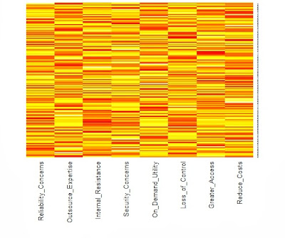
We need an example to illustrate these points. The R package psych contains a function for simulating graded response data. As shown in the appendix, we have random generated 200 respondents who rated 9 features on the 4-point anchored scale previous defined. The heatmap below reveals the underlying structure.
The categories are represented by color with dark blue=4, light blue=3, light red=2 and dark red=1. The respondents have been sorted by their total scores so that the consistently lowest ratings are indicated by rows of dark red toward the top of the heatmap. As one moves down the heatmap, the rows change gradually from predominantly red to blue. In addition, the columns have been sorted from the features with the lowest average rating to those features with the highest rating. As a result, the color changes in the rows follow a pattern with the most wanted features turning colors first as we proceed down the heatmap. V9 represents a feature that most want, but V1 is desired by only the most intense user. Put another way, our user in the bottom row is a "cell phone picture taking machine" who has to have every feature, even those features with which most others have little interest. However, the users near the top of our heatmap are not interested in any of the additional features.

Multiple Correspondence Analysis (MCA)

In the prior post that I have already referenced, the reader can find a worked example of how to code and interpret a graded response model using the R package ltm for latent trait modeling. Instead of repeating that analysis with a new data set, I wanted to supplement the graphic displays from heatmaps with the graphic displays from MCA. Warrens and Heiser have written an overview of this approach, but let me emphasize a couple of points from that article. MCA is a dual scaling technique. Dual scaling refers to the placement of rows and column on the same space. Similar rows are placed near each other and away from dissimilar rows. The same is true for columns. The relationship between rows and columns, however, is not directly plotted on the map, although in general one will find respondents located in the same region as the columns they tended to select. Even if you have had no prior experience with MCA, you should be able to follow the discussion below as if it were nothing more than a description of some scatterplots.

As mentioned before, the R code for all the analysis can be found in the appendix at the end of this post. Unlike a graded response model, MCA treats all category levels as nominal or factors in R. Thus, the 200 x 9 data matrix must be expanded to repeat the four category levels for each of the nine features. That is, a "3" (indicating that the feature would break a tie between two otherwise equivalent products) is represented in MCA by four category levels taking only zero and one values (in this case 0, 0, 1, 0). This means that the 200 x 9 data matrix becomes a 200 x 36 indicator matrix with four columns for each feature.

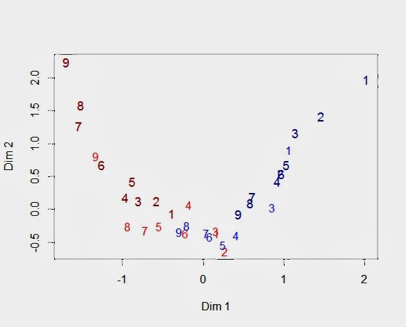
Looking at our heatmap above, the bottom rows with many 3's and 4's (blue) across all the features will be positioned near each other because their response patterns are similar. We would expect the same for the top rows, although in this case it is because the respondents share many 1's and 2's (dark red). We can ask the same location question about the 36 columns, but now the heatmap shows only the relationships among the 9 features. Obviously, adjacent columns are more similar, but we will need to examine the MCA map to learn about the locations of the category levels for each feature.  I have presented such a map below displaying the positions of the 36 columns on the first two latent dimensions.


The numbers refer to the nine features (V1 to V9). There are four 9's because there are four category levels for V9. I used the same color scheme as the heatmap, so that the 1's are dark red, and I made them slightly larger in order differentiate them from the 2's that are a lighter shade of red. Similarly, the light blue numbers refer to category level 3 for each feature, and the slightly larger dark blue numbers are the feature's fourth category (pay more for).

You can think of this "arc" as a path along which the rows of the heatmap fall. As you move along this path from the upper left to the upper right, you will trace out the rows of the heatmap. That is, the dark red "9" indicates the lowest score for Feature 9. It is followed by the lowest score for Feature 8 and Feature 7. What comes next? The light red for Feature 9 indicates the second lowest score for Feature 9. Then we see the lowest scores for the remaining features. This is the top of our heatmap. When we get to the end of our path, we see a similar pattern in reverse with respondents at the bottom of the heatmap.

Sometimes it helps to remember that the first dimension represents the respondent's propensity to be impacted by the features. As a result, we see the same rank ordering of the features repeated for each category level. For example, you can see the larger and darker red numbers decrease from 9 to 1 as you move down from the upper left side. Then, that pattern is repeated for the lighter and smaller red numbers, although Features 6 and 1 seem to be a little out of place. Feature 2 is hidden, but the light blue features are ordered as expected. Finally, the last repetition is for the larger dark blue numbers, even if Feature 4 moved out of line. In this example with simulated data, the features and the categories are well-separated. While we will always expect to see the categories for a single feature to be ordered, it is common to see overlap between different features and their respective categories.

It is worth our time to understand the arrangement of feature levels by examining the coordinates for the 36 columns that are plotted in the above graph (shown below). First, the four levels for each feature follow the same pattern with 1 < 2 < 3 < 4. Of course, this is what one would expect given that the scale was constructed to be ordinal. Still, we have passed a test since MCA does not force this ordering. The data entering a MCA are factors or nominal variables that are not ordered. Second, the fact that Feature 9 is preferred over Feature 1 can be seen in the placement of the four levels for each feature. Feature 1 starts at -0.39 (V1_1) and ends at 2.02 (V1_4). Feature 9, on the other hand, begins at -1.69 (V9_1) and finishes at 0.44 (V9_4). V9_1 has the lowest value on the first dimension because only a respondent with no latent interest in any feature would give the lowest score to the best feature. Similarly, the highest value on the first dimension belongs to V1_4 since only a zealot would pay more for the worst feature.


Dim 1
Dim 2
V1_1
-0.39
-0.06
V1_2
0.17
-0.36
V1_3
1.06
0.91
V1_4
2.02
1.97
V2_1
-0.58
0.13
V2_2
0.27
-0.64
V2_3
0.96
0.55
V2_4
1.46
1.42
V3_1
-0.80
0.13
V3_2
0.16
-0.33
V3_3
0.86
0.03
V3_4
1.14
1.16
V4_1
-0.97
0.18
V4_2
-0.18
0.07
V4_3
0.41
-0.39
V4_4
0.92
0.42
V5_1
-0.88
0.42
V5_2
-0.55
-0.25
V5_3
0.24
-0.54
V5_4
1.03
0.68
V6_1
-1.26
0.68
V6_2
-0.22
-0.36
V6_3
0.08
-0.41
V6_4
0.96
0.54
V7_1
-1.54
1.28
V7_2
-0.72
-0.32
V7_3
0.04
-0.36
V7_4
0.60
0.19
V8_1
-1.52
1.59
V8_2
-0.93
-0.25
V8_3
-0.20
-0.25
V8_4
0.58
0.10
V9_1
-1.69
2.24
V9_2
-1.33
0.81
V9_3
-0.30
-0.34
V9_4
0.44
-0.07

Finally, let us see how the respondents are positioned on the same MCA map. The red triangles are the 36 columns of the indicator matrix whose coordinates we have already seen in the above table. The blue dots are respondents. Respondents with similar response profiles are placed near each other. Given the feature structure shown in the heatmap, total score becomes a surrogate for respondent similarity. Defining a respondent's total score as the sum of the nine feature scores means that the total scores can range from 9 to 36. The 9'ers can be found at the top of the heatmap, and the 36'ers are at the bottom. It should be obvious that the closer the rows in the heatmap, the more similar the respondents.

Again, we see an arc that can be interpreted as the manifold or principal curve showing the trajectory of the underlying latent trait. The second dimension is a quadratic function of the first dimension (dim 2 = f(dim 1^2) with R-square = 0.86). This effect has been named the "horseshoe" effect. Although that name is descriptive, it encourages us to think of the arc as an artifact rather than a quadratic curve representing a scaling of the latent trait.


Finally, respondents fall along this arc in same order as their total scores. Respondent at the low end of the arc in the upper left are those giving the lowest scores to all the items. At the end of the arc in the upper right is where we find those respondents giving the highest feature scores.

Caveats and Other Conditions, Warnings and Stipulations

Everything we have done depends on the respondent's ability to know and report accurately on how the additional feature will impact them in the marketplace. Self-report, however, does not have a good track record, though sometimes it is the best we can do when there are many features to be screened. Besides social desirability, the most serious limitation is that respondents tend to be too optimistic because their mental simulations do not anticipate the impediments that will occur when the product with the added feature is actually offered in the marketplace. Prospection is no more accurate than retrospection.

Finally, it is an empirical question whether the graded response model captures the underlying feature prioritization process. To be clear, we are assuming that our behaviorally-anchored ratings are generated on the basis of a single continuous latent variable along which both the features and the respondents can be located. This may not be the case. Instead, we may have a multidimensional feature space, or our respondents may be a mixture of customer segments with different feature prioritization.

If customer heterogeneity is substantial and the product supports varying product configurations, we might find different segments wanting different feature sets. For example, feature bundles can be created to appeal to diverse customer segments as when a cable or direct TV provider offers sports programming or movie channel packages at a discounted price. However, this is not a simple finite mixture or latent class model but a hybrid mixture of customer types and intensities for some buyers of sports programming are sports fanatics who cannot live without it and other buyers are far less committed. You can read more about hybrid mixtures of categorical and continuous latent variables in a previous post.

In practice, one must always be open to the possibility that your data set is not homogeneous but contains one or more segments seeking different features. Wants and needs are not like perceptions, which seem to be shared even by individuals with very different needs (e.g., you may not have children and never go to McDonald's but you know that it offers fast food for kids). Nonetheless, when the feature set does not contain bundles deliberately chosen to appeal to different segments, the graded response model seems to perform well.

I am aware that our model imposes a good deal of structure on the response generation process. Yet in the end, the graded response model reflects the feature prioritization process in the same way that a conjoint model reflects the choice process. Conjoint models assume that the product is a bundle of attributes and that product choice can be modeled as an additive combination of the value of attribute levels. If the conjoint model can predict choice, it is accepted as an "as if" model even when we do not believe that consumers stored large volumes of attribute values that they retrieve from memory and add together. They just behave as if they did.


Appendix:  All the R code needed to create the data and run the analyses

I used a function from the psych library to generate the 4-point rating scale for the graded response model.  One needs to set the difficulty values using d and realize that the more difficult items are the less popular ones (i.e., a "hard" feature finds it "hard" to have an impact, while an "easy" feature finds it "easy").  The function sim.poly.npl() need to know the number of variables(nvar), the number of respondents(n), the number of categories (cat), and the mean(mu) plus standard deviation (sd) for the normal distribution describing the latent trait differentiating among our respondents.  The other parameters can be ignored for this example.  The function returns a list with scale scores in bar$items from 0 to 3 (thus the +1 to get a 4-point scale from1 to 4).

The function heatmap.2() comes from the gplots package.  Since I have sorted the data matrix by row and column marginals, I have suppressed the clustering of row and columns.

The MCA() function from FactoMineR needs factors, so there are three line showing how to make ratings a data frame and then use lapply to convert the numeric to factors.  You will notice that I needed to flip the first dimension to run from low to high, so there are a number of lines that reverse the sign of the first dimension.


library(psych)
d<-c(1.50,1.25,1.00,.25,0,
-.25,-1.00,-1.25,-1.50)
set.seed(12413)
bar<-sim.poly.npl(nvar = 9, n = 200,
low=-1, high=1, a=NULL,
c=0, z=1, d=d, mu=0,
sd=1, cat=4)
ratings<-bar$items+1
 
library(gplots)
feature<-apply(ratings,2,mean)
person<-apply(ratings,1,sum)
ratingsOrd<-ratings[order(person),
order(feature)]
heatmap.2(as.matrix(ratingsOrd), Rowv=FALSE,
Colv=FALSE, dendrogram="none",
col=redblue(16), key=FALSE,
keysize=1.5, density.info="none",
trace="none", labRow=NA)
 
F.ratings<-data.frame(ratings)
F.ratings[]<-lapply(F.ratings, factor)
str(F.ratings)
 
library(FactoMineR)
mca<-MCA(F.ratings)
summary(mca)
 
categories<-mca$var$coord[,1:2]
categories[,1]<--categories[,1]
categories
 
feature_label<-c(rep(1,4),rep(2,4),rep(3,4),
rep(4,4),rep(5,4),rep(6,4),
rep(7,4),rep(8,4),rep(9,4))
category_color<-rep(c("darkred","red",
"blue","darkblue"),9)
category_size<-rep(c(1.1,1,1,1.1),9)
plot(categories, type="n")
text(categories, labels=feature_label,
col=category_color, cex=category_size)
 
mca2<-mca
mca2$var$coord[,1]<--mca$var$coord[,1]
mca2$ind$coord[,1]<--mca$ind$coord[,1]
plot(mca2, choix="ind", label="none")
Created by Pretty R at inside-R.org

To leave a comment for the author, please follow the link and comment on his blog: Engaging Market Research.

R-bloggers.com offers daily e-mail updates about R news and tutorials on topics such as: visualization (ggplot2, Boxplots, maps, animation), programming (RStudio, Sweave, LaTeX, SQL, Eclipse, git, hadoop, Web Scraping) statistics (regression, PCA, time series, trading) and more...

Processing EXIF Data

$
0
0

(This article was first published on Exegetic Analytics » R, and kindly contributed to R-bloggers)

I got quite inspired by the EXIF with R post on the Timely Portfolio blog and decided to do a similar analysis with my photographic database.

The Data

The EXIF data were dumped using exiftool.

$ find 1995/ 20* -type f -print0 | xargs -0 exiftool -S -FileName -Orientation -ExposureTime \
  -FNumber -ExposureProgram -ISO -CreateDate -ShutterSpeedValue -ApertureValue -FocalLength \
  -MeasuredEV -FocusDistanceLower -FocusDistanceUpper | tee image-data.txt

This command uses some of the powerful features of the bash shell. If you are interested in seeing more about these, take a look at shell-fu and commandfu.

The resulting data were a lengthy series of records (one for each image file) that looked like this:

======== 2003/02/18/PICT0040.JPG
FileName: PICT0040.JPG
Orientation: Horizontal (normal)
ExposureTime: 1/206
FNumber: 8.4
ExposureProgram: Program AE
ISO: 50
CreateDate: 2003:02:18 23:11:35
FocalLength: 16.8 mm
======== 2003/07/02/100-0006.jpg
FileName: 100-0006.jpg
Orientation: Horizontal (normal)
ExposureTime: 1/250
FNumber: 8.0
ISO: 50
CreateDate: 2003:07:02 11:14:58
ShutterSpeedValue: 1/251
ApertureValue: 8.0
FocalLength: 6.7 mm
MeasuredEV: 14.91
FocusDistanceLower: 0 m
FocusDistanceUpper: inf

The data for each image begin at the “========” separator and the number of fields varies according to what information is available per image.

Getting the Data into R

The process of importing the data into R and transforming it into a workable structure took a little bit of work. Nothing too tricky though.

> data = readLines("data/image-data.txt")
> data = paste(data, collapse = "|")
> data = strsplit(data, "======== ")[[1]]
> data = strsplit(data, "|", fixed = TRUE)
> data = data[sapply(data, length) > 0]

Basically, here I loaded all of the data using readLines() which gave me a vector of strings. I then concatenated all of those strings into a single very, very long string. I sliced this up into blocks using the separator string “======== ” and then split the records in each block at the pipe symbol “|”. Finally, I found that the results had a few empty elements which I simply discarded.

The resulting data looked like this:

> sample(data, 3)
[[1]]
 [1] "2008/10/26/img_0570.jpg"          "FileName: img_0570.jpg"           "Model: Canon DIGITAL IXUS 60"    
 [4] "Orientation: Horizontal (normal)" "ExposureTime: 1/800"              "FNumber: 2.8"                    
 [7] "ISO: 82"                          "CreateDate: 2008:10:26 16:10:16"  "ShutterSpeedValue: 1/807"        
[10] "ApertureValue: 2.8"               "FocalLength: 5.8 mm"              "MeasuredEV: 14.12"               
[13] "FocusDistanceLower: 0 m"          "FocusDistanceUpper: 4.23 m"      

[[2]]
 [1] "2012/08/07/IMG_8766.JPG"          "FileName: IMG_8766.JPG"           "Model: Canon EOS 500D"           
 [4] "Orientation: Horizontal (normal)" "ExposureTime: 1/8"                "FNumber: 2.8"                    
 [7] "ExposureProgram: Program AE"      "ISO: 800"                         "CreateDate: 2012:08:07 18:03:42" 
[10] "ShutterSpeedValue: 1/8"           "ApertureValue: 2.8"               "FocalLength: 17.0 mm"            
[13] "MeasuredEV: 2.88"                 "FocusDistanceLower: 0.42 m"       "FocusDistanceUpper: 0.44 m"      

[[3]]
 [1] "2011/05/11/IMG_7355.CR2"          "FileName: IMG_7355.CR2"           "Model: Canon EOS 500D"           
 [4] "Orientation: Horizontal (normal)" "ExposureTime: 1/500"              "FNumber: 9.5"                    
 [7] "ExposureProgram: Program AE"      "ISO: 800"                         "CreateDate: 2011:05:11 17:51:04" 
[10] "ShutterSpeedValue: 1/512"         "ApertureValue: 9.5"               "FocalLength: 23.0 mm"            
[13] "MeasuredEV: 12.62"                "FocusDistanceLower: 0.51 m"       "FocusDistanceUpper: 0.54 m"

The next step was to reformat the data in each of these records and consolidate into a data frame.

> extract <- function(d) {
+   # Remove file name (redundant since it is also in first named record)
+   d <- d[-1]
+   #
+   d <- strsplit(d, ": ")
+   #
+   # This list looks like
+   #
+   #   [[1]]
+   #   [1] "FileName"     "DIA_0095.jpg"
+   #   
+   #   [[2]]
+   #   [1] "CreateDate"          "1995:06:23 09:09:54"
+   #
+   # We want to convert it into a key-value list...
+   #
+   as.list(setNames(sapply(d, function(n) {n[2]}), sapply(d, function(n) {n[1]})))
+ }
> 
> data <- lapply(data, extract)

Note the use of the handy utility function setNames() which was used to avoid creating a temporary variable. The result is a list, each element of which is a sub-list with named fields. A typical element looks like

> data[500]
[[1]]
[[1]]$FileName
[1] "dscf0271.jpg"

[[1]]$Model
[1] "FinePix A340"

[[1]]$Orientation
[1] "Horizontal (normal)"

[[1]]$ExposureTime
[1] "1/60"

[[1]]$FNumber
[1] "2.8"

[[1]]$ExposureProgram
[1] "Program AE"

[[1]]$ISO
[1] "100"

[[1]]$CreateDate
[1] "2004:12:25 06:18:36"

[[1]]$ShutterSpeedValue
[1] "1/64"

[[1]]$ApertureValue
[1] "2.8"

[[1]]$FocalLength
[1] "5.7 mm"

The next step was to concatenate all of these elements to form a single data frame. Normally I would do this using a combination of do.call() and rbind() but this will not work for the present case because the named lists for each of the images do not all contain the same set of fields. So, instead I used ldply(), which deals with this situation gracefully.

> library(plyr)
> #
> data = ldply(data, function(d) {as.data.frame(d)})

The final data, after a few more minor manipulations, is formatted as a neat data frame.

> tail(data)
          FileName          Model          CreateDate   Orientation ExposureTime FNumber ExposureProgram ISO
30151 IMG_2513.JPG Canon EOS 500D 2013-10-05 13:40:27 Rotate 270 CW          125     5.6      Program AE 400
30152 IMG_2515.JPG Canon EOS 500D 2013-10-05 13:40:29 Rotate 270 CW          125     5.6      Program AE 400
30153 IMG_2517.JPG Canon EOS 500D 2013-10-05 13:40:45 Rotate 270 CW          125     5.6      Program AE 400
30154 IMG_2519.JPG Canon EOS 500D 2013-10-05 13:40:48 Rotate 270 CW          125     5.6      Program AE 400
30155 IMG_2523.JPG Canon EOS 500D 2013-10-05 13:40:57 Rotate 270 CW          125     5.6      Program AE 400
30156 IMG_2525.JPG Canon EOS 500D 2013-10-05 13:41:00 Rotate 270 CW          125     5.6      Program AE 400
      FocalLength ShutterSpeedValue ApertureValue MeasuredEV FocusDistanceLower FocusDistanceUpper
30151          20               125           5.6      10.25               2.57               3.18
30152          21               125           5.6      10.25               2.57               3.18
30153          23               125           5.6      10.50               2.57               3.18
30154          25               125           5.6      10.25               2.57               3.18
30155          17               125           5.6      10.38               2.57               3.18
30156          21               125           5.6      10.25               2.57               3.18

Plots and Analysis

There are quite a few photographs in the data.

> dim(data)
[1] 21031    14

The only sensible way to understand my photography habits is to produce some visualisations. The three elements in the exposure triangle are ISO, shutter speed (or exposure time) and aperture (or F-number). I try to always shoot at the lowest ISO, so the two variables of interest are shutter speed and aperture.

First let’s look at mosaic and association plots for these two variables.

exif-mosaic

Mosaic plots are a powerful way of understanding multivariate categorical data. The mosaic plot above indicates the relative frequency of photographs with particular combinations of shutter speed and aperture. The large blue block in the tenth row from the top indicates that there are many photographs at 1/60 second and F/2.8. Whereas the small blue block on the right of the top row indicates that there are relatively few photographs at 1 second and F/32. The colour shading in the plot indicates whether there are too many (blue) or too few (red) photographs with a given combination of shutter speed and aperture relative to the assumption that these two variables are independent [1,2]. Grey blocks are not inconsistent with the assumption of independence. Since there are a significant number of blue and red blocks, the data suggests that there is a significant relationship between shutter speed and aperture (which is just what one would expect!).

exif-assoc

The association plot provides essentially the same information, with the area of a block being positive (blue and above the line) or negative (red and below the line) according to whether or not the observed data are greater than or less than what would be expected in the case of independence.

A somewhat simpler way of looking at these data is a heat map, which just gives the number of counts for each combination of shutter speed and aperture and does not make any model comparisons. It is presented on a regular grid, which makes it a little easier on the mind too (although it is appreciably weaker in terms of information content).

fstop-exposure-heatmap

Again we can see that the overwhelming majority of my photographs have been taken at 1/60 second and F/2.8, which I am ashamed to say shows a distinct lack of imagination! (Note to self to remedy this situation).

And, finally, another heat map which shows how the number of photographs I have taken has evolved over time. There have been some very busy periods like the (southern hemisphere) summers of 2004/5 and 2007/8 when I went to Antarctica, and April/May 2007 when I visited Marion Island.

calendar-heatmap

There are a lot of other interesting things that one might do with these data. For example, looking at the upper and lower limits of focus distance, but these will have to wait for another day.

References

[1] Zeileis, Achim, David Meyer, and Kurt Hornik. “Residual-based Shadings in vcd.”
[2] Visualizing contingency tables

To leave a comment for the author, please follow the link and comment on his blog: Exegetic Analytics » R.

R-bloggers.com offers daily e-mail updates about R news and tutorials on topics such as: visualization (ggplot2, Boxplots, maps, animation), programming (RStudio, Sweave, LaTeX, SQL, Eclipse, git, hadoop, Web Scraping) statistics (regression, PCA, time series, trading) and more...

Plotly Beta: Collaborative Plotting with R

$
0
0

(This article was first published on R-statistics blog » R, and kindly contributed to R-bloggers)

(Guest post by Matt Sundquist on a lovely new service which is pro-actively supporting an API for R)

The Plotly R graphing library  allows you to create and share interactive, publication-quality plots in your browser. Plotly is also built for working together, and makes it easy to post graphs and data publicly with a URL or privately to collaborators.

In this post, we’ll demo Plotly, make three graphs, and explain sharing. As we’re quite new and still in our beta, your help, feedback, and suggestions go a long way and are appreciated. We’re especially grateful for Tal’s help and the chance to post.

Installing Plotly

Sign-up and Install (more in documentation)

From within the R console:

install.packages("devtools")
library("devtools")

Next, install plotly (a big thanks to Hadley, who suggested the GitHub route):

devtools::install_github("plotly/R-api")
# ...
# * DONE (plotly)

Then sign-up like this or at https://plot.ly/:

>library(plotly)
>response = signup (username = 'username', email= 'youremail')
…
Thanks for signing up to plotly! 
 
Your username is: MattSundquist
 
Your temporary password is: pw. You use this to log into your plotly account at https://plot.ly/plot. Your API key is: “API_Key”. You use this to access your plotly account through the API.
 
To get started, initialize a plotly object with your username and api_key, e.g. 
>>> p <- plotly(username="MattSundquist", key="API_Key")
Then, make a graph!
>>> res <- p$plotly(c(1,2,3), c(4,2,1))

And we’re up and running! You can change and access your password and key in your homepage.

1. Overlaid Histograms:

Here is our first script.

library("plotly")
p <- plotly(username="USERNAME", key="API_Key")
 
x0 = rnorm(500)
x1 = rnorm(500)+1
data0 = list(x=x0,
             type='histogramx',
opacity=0.8)
data1 = list(x=x1,
             type='histogramx',
opacity=0.8)
layout = list(barmode='overlay')  
 
response = p$plotly(data0, data1, kwargs=list(layout=layout)) 
 
browseURL(response$url)

The script makes a graph. Use the RStudio viewer or add “browseURL(response$url)” to your script to avoid copy and paste routines of your URL and open the graph directly.

image001

Press “Save a Copy” to start styling from the GUI. So, find out “how would this look if I tweaked…,” or “what if I tweaked [element of graph I love to obsess over]?”

image002

Plotly supports line charts, scatter plots, bubble charts, histograms, 2D histograms, box plots, heatmaps, and error bars. We also support log axes, date axes, multiple axes, subplots, and LaTeX. Or, analyze your data:

image003

You can also embed your URL into this snippet to make an iframe (e.g., this Washington Post piece). You can adjust the width and height.

<iframe id=”igraph” src=”https://plot.ly/~MattSundquist/594/400/250/” width=”400″ height=”250″ seamless=”seamless” scrolling=”no”></iframe>

image004

2. Heatmap

image005


library(plotly)
p <- plotly(username='USERNAME', key='API_KEY')
 
zd <- matrix(rep(runif(38,0,38),26),26)
 
#random.sample(range(0, 41),41) for j in range(8)]
z <- tapply(z,(rep(1:nrow(z),ncol(z))),function(i)list(i))
 
cs <- list(
    c(0,"rgb(12,51,131)"),
    c(0.25,"rgb(10,136,186)"),
    c(0.5,"rgb(242,211,56)"),
    c(0.75,"rgb(242,143,56)"),
    c(1,"rgb(217,30,30)")
)
 
data <- list(
    z = zd,
    scl = cs,
    type = 'heatmap'
)
 
response <- p$plotly(data)
 
browseURL(response$url)

3. Log-normal Boxplot

image006

library(plotly)
p <- plotly(username='USERNAME', key='API_KEY')
 
x <- c(seq(0,0,length=1000),seq(1,1,length=1000),seq(2,2,length=1000))
y <- c(rlnorm(1000,0,1),rlnorm(1000,0,2),rlnorm(1000,0,3))
s <- list(
    type = 'box',
    jitter = 0.5
)
layout <- list(
    title = 'Fun with the Lognormal distribution',
    yaxis = list(
        type = 'log'
    )
)
 
response <- p$plotly(x,y, kwargs = list(layout = layout, style=s))
 
browseURL(response$url)

Collaborating and Sharing: You’re in Control

Nicola Sommacal posted about Plotly this week, which we thoroughly appreciate. He mentioned privacy, and we wanted to make sure we highlighted:

(1) You control if graphs are public or private, and who you share with (like Google Docs)

(2) Public sharing in Plotly is free (like GitHub).

To share privately, press “Share” in our GUI or share with your script. Users you share with get an email and can edit and comment on graphs. That means no more emailing data, graphs, screenshots, and spreadsheets around: you can do it all in Plotly. You can also save and apply custom themes to new data to avoid re-making the same graphs with new data. Just upload and apply your theme.

We would love to see your examples and hear your feedback. You can email our team at feedback@plot.ly, or connect with us on Twitter or Facebook.

Click here to see the graphs and code for our gallery. Happy plotting!

image007

To leave a comment for the author, please follow the link and comment on his blog: R-statistics blog » R.

R-bloggers.com offers daily e-mail updates about R news and tutorials on topics such as: visualization (ggplot2, Boxplots, maps, animation), programming (RStudio, Sweave, LaTeX, SQL, Eclipse, git, hadoop, Web Scraping) statistics (regression, PCA, time series, trading) and more...

OA week – A simple use case for programmatic access to PLOS full text

$
0
0

(This article was first published on rOpenSci Blog - R, and kindly contributed to R-bloggers)

Open access week is here! We love open access, and think it's extremely important to publish in open access journals. One of the many benefits of open access literature is that we likely can use the text of articles in OA journals for many things, including text-mining.

What's even more awesome is some OA publishers provide API (application programming interface) access to their full text articles. Public Library of Science (PLOS) is one of these. We have had an R package for a while now that makes it convenient to search PLOS full text programatically. You can search on specific parts of articles (e.g., just in titles, or just in results sections), and you can return specific parts of articles (e.g., just abstracts). There are additional options for more fine-grained control over searches like facetting.

What if you want to find similar papers based on their text content? This can be done using the PLOS search API, with help from the tm R package. These are basic examples just to demonstrate that you can quickly go from a search of PLOS data to a visualization or analysis.

Install rplos and other packages from CRAN

install.packages(c("rplos", "tm", "wordcloud", "RColorBrewer", "proxy", "plyr"))

Get some text

library(rplos)
out <- searchplos("birds", fields = "id,introduction", limit = 20, toquery = list("cross_published_journal_key:PLoSONE", 
    "doc_type:full"))
out$idshort <- sapply(out$id, function(x) strsplit(x, "\\.")[[1]][length(strsplit(x, 
    "\\.")[[1]])], USE.NAMES = FALSE)

The result is a list of length limit defined in the previous call.

nrow(out)
[1] 20

Word dictinoaries.

Next, we'll use the tm package to create word dictionaries for each paper.

library(tm)
library(proxy)
corpus <- Corpus(DataframeSource(out["introduction"]))

# Clean up corpus
corpus <- tm_map(corpus, function(x) removeWords(x, stopwords("english")))
corpus <- tm_map(corpus, function(x) removePunctuation(x))
tdm <- TermDocumentMatrix(corpus)
tdm$dimnames$Docs <- out$idshort

# Comparison among documents in a heatmap
dissmat <- dissimilarity(tdm, method = "Euclidean")
get_dist_frame <- function(x) {
    temp <- data.frame(subset(data.frame(expand.grid(dimnames(as.matrix(x))), 
        expand.grid(lower.tri(as.matrix(x)))), Var1.1 == "TRUE")[, -3], as.vector(x))
    names(temp) <- c("one", "two", "value")
    tempout <- temp[!temp[, 1] == temp[, 2], ]
    tempout
}
dissmatdf <- get_dist_frame(dissmat)
ggplot(dissmatdf, aes(one, two)) + geom_tile(aes(fill = value), colour = "white", 
    binwidth = 3) + scale_fill_gradient(low = "white", high = "steelblue") + 
    theme_grey(base_size = 16) + labs(x = "", y = "") + scale_x_discrete(expand = c(0, 
    0)) + scale_y_discrete(expand = c(0, 0)) + theme(axis.ticks = theme_blank(), 
    axis.text.x = element_text(size = 12, hjust = 0.6, colour = "grey50", angle = 90), 
    panel.grid.major = theme_blank(), panel.grid.minor = theme_blank(), panel.border = theme_blank())

plot of chunk tmit

Picking two with low values (=high similarity), dois 10.1371/journal.pone.0000184 and 10.1371/journal.pone.0004148, here's some of the most common terms used (some overlap).

library(plyr)
df1 <- sort(termFreq(corpus[[grep("10.1371/journal.pone.0010997", out$id)]]))
df1 <- data.frame(terms = names(df1[df1 > 2]), vals = df1[df1 > 2], row.names = NULL)
df2 <- sort(termFreq(corpus[[grep("10.1371/journal.pone.0004148", out$id)]]))
df2 <- data.frame(terms = names(df2[df2 > 1]), vals = df2[df2 > 1], row.names = NULL)
df1$terms <- reorder(df1$terms, df1$vals)
df2$terms <- reorder(df2$terms, df2$vals)
dfboth <- ldply(list(`0010997` = df1, `0004148` = df2))
ggplot(dfboth, aes(x = terms, y = vals)) + geom_histogram(stat = "identity") + 
    facet_grid(. ~ .id, scales = "free") + theme(axis.text.x = element_text(angle = 90))

plot of chunk words

Determine similarity among papers

Using a wordcloud

library(wordcloud)
library(RColorBrewer)

m <- as.matrix(tdm)
v <- sort(rowSums(m), decreasing = TRUE)
d <- data.frame(word = names(v), freq = v)
pal <- brewer.pal(9, "Blues")
pal <- pal[-(1:2)]

# Plot the chart
wordcloud(d$word, d$freq, scale = c(3, 0.1), min.freq = 2, max.words = 250, 
    random.order = FALSE, rot.per = 0.2, colors = pal)

plot of chunk wordcloud

To leave a comment for the author, please follow the link and comment on his blog: rOpenSci Blog - R.

R-bloggers.com offers daily e-mail updates about R news and tutorials on topics such as: visualization (ggplot2, Boxplots, maps, animation), programming (RStudio, Sweave, LaTeX, SQL, Eclipse, git, hadoop, Web Scraping) statistics (regression, PCA, time series, trading) and more...

Using R: correlation heatmap, take 2

$
0
0

(This article was first published on There is grandeur in this view of life » R, and kindly contributed to R-bloggers)

Apparently, this turned out to be my most popular post ever.  Of course there are lots of things to say about the heatmap (or quilt, tile, guilt plot etc), but what I wrote was literally just a quick celebratory post to commemorate that I’d finally grasped how to combine reshape2 and ggplot2 to quickly make this colourful picture of a correlation matrix.

However, I realised there is one more thing that is really needed, even if just for the first quick plot one makes for oneself: a better scale. The default scale is not the best for correlations, which range from -1 to 1, because it’s hard to tell where zero is. We use the airquality dataset for illustration as it actually has some negative correlations. In ggplot2, it’s very easy to get a scale that has a midpoint and a different colour in each direction. It’s called scale_colour_gradient2, and we just need to add it. I also set the limits to -1 and 1, which doesn’t change the colour but fills out the legend for completeness. Done!

data <- airquality[,1:4]
library(ggplot2)
library(reshape2)
qplot(x=Var1, y=Var2, data=melt(cor(data, use="p")), fill=value, geom="tile") +
   scale_fill_gradient2(limits=c(-1, 1))

correlation_heatmap2


Postat i:computer stuff, data analysis, english Tagged: #blogg100, ggplot2, R, reshape2

To leave a comment for the author, please follow the link and comment on his blog: There is grandeur in this view of life » R.

R-bloggers.com offers daily e-mail updates about R news and tutorials on topics such as: visualization (ggplot2, Boxplots, maps, animation), programming (RStudio, Sweave, LaTeX, SQL, Eclipse, git, hadoop, Web Scraping) statistics (regression, PCA, time series, trading) and more...

Mining Research Interests – or: What Would Google Want to Know?

$
0
0

(This article was first published on Beautiful Data » R, and kindly contributed to R-bloggers)

I am a regular visitor of Google’s research page where they post all of their latest and upcoming scientific papers. Lately I have thought whether it would be possible to statistically extract some of the meta-information from the papers. Here’s the result of the analysis of the papers’ titles produced with just a few lines of R code:

Research Topics @ Google


I clustered the data with a standard hierarchical cluster analysis to find out which terms tend to often go together in the paper titles. Then I took a deeper look at the abstracts – of all the papers that had abstracts that is. I processed the abstracts with the tm R package and draw the following heat-map that shows how often which of the most important keywords appear in each paper:

Keywords_Abstracts_google

I did a similar heatmap but this time normalized by the term frequency – inverse document frequency measure. While the first heatmap shows the most frequently used terms, this weighted heatmap shows terms that are quite important in their respective research papers but normalizes this by the overall term frequency.

Keywords_Abstracts_google_tfidf

If you need input for playing buzzword bingo at the next Strata Conference in Santa Clara, you don’t have to look any further ;-)

To leave a comment for the author, please follow the link and comment on his blog: Beautiful Data » R.

R-bloggers.com offers daily e-mail updates about R news and tutorials on topics such as: visualization (ggplot2, Boxplots, maps, animation), programming (RStudio, Sweave, LaTeX, SQL, Eclipse, git, hadoop, Web Scraping) statistics (regression, PCA, time series, trading) and more...

Lyric Analytics

$
0
0

(This article was first published on More or Less Numbers, and kindly contributed to R-bloggers)
I was messing around with the text mining (tm) package in R and was thinking of something I could comb through.  I looked through some other blogs and websites to see how they were using it:  mining through presidential speeches debates being one of the more notable uses.  I was thinking about it in terms of where we focus mostly on how things are said and really not what is actually said...ie music.  For some people, what is said is important and I would argue for most artists who, "make it" eventually it comes around to be important to an artist's being catapulted into fame :-)


One of the greater(est) rock and roll icons who began making albums slightly before my ears were ready for it is "The Boss".  Lots of albums, lots of words.  Although Bruce Springsteen was definitely communicating a lot of powerful ideas in his music, ultimately it's the passion he sings with, the way he is miraculously able to have a sax weaved into most of his songs, or just having come up with the nickname "The Boss" that makes him awesome.  Anyways, I thought about looking at the album Born to Run as a primer in what I'll call, "lyric mining".

Below is a graph showing the most frequent words used in the album across every song that are mentioned at least 5 times.  For those of us familiar with the album, if you just look at these words you can hear the music.

Number of times words are used in the album Born to Run

Below is a heat map showing words and their corresponding albums (lighter the colors = more usage).  I chose only words that were mentioned at least 5 times in the album, otherwise it was too large.  On the axis not labeled are dendograms (basically a graphical way to show how things are associated or how similar they are - more on how to read them here).  Each cell in the heat map has a bar graph showing the relative usage of the word...highest being 10 times in one song...that being the word "one" in the song "She's the One".

Born to Run album Heatmap

In terms of what is said you'll notice that the song "Night" is associated with "Jungleland"(height of the lines and being in the same "clade" on the dendogram) in terms of the words used, at least those that are used at least 5 times.  Here's how this looks when they are graphed against each other:

Night lyrics graphed against Jungleland lyrics for words mentioned 5=< times
Alternatively "10 Avenue Freeze Out" is an outlier in terms of word usage among the other songs as you can see it sits relatively unconnected from other songs in the dendogram on the x-axis.

On the y-axis you can see the associations across different words and their usage.  "Night" and "One" even though they are used a lot are not distributed the same (different "clades")...meaning when "The Boss" is belting it out, he's using these words in different places - different songs.

Which brings up an interesting point about great albums (in my opinion):  their distribution of themes.  "Born to Run" definitely has some great themes in it and while I won't interpret the meaning of each song, we can see it through the distribution of words in the lyrics and songs in the album.  While we know the song themes are strong in this album, we can also see (through the word distribution) that the great themes are distributed across the album and it's not just one song that makes this album great.


To leave a comment for the author, please follow the link and comment on his blog: More or Less Numbers.

R-bloggers.com offers daily e-mail updates about R news and tutorials on topics such as: visualization (ggplot2, Boxplots, maps, animation), programming (RStudio, Sweave, LaTeX, SQL, Eclipse, git, hadoop, Web Scraping) statistics (regression, PCA, time series, trading) and more...

Self-Organising Maps for Customer Segmentation using R

$
0
0

(This article was first published on Shane Lynn » R, and kindly contributed to R-bloggers)

Self-Organising Maps (SOMs) are an unsupervised data visualisation technique that can be used to visualise high-dimensional data sets in lower (typically 2) dimensional representations. In this post, we examine the use of R to create a SOM for customer segmentation. The figures shown here used use the 2011 Irish Census information for the greater Dublin area as an example data set. This work is based on a talk given to the Dublin R Users group in January 2014.

If you are keen to get down to business:

  • download The slides from a talk on this subject that I gave to the Dublin R Users group in January 2014 are available here
  • download The code for the Dublin Census data example is available for download from here.(zip file containing code and data – filesize 25MB)

SOM diagram

SOMs were first described by Teuvo Kohonen in Finland in 1982, and Kohonen’s work in this space has made him the most cited Finnish scientist in the world. Typically, visualisations of SOMs are colourful 2D diagrams of ordered hexagonal nodes.

The SOM Grid

SOM visualisation are made up of multiple “nodes”. Each node vector has:

  • A fixed position on the SOM grid
  • A weight vector of the same dimension as the input space. (e.g. if your input data represented people, it may have variables “age”, “sex”, “height” and “weight”, each node on the grid will also have values for these variables)
  • Associated samples from the input data. Each sample in the input space is “mapped” or “linked” to a node on the map grid. One node can represent several input samples.

The key feature to SOMs is that the topological features of the original input data are preserved on the map. What this means is that similar input samples (where similarity is defined in terms of the input variables (age, sex, height, weight)) are placed close together on the SOM grid. For example, all 55 year old females that are appoximately 1.6m in height will be mapped to nodes in the same area of the grid.  Taller and smaller people will be mapped elsewhere, taking all variables into account. Tall heavy males will be closer on the map to tall heavy females than small light males as they are more “similar”.

SOM Heatmaps

Typical SOM visualisations are of “heatmaps”. A heatmap shows the distribution of a variable across the SOM. If we imagine our SOM as a room full of people that we are looking down upon, and we were to get each person in the room to hold up a coloured card that represents their age – the result would be a SOM heatmap. People of similar ages would, ideally, be aggregated in the same area. The same can be repeated for age, weight, etc. Visualisation of different heatmaps allows one to explore the relationship between the input variables.

The figure below demonstrates the relationship between average education level and unemployment percentage using two heatmaps. The SOM for these diagrams was generated using areas around Ireland as samples.

Heatmaps from SOM


SOM Algorithm

The algorithm to produce a SOM from a sample data set can be summarised as follows:

  1. Select the size and type of the map. The shape can be hexagonal or square, depending on the shape of the nodes your require. Typically, hexagonal grids are preferred since each node then has 6 immediate neighbours.
  2. Initialise all node weight vectors randomly.
  3. Choose a random data point from training data and present it to the SOM.
  4. Find the “Best Matching Unit” (BMU) in the map – the most similar node. Similarity is calculated using the Euclidean distance formula.
  5. Determine the nodes within the “neighbourhood” of the BMU.
    - The size of the neighbourhood decreases with each iteration.
  6. Adjust weights of nodes in the BMU neighbourhood towards the chosen datapoint.
    - The learning rate decreases with each iteration.
    - The magnitude of the adjustment is proportional to the proximity of the node to the BMU.
  7. Repeat Steps 2-5 for N iterations / convergence.

Sample equations for each of the parameters described here are given on Slideshare.

SOMs in R

Training

The “kohonen” package is a well-documented package in R that facilitates the creation and visualisation of SOMs. To start, you will only require knowledge of a small number of key functions, the general process in R is as follows (see the presentation slides for further details):

# Load the kohonen package 
require(kohonen)

# Create a training data set (rows are samples, columns are variables
# Here I am selecting a subset of my variables available in "data"
data_train <- data[, c(2,4,5,8)]

# Change the data frame with training data to a matrix
# Also center and scale all variables to give them equal importance during
# the SOM training process. 
data_train_matrix <- as.matrix(scale(data_train))

# Create the SOM Grid - you generally have to specify the size of the 
# training grid prior to training the SOM. Hexagonal and Circular 
# topologies are possible
som_grid <- somgrid(xdim = 20, ydim=20, topo="hexagonal")

# Finally, train the SOM, options for the number of iterations,
# the learning rates, and the neighbourhood are available
som_model <- som(data_train_matrix, 
		grid=som_grid, 
		rlen=100, 
		alpha=c(0.05,0.01), 
		keep.data = TRUE,
		n.hood=“circular” )

Visualisation

The kohonen.plot function is used to visualise the quality of your generated SOM and to explore the relationships between the variables in your data set. There are a number different plot types available. Understanding the use of each is key to exploring your SOM and discovering relationships in your data.

  1. Training Progress:
    As the SOM training iterations progress, the distance from each node’s weights to the samples represented by that node is reduced. Ideally, this distance should reach a minimum plateau. This plot option shows the progress over time. If the curve is continually decreasing, more iterations are required. 
    plot(som_model, type="changes")

    Progress of error for each iteration of SOM training
  2. Node Counts
    The Kohonen packages allows us to visualise the count of how many samples are mapped to each node on the map. This metric can be used as a measure of map quality – ideally the sample distribution is relatively uniform. Large values in some map areas suggests that a larger map would be benificial. Empty nodes indicate that your map size is too big for the number of samples. Aim for at least 5-10 samples per node when choosing map size. 
    plot(som_model, type="count")

    Number of samples per SOM node
  3. Neighbour Distance
    Often referred to as the “U-Matrix”, this visualisation is of the distance between each node and its neighbours. Typically viewed with a grayscale palette, areas of low neighbour distance indicate groups of nodes that are similar. Areas with large distances indicate the nodes are much more dissimilar – and indicate natural boundaries between node clusters. The U-Matrix can be used to identify clusters within the SOM map. 
    plot(som_model, type="dist.neighbours")

    Som neighbour distances
  4. Codes / Weight vectors
    The node weight vectors, or “codes”, are made up of normalised values of the original variables used to generate the SOM. Each node’s weight vector is representative / similar of the samples mapped to that node. By visualising the weight vectors across the map, we can see patterns in the distribution of samples and variables. The default visualisation of the weight vectors is a “fan diagram”, where individual fan representations of the magnitude of each variable in the weight vector is shown for each node. Other represenations are available, see the kohonen plot documentation for details. 
    plot(som_model, type="codes")

    SOM code view
  5. Heatmaps
    Heatmaps are perhaps the most important visualisation possible for Self-Organising Maps. The use of a weight space view as in (4) that tries to view all dimensions on the one diagram is unsuitable for a high-dimensional (>7 variable) SOM. A SOM heatmap allows the visualisation of the distribution of a single variable across the map. Typically, a SOM investigative process involves the creation of multiple heatmaps, and then the comparison of these heatmaps to identify interesting areas on the map. It is important to remember that the individual sample positions do not move from one visualisation to another, the map is simply coloured by different variables.
    The default Kohonen heatmap is created by using the type “heatmap”, and then providing one of the variables from the set of node weights. In this case we visualise the average education level on the SOM. 
    plot(som_model, type = "property", property = som_model$codes[,4], main=names(som_model$data)[4], palette.name=coolBlueHotRed)

    SOM heatmap

    It should be noted that this default visualisation plots the normalised version of the variable of interest. A more intuitive and useful visualisation is of the variable prior to scaling, which involves some R trickery – using the aggregate function to regenerate the variable from the original training set and the SOM node/sample mappings. The result is scaled to the real values of the training variable (in this case, unemployment percent).

    var <- 2 #define the variable to plot 
    var_unscaled <- aggregate(as.numeric(data_train[,var]), by=list(som_model$unit.classif), FUN=mean, simplify=TRUE)[,2] 
    plot(som_model, type = "property", property=var_unscaled, main=names(data_train)[var], palette.name=coolBlueHotRed)

    SOM heatmap scaled

    It is noteworthy that these two heatmaps immediately show an inverse relationship between unemployment percent and education level in the areas around Dublin. Further heatmaps, visualised side by side, can be used to build up a picture of the different areas and their characteristics.

    Multiple heatmaps

Clustering

Clustering can be performed on the SOM nodes to isolate groups of samples with similar metrics. Manual identification of clusters is completed by exploring the heatmaps for a number of variables and drawing up a “story” about the different areas on the map. An estimate of the number of clusters that would be suitable can be ascertained using a kmeans algorithm and examing for an “elbow-point” in the plot of “within cluster sum of squares”.  The Kohonen package documentation shows how a map can be clustered using hierachical clustering. The results of the clustering can be visualised using the SOM plot function again.

mydata <- som_model$codes 
wss <- (nrow(mydata)-1)*sum(apply(mydata,2,var)) 
for (i in 2:15) {
  wss[i] <- sum(kmeans(mydata, centers=i)$withinss)
}
plot(wss)

## use hierarchical clustering to cluster the codebook vectors
som_cluster <- cutree(hclust(dist(som_model$codes)), 6)
# plot these results:
plot(som_model, type="mapping", bgcol = pretty_palette[som_cluster], main = "Clusters") 
add.cluster.boundaries(som_model, som_cluster)

Clusters on SOM

Ideally, the clusters found are contiguous on the map surface. However, this may not be the case, depending on the underlying distribution of variables. To obtain contiguous cluster, a hierachical clustering algorithm can be used that only combines nodes that are similar AND beside each other on the SOM grid. However, hierachical clustering usually suffices and any outlying points can be accounted for manually.

The mean values and distributions of the training variables within each cluster are used to build a meaningful picture of the cluster characteristics. The clustering and visualisation procedure is typically an iterative process. Several SOMs are normally built before a suitable map is created. It is noteworthy that the majority of time used during the SOM development exercise will be in the visualisation of heatmaps and the determination of a good “story” that best explains the data variations.

Conclusions

Self-Organising Maps (SOMs) are another powerful tool to have in your data science repertoire. Advantages include: –

  • Intuitive method to develop customer segmentation profiles.
  • Relatively simple algorithm, easy to explain results to non-data scientists
  • New data points can be mapped to trained model for predictive purposes.

Disadvantages include:

  • Lack of parallelisation capabilities for VERY large data sets since the training data set is iterative
  • Difficult to represent very many variables in two dimensional plane
  • Requires clean, numeric data

Please do explore the slides and code (2014-01 SOM Example code_release.zip) from the talk for more detail. Contact me if you there are any problems running the example code etc.


To leave a comment for the author, please follow the link and comment on his blog: Shane Lynn » R.

R-bloggers.com offers daily e-mail updates about R news and tutorials on topics such as: visualization (ggplot2, Boxplots, maps, animation), programming (RStudio, Sweave, LaTeX, SQL, Eclipse, git, hadoop, Web Scraping) statistics (regression, PCA, time series, trading) and more...
Viewing all 152 articles
Browse latest View live